Start a project

If you would like to find out more about how we can work together, fill out the form and we’ll set up a time to chat about what’s next for your brand.


for best experience
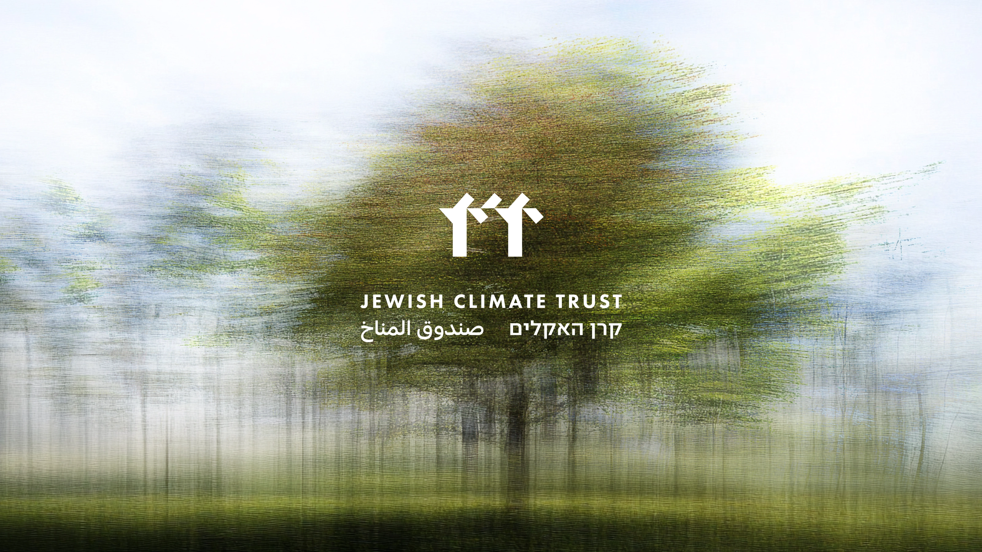
A brand for hope, rigour and systemic change
The Jewish Climate Trust is a new kind of organisation: part think tank, part foundation, part bridge-builder. Its mission is to elevate the climate performance of the Jewish people and the State of Israel by 2048, Israel’s centennial year. They came to us at the very beginning. Without an identity but with a distinct vision and a bold ambition to create lasting climate impact through mitigation, adaptation and innovation. They needed an something that could hold all that complexity with calm, confidence and clarity.
- Brand Identity
- Art Direction & Design
- Website Design
- UI UX
- Illustration
- Digital Assets
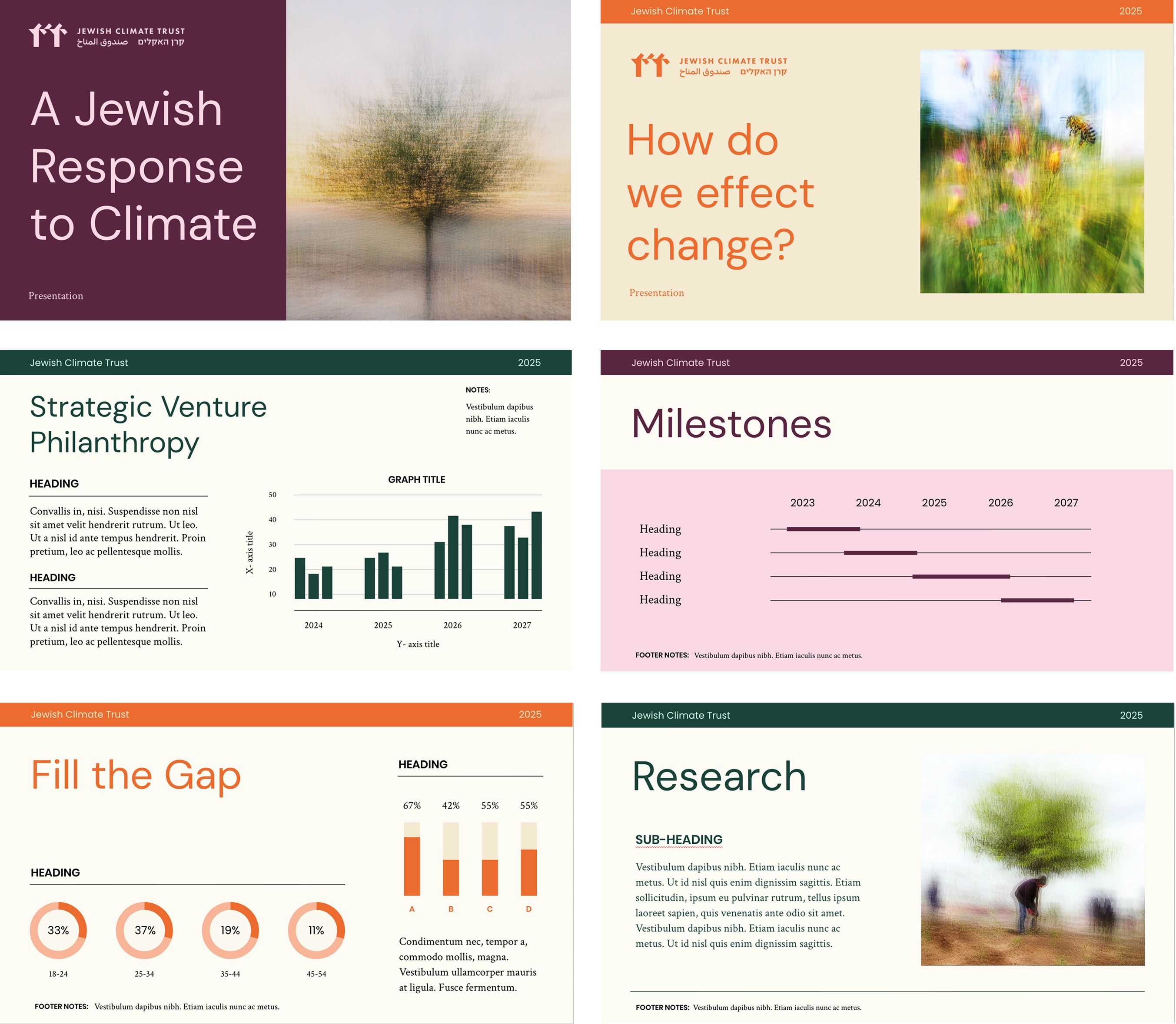
This project was never about painting things green. The challenge was to express environmental urgency with the discipline of a policy institute and the warmth of a faith-rooted movement. We spent time understanding their mission, the bridges they wanted to build between Israel and the diaspora, between science and spirituality, between philanthropy and policy. From that insight came a design system that balances complexity with simplicity and speaks with quiet authority to governments, funders, NGOs and faith communities.
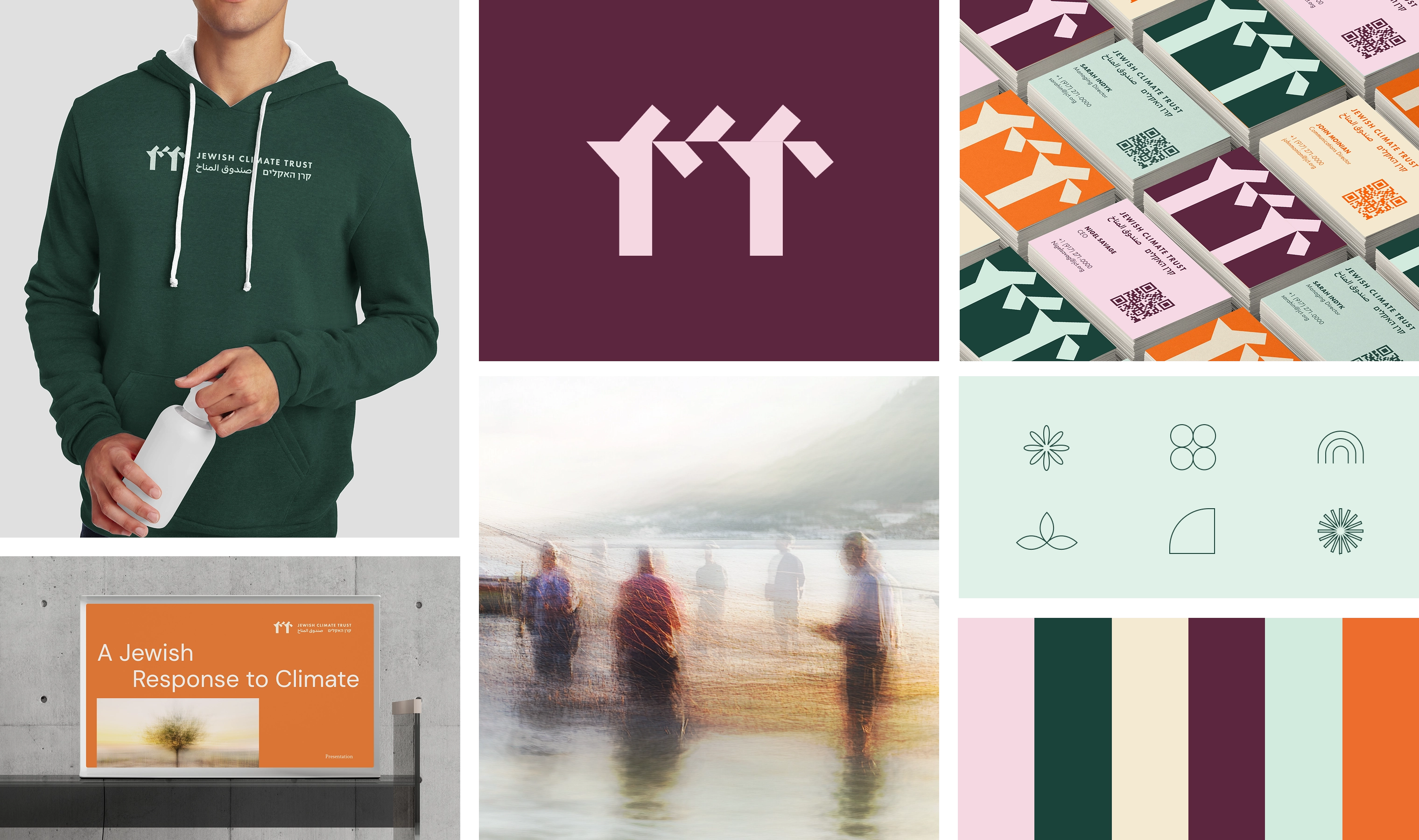
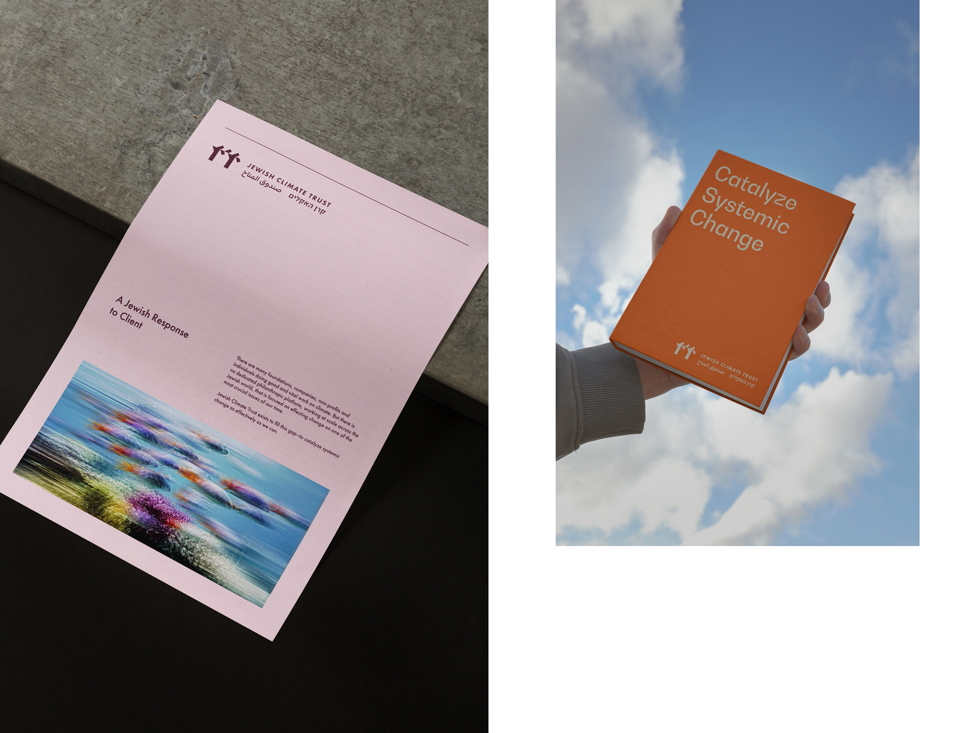
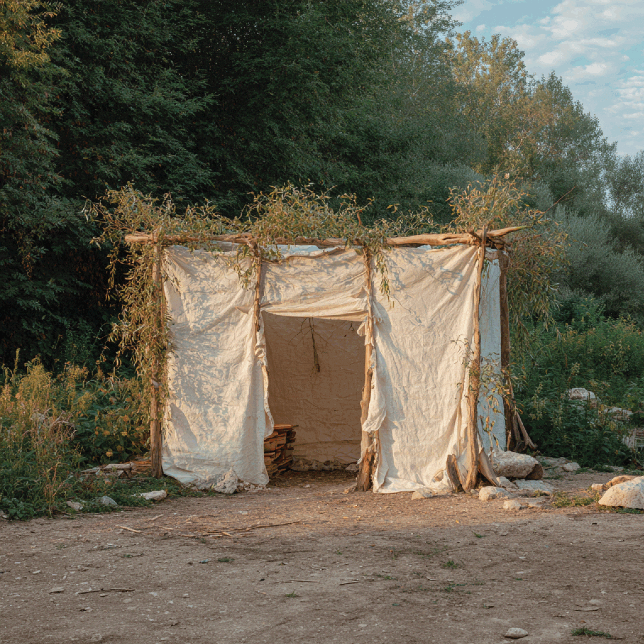
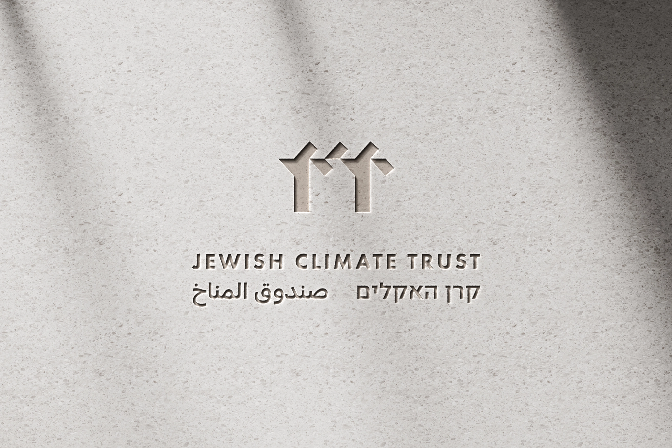
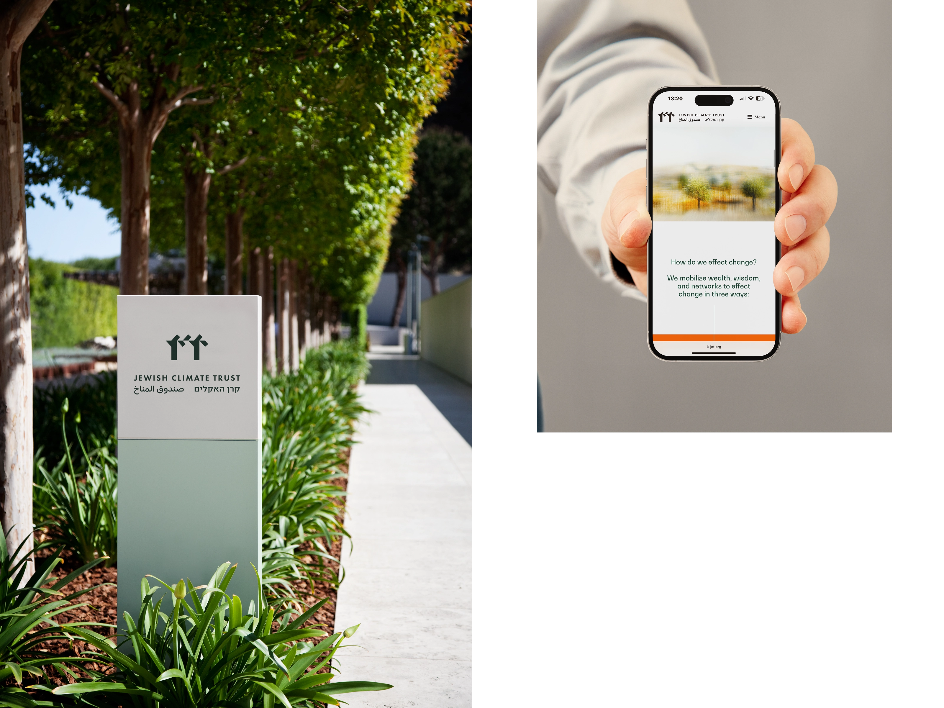
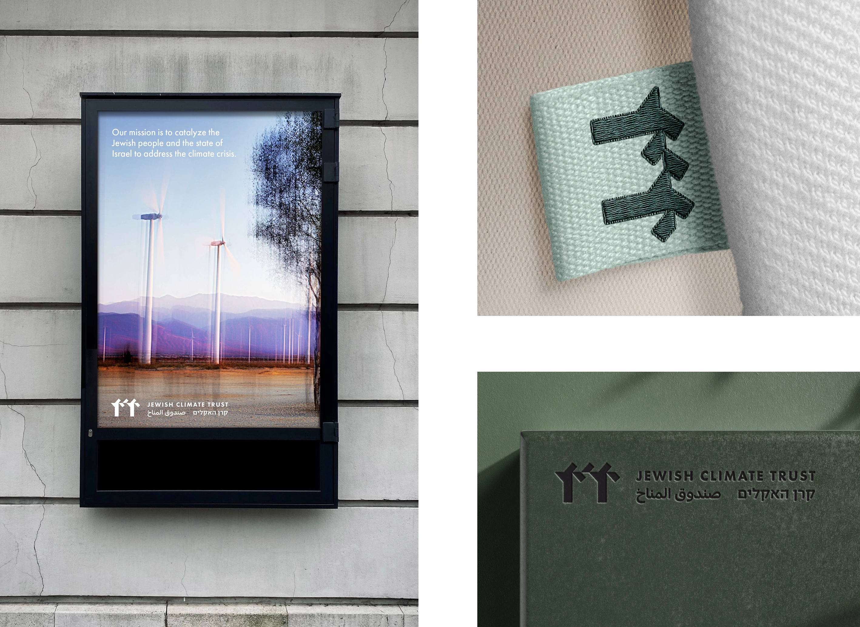
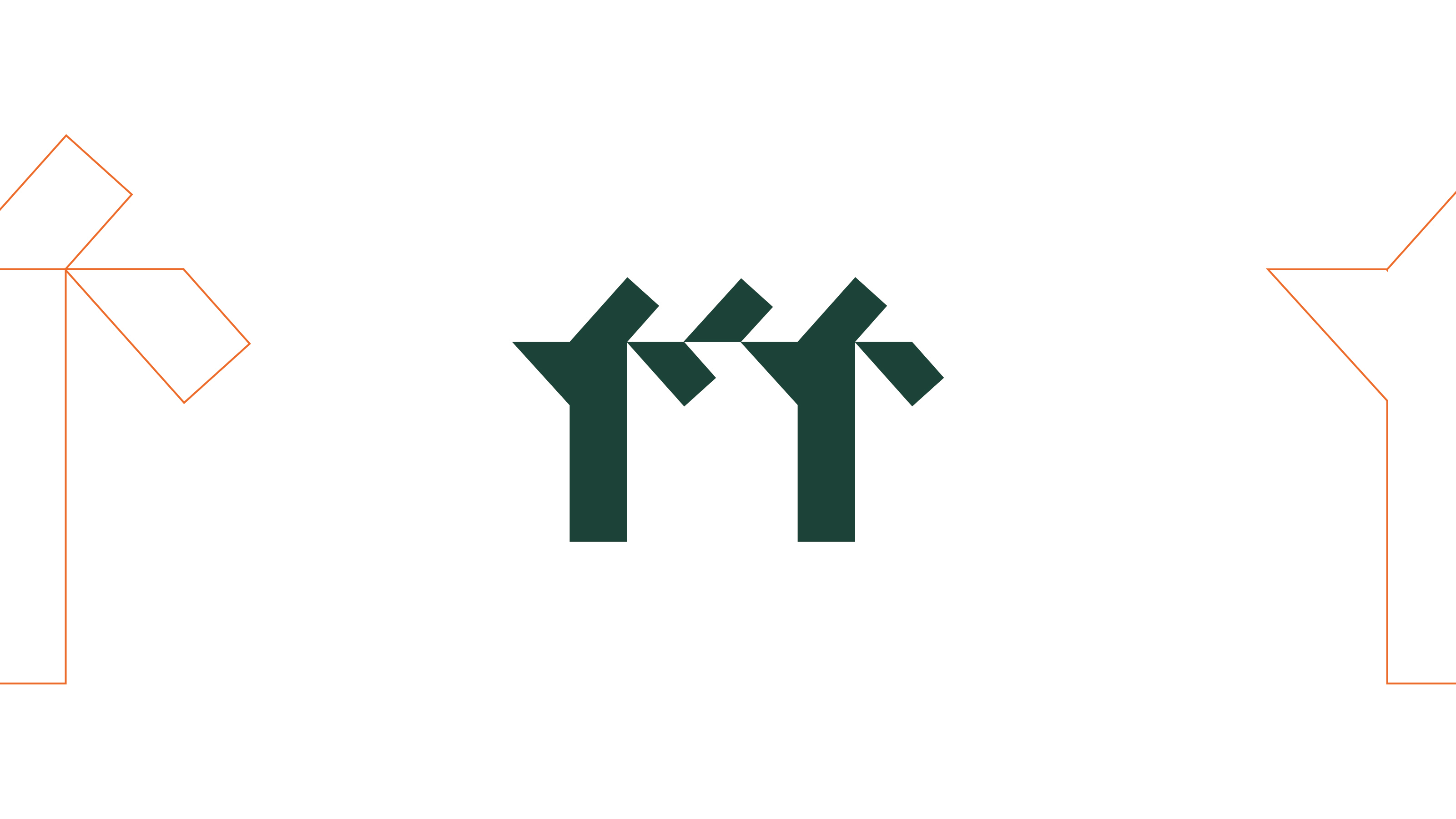
At the heart of the identity is an emblem inspired by the sukkah, a temporary shelter built during the Jewish festival of Sukkot. It serves as a symbol of humility and interdependence, reminding us that our time on earth is temporary and that we exist in relationship with the natural world. The sukkah connects faith and environment, tradition and sustainability, grounding the brand in a distinctly Jewish expression of care for creation.
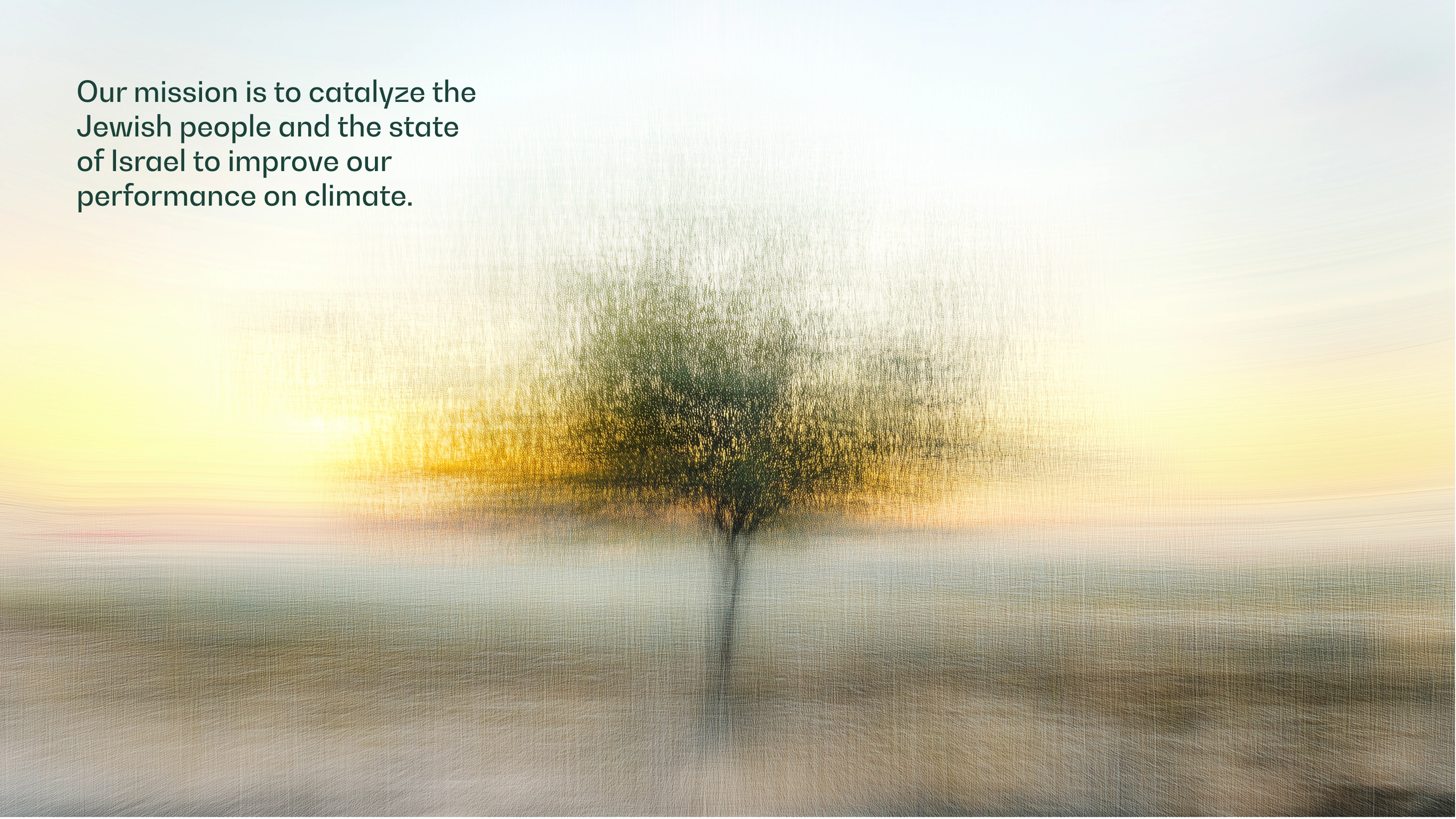
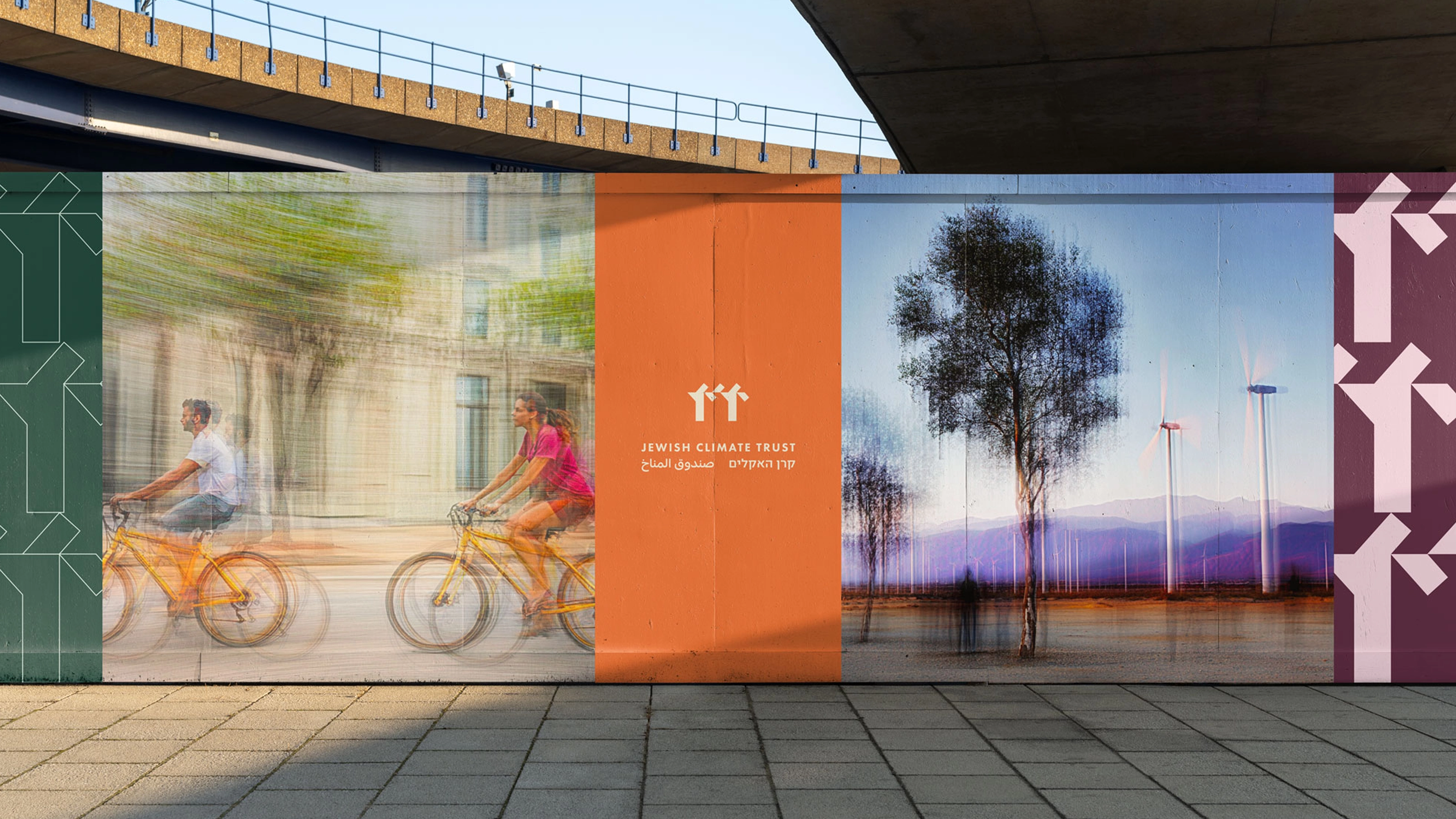
Artistic photographic textures were created to complement the visual system. These abstract, nature-inspired artworks bring softness and emotion to the identity, evoking light, movement and atmosphere. They serve as a visual bridge between the analytical and the spiritual — reminding viewers that climate action is both scientific and deeply human.

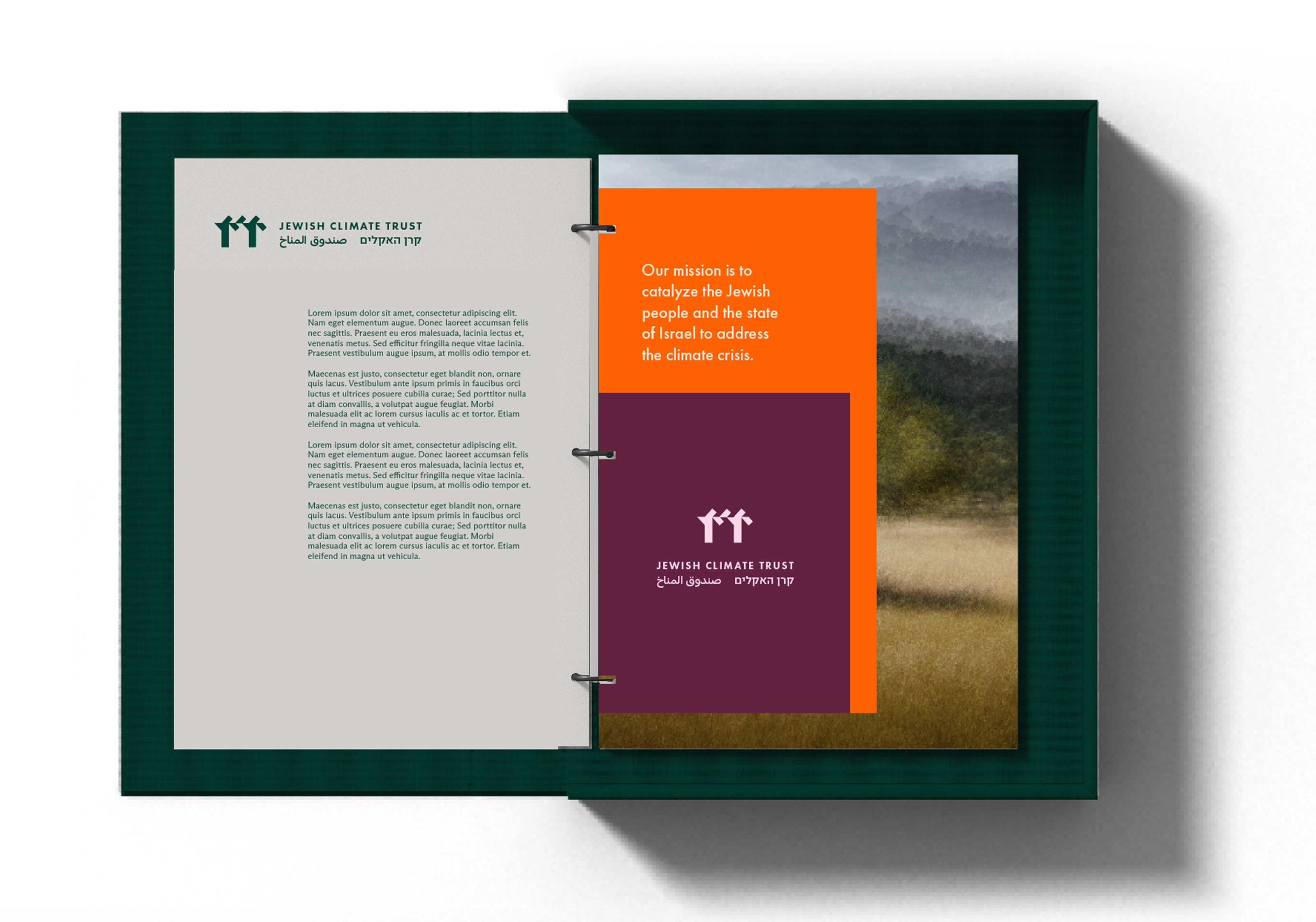

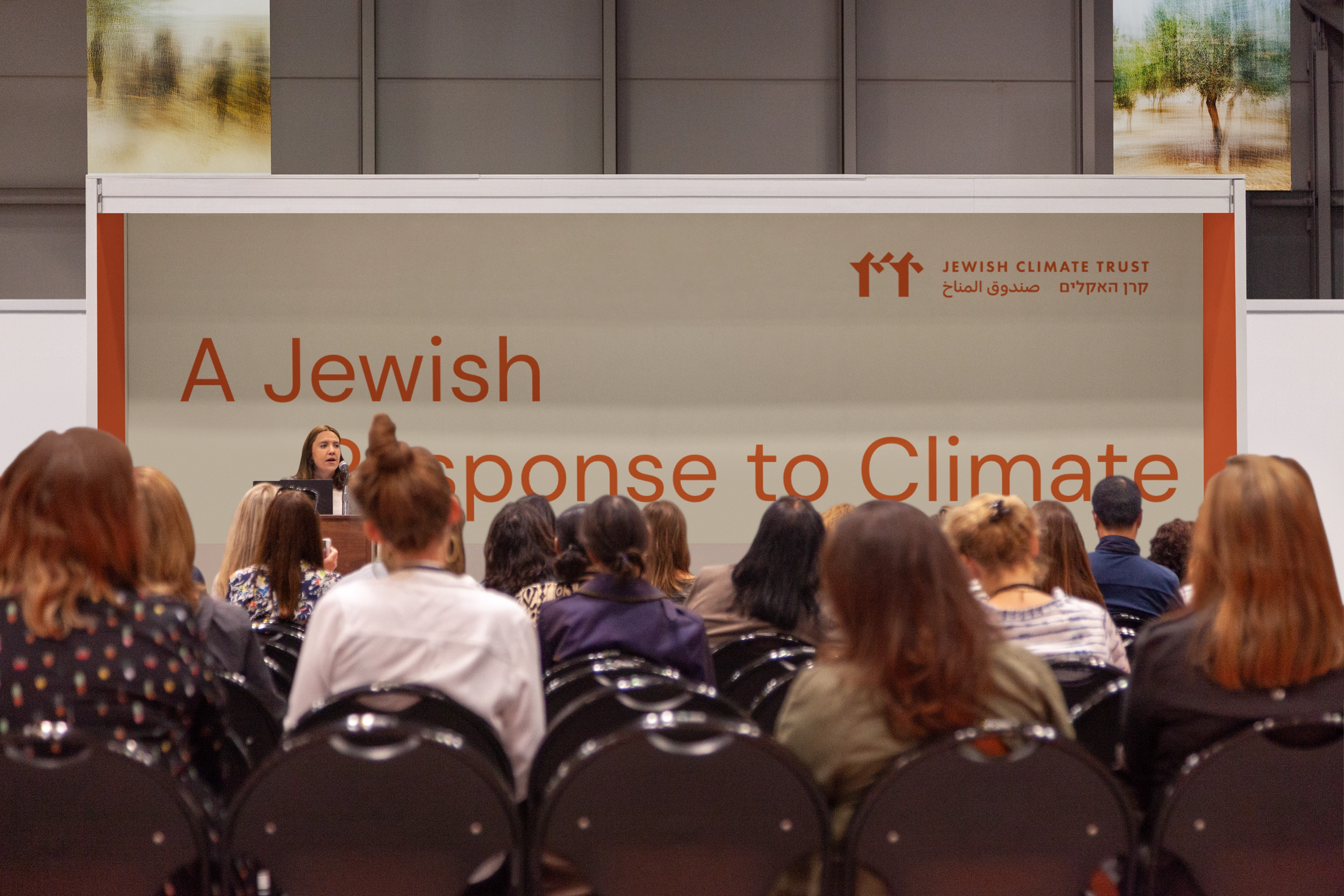
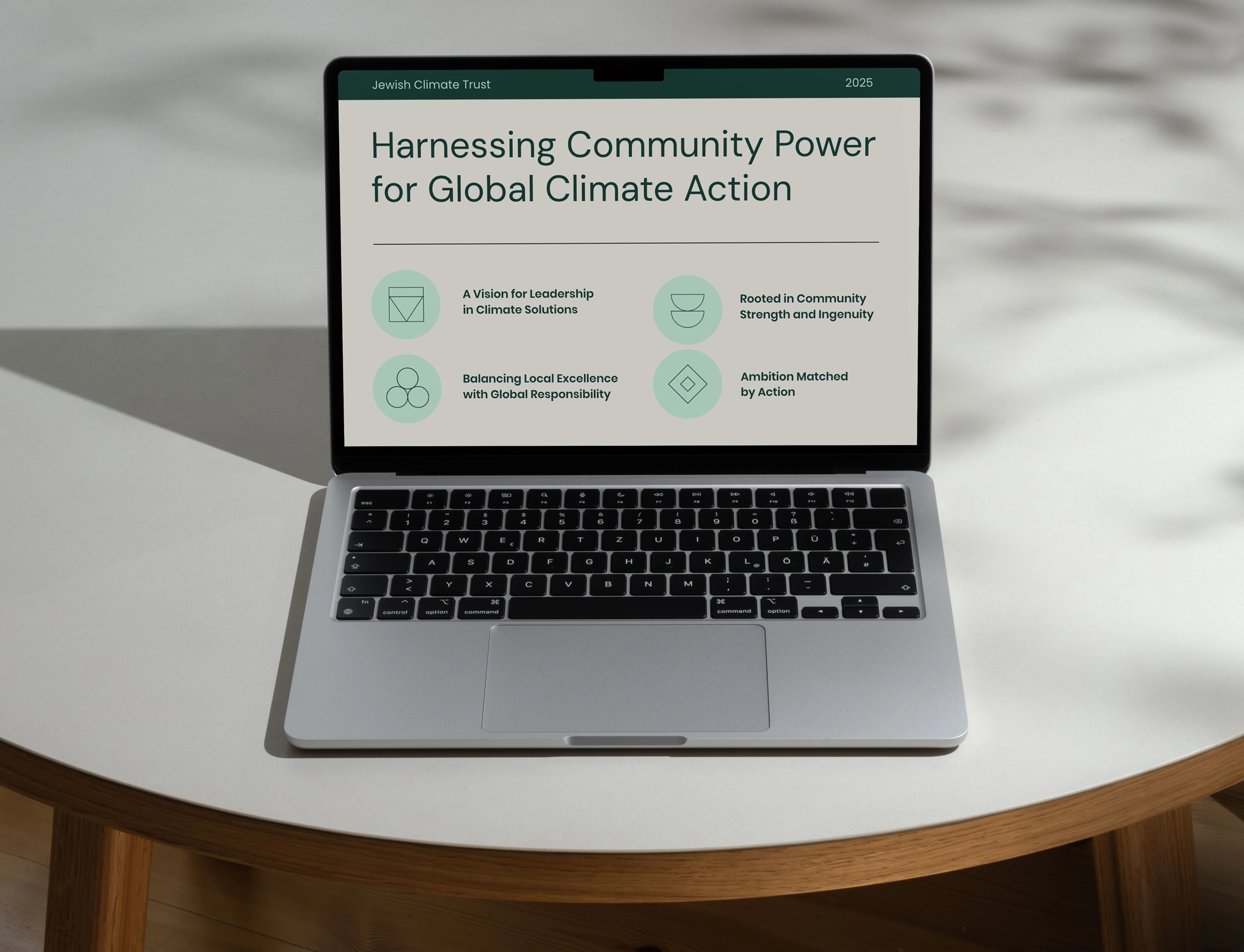
This identity doesn’t need to shout. It earns attention through restraint and confidence. Across reports, convenings and campaigns, the system builds consistency and credibility. It is flexible, dignified and designed to grow across every platform. The Jewish Climate Trust now stands as a serious and strategic force for climate action — a brand built not just to inspire belief but to mobilise it, underpinned by an identity that thinks, acts and gives us reason to hope.
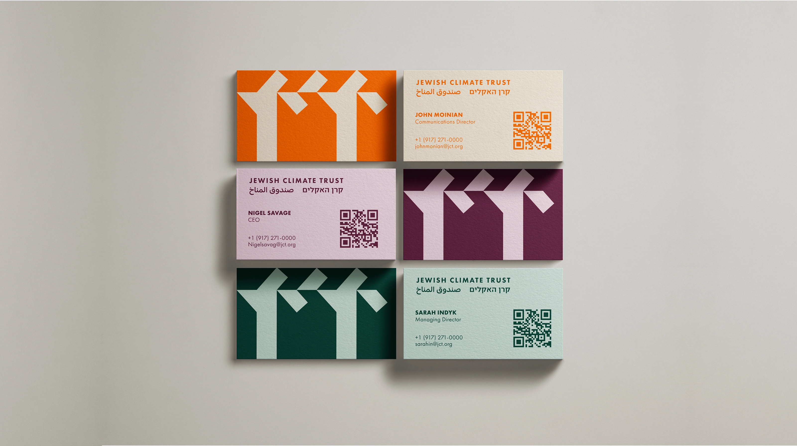

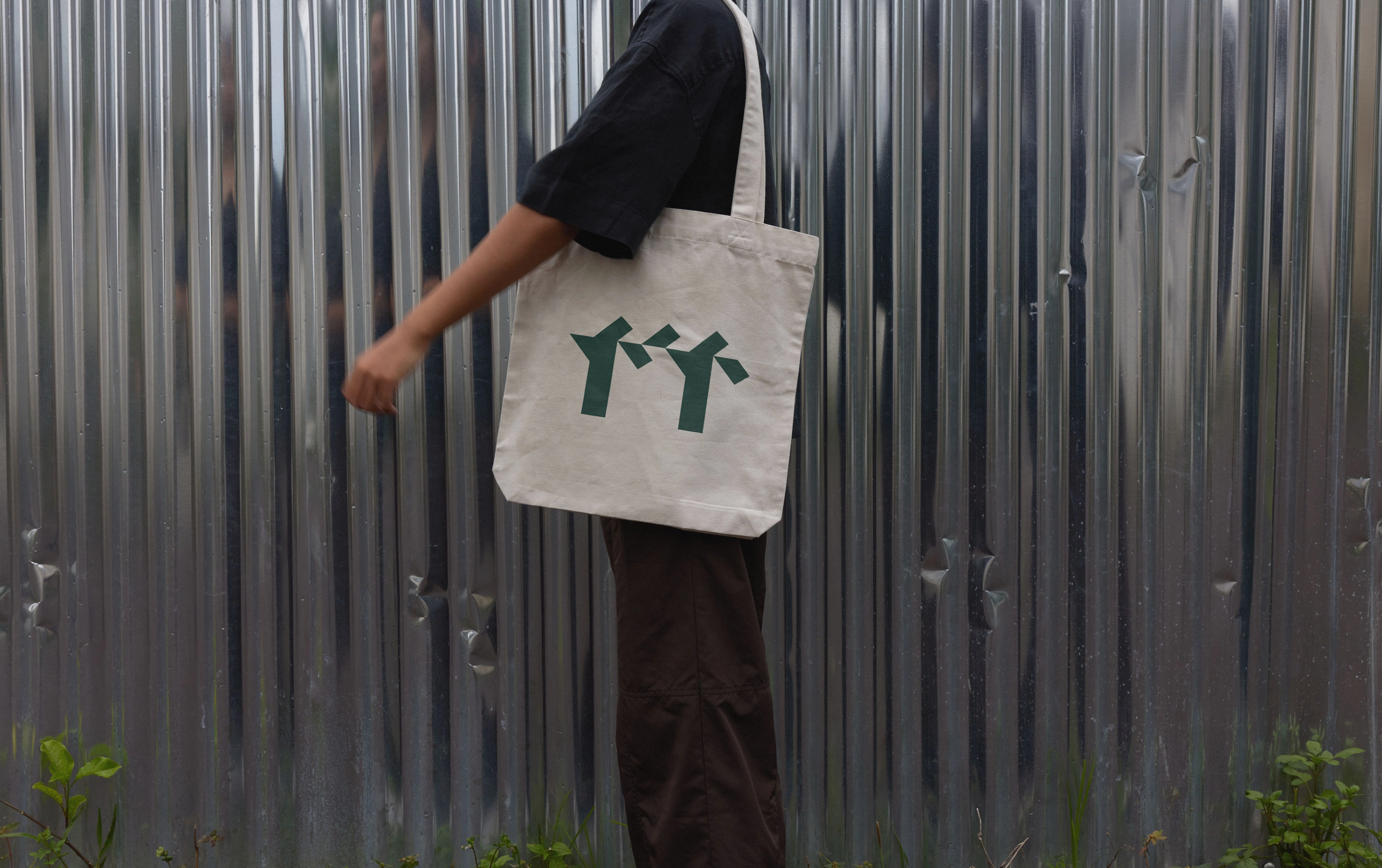

Typography balances modernity and heritage. A confident sans serif brings clarity and strength. A refined serif introduces depth and continuity. A creative display type adds individuality and character, capturing the organisation’s mix of rigour, imagination and hope.
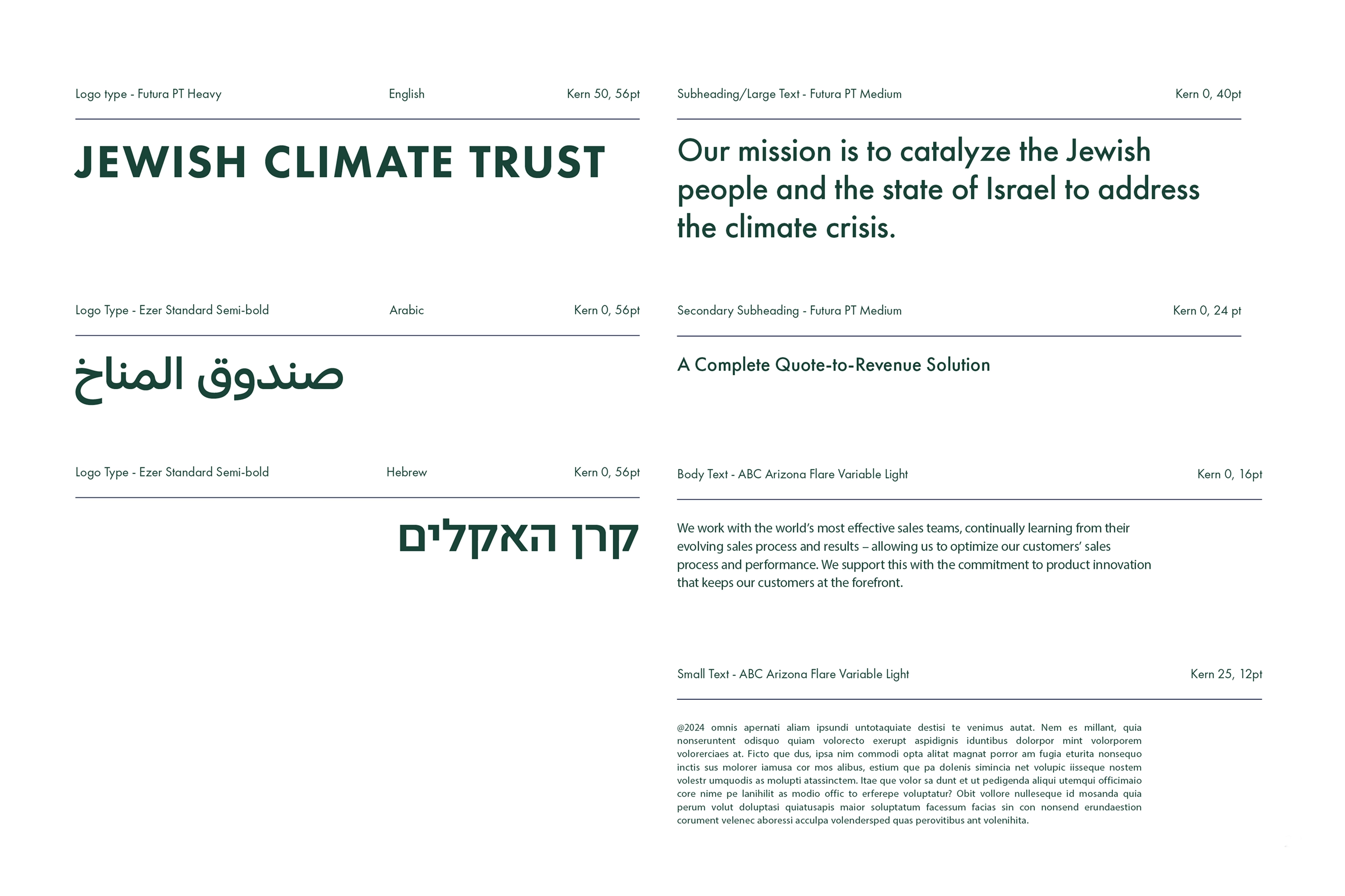
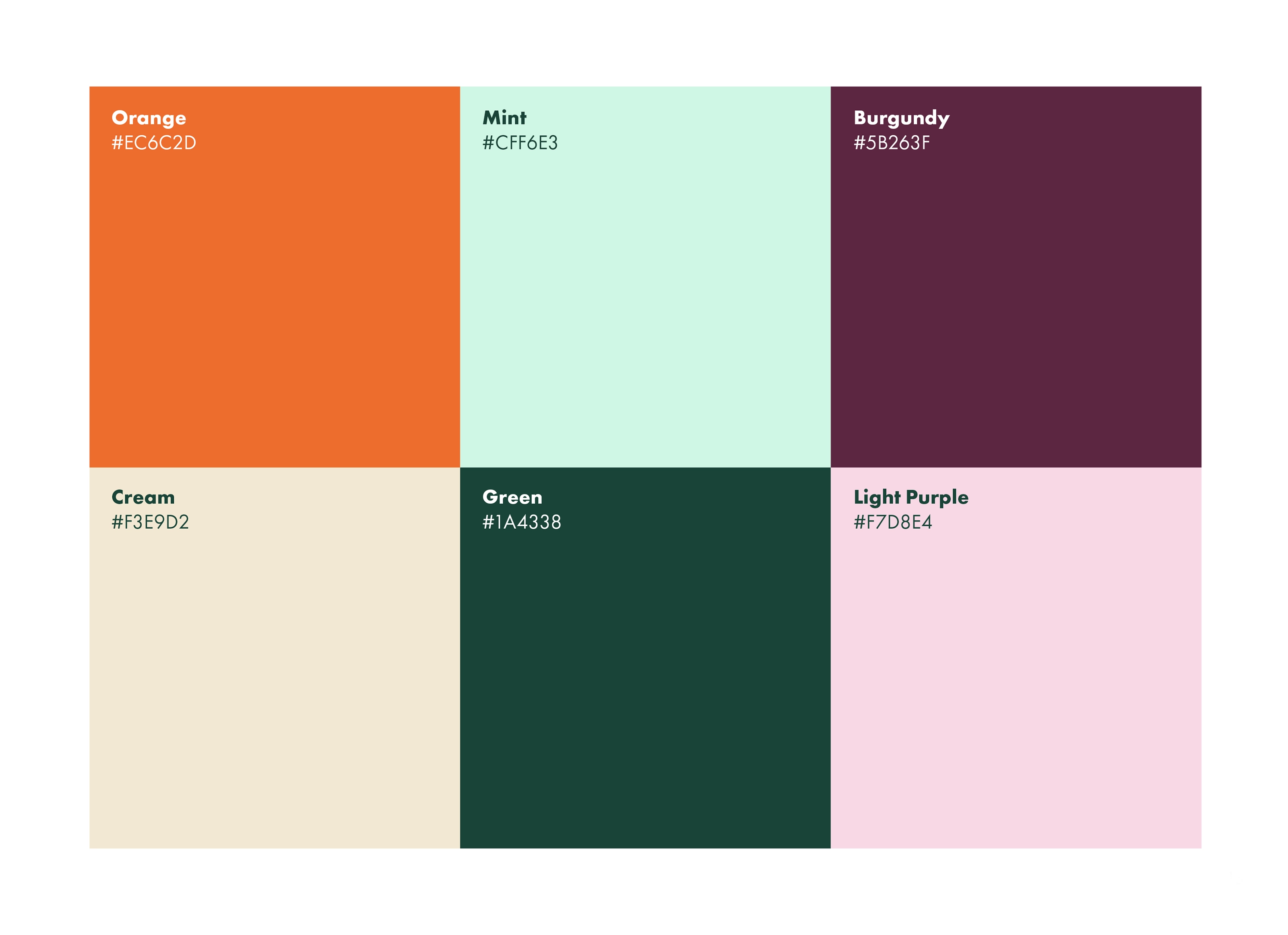
The colour palette avoids predictable greens and blues. Instead it draws from soft, human tones: some gentle greens some more powerful, purples and oranges that feel grounded, warm and alive. The result is approachable and optimistic, echoing the organisation’s vision of renewal and cooperation.