Start a project

If you would like to find out more about how we can work together, fill out the form and we’ll set up a time to chat about what’s next for your brand.


for best experience

Make Your Mark
Some places trade on prestige. Others on proximity. But Kentish Town has always carved its own path—creative, connected, confident. A neighbourhood with grit, charm, and its own unspoken rules. Move here and you’re not just buying a postcode—you’re joining a story that’s still being written.
- Brand Identity
- Art Direction & Design
- Computer Generated Images
- Editorial
- Printed Materials
- Photography

A collection of 41 contemporary apartments, each with private outdoor spaces and exclusive residents’ amenities, The Tipton is a new addition to the neighbourhood—but one that already feels at home. Named in honour of Violet Tipton—Kentish Town local, chorus girl, and one of the first female stars of the 20th century—it carries the same spirit of boldness, warmth, and self-assured individuality.
The identity we crafted for The Tipton draws on that spirit. Honest and direct, with a quiet confidence. The name itself, embedded in place and history, set the tone for a brand built on empowerment, invitation, and belonging.


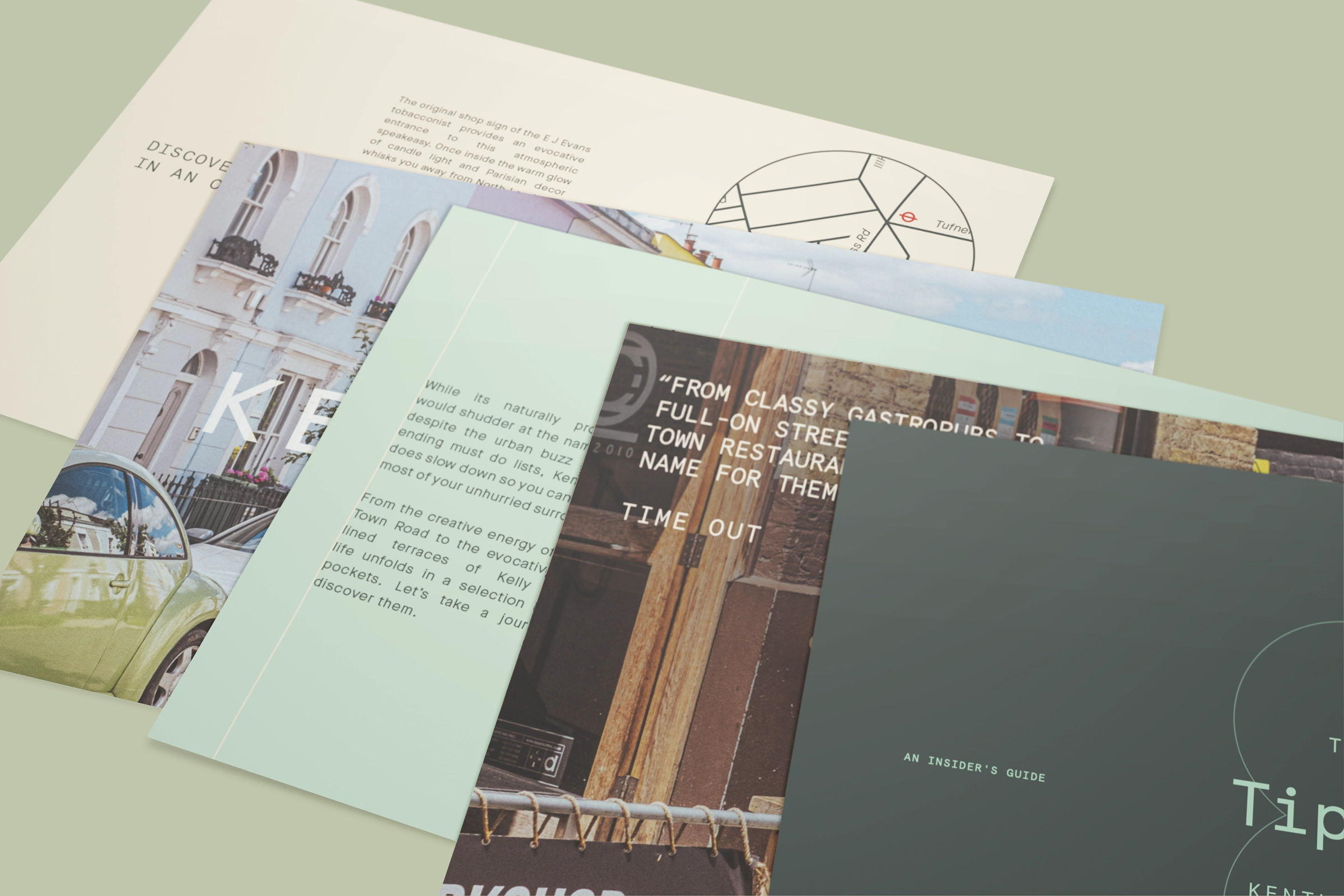
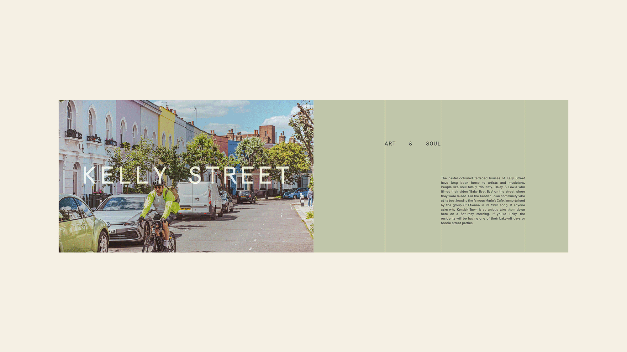
To help buyers feel part of the fabric of Kentish Town, we created The Tipton Field Guide—a bespoke, pocket-sized set of printed cards showcasing local favourites, from independent coffee spots to hidden-gem speakeasies. Supported by an earthy, fresh photography style, the Field Guide connects the homes to the streets they sit within.
The Tipton isn’t about arriving. It’s about starting something. About putting down roots in a place that’s always had time for originals.


The visual language is clean, modern, and unpretentious—strong typography, crisp lines, and a palette that balances soft neutrals with bold hits of colour. A system designed to flex across touchpoints—from brochures to hoardings, social posts to digital ads—always clear, always considered.
The tone of voice speaks directly to its audience—first-time buyers, young Londoners, those ready to put their own stamp on the city. Not lofty, not over-polished—just the right mix of warm, empowering, and self-assured. Make your home. Make it nice. Make your mark.


