Start a project

If you would like to find out more about how we can work together, fill out the form and we’ll set up a time to chat about what’s next for your brand.


for best experience
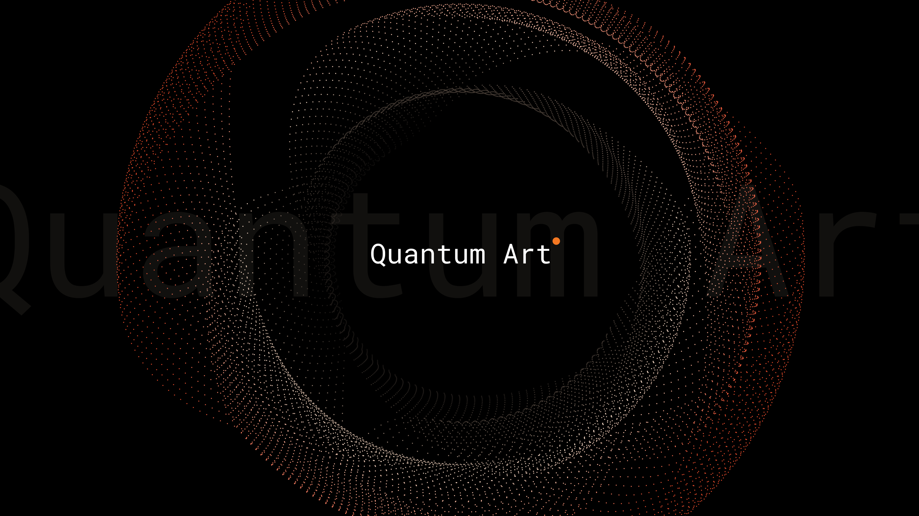
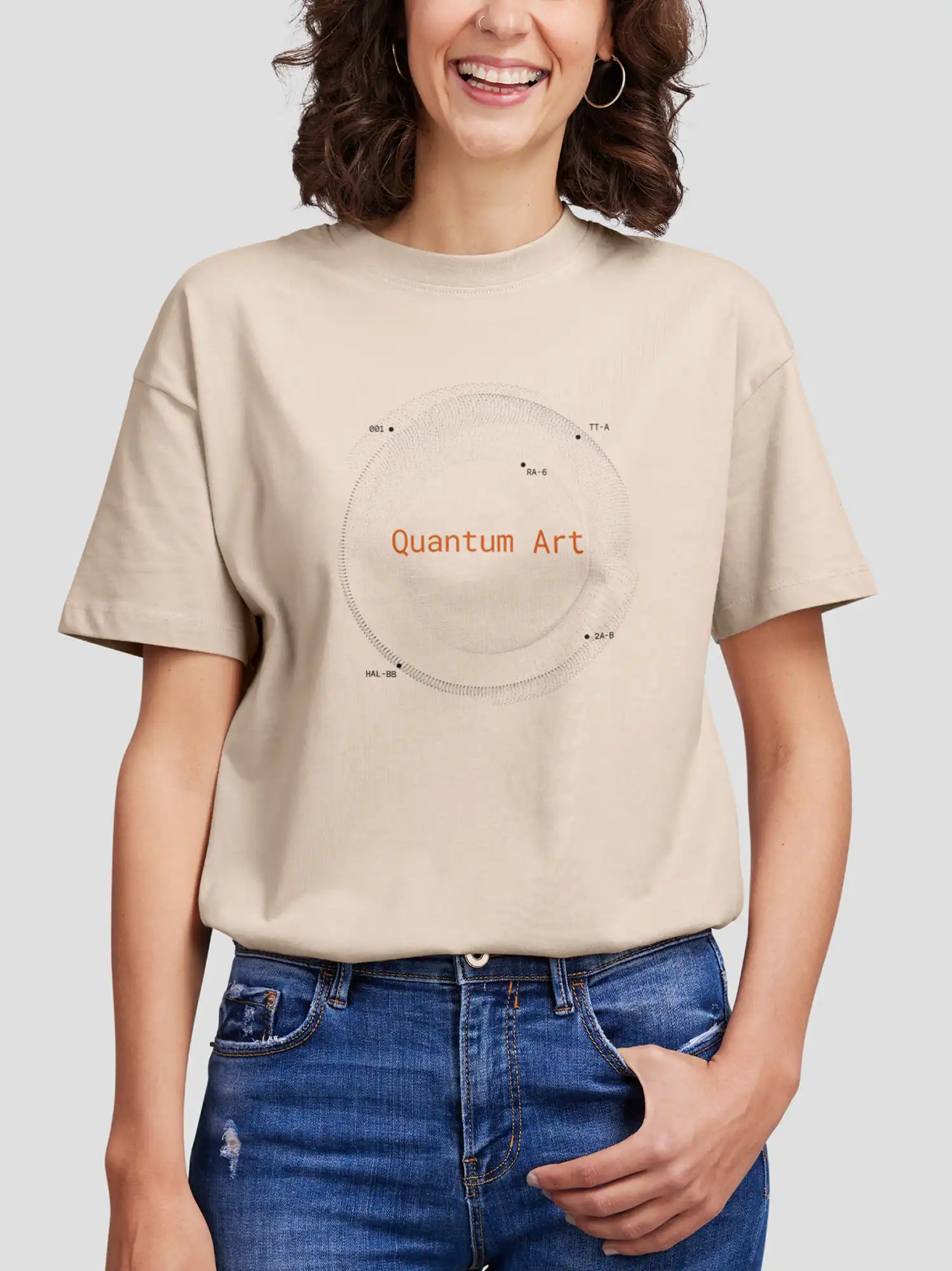
Quantum Art
Designing clarity at the edge of possibility
- Brand Identity
- Art Direction & Design
- Website Design
- UI UX
- Illustration
- Digital Assets
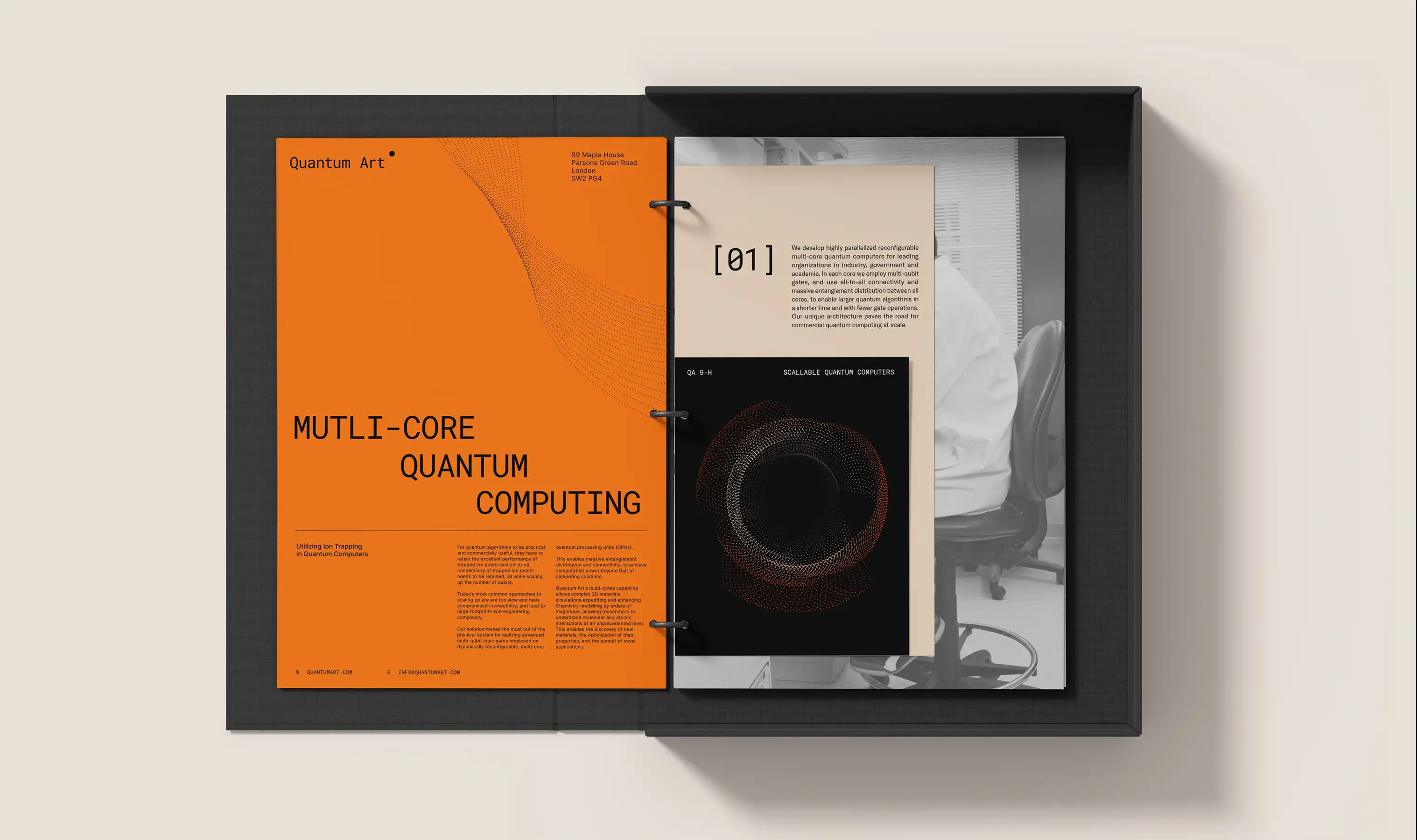
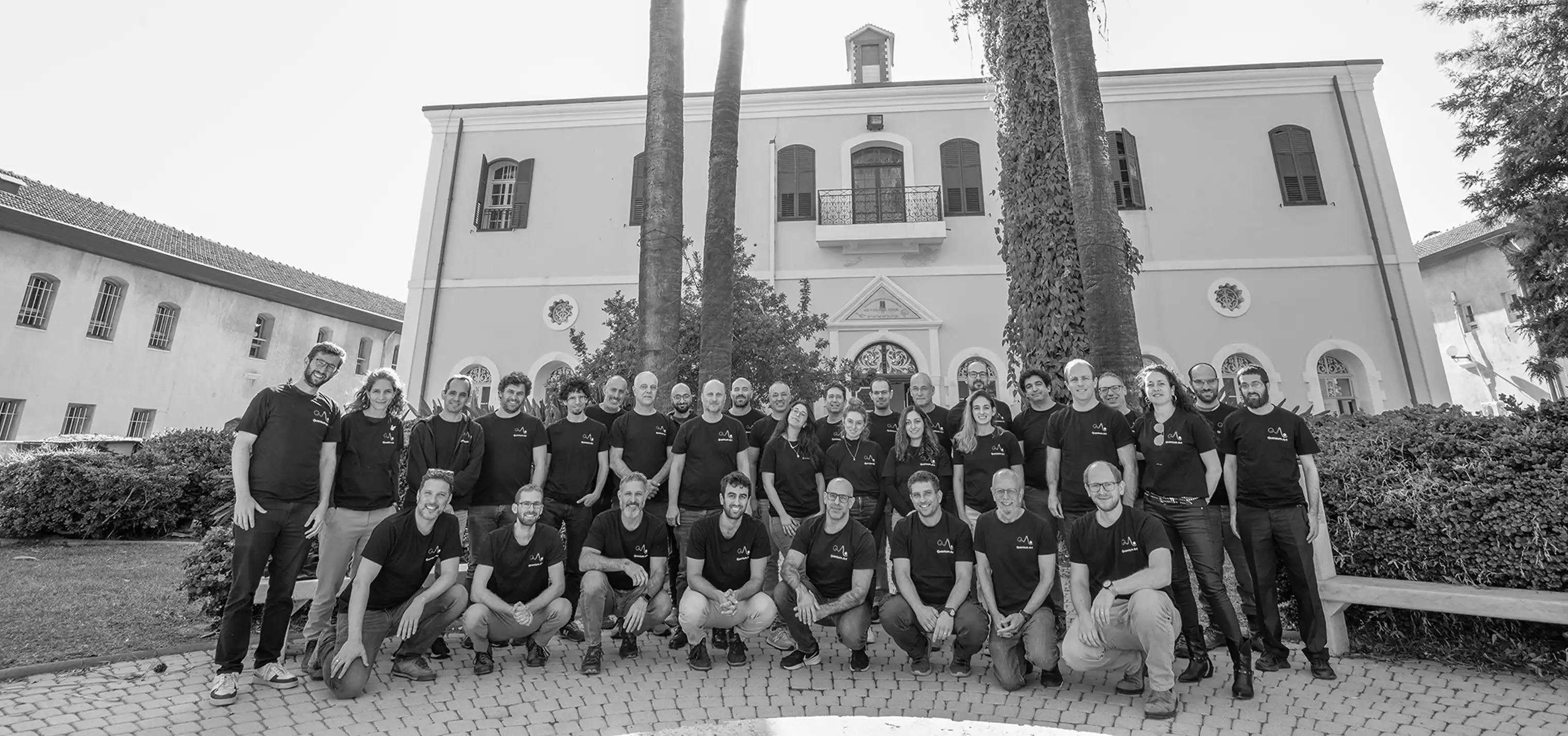
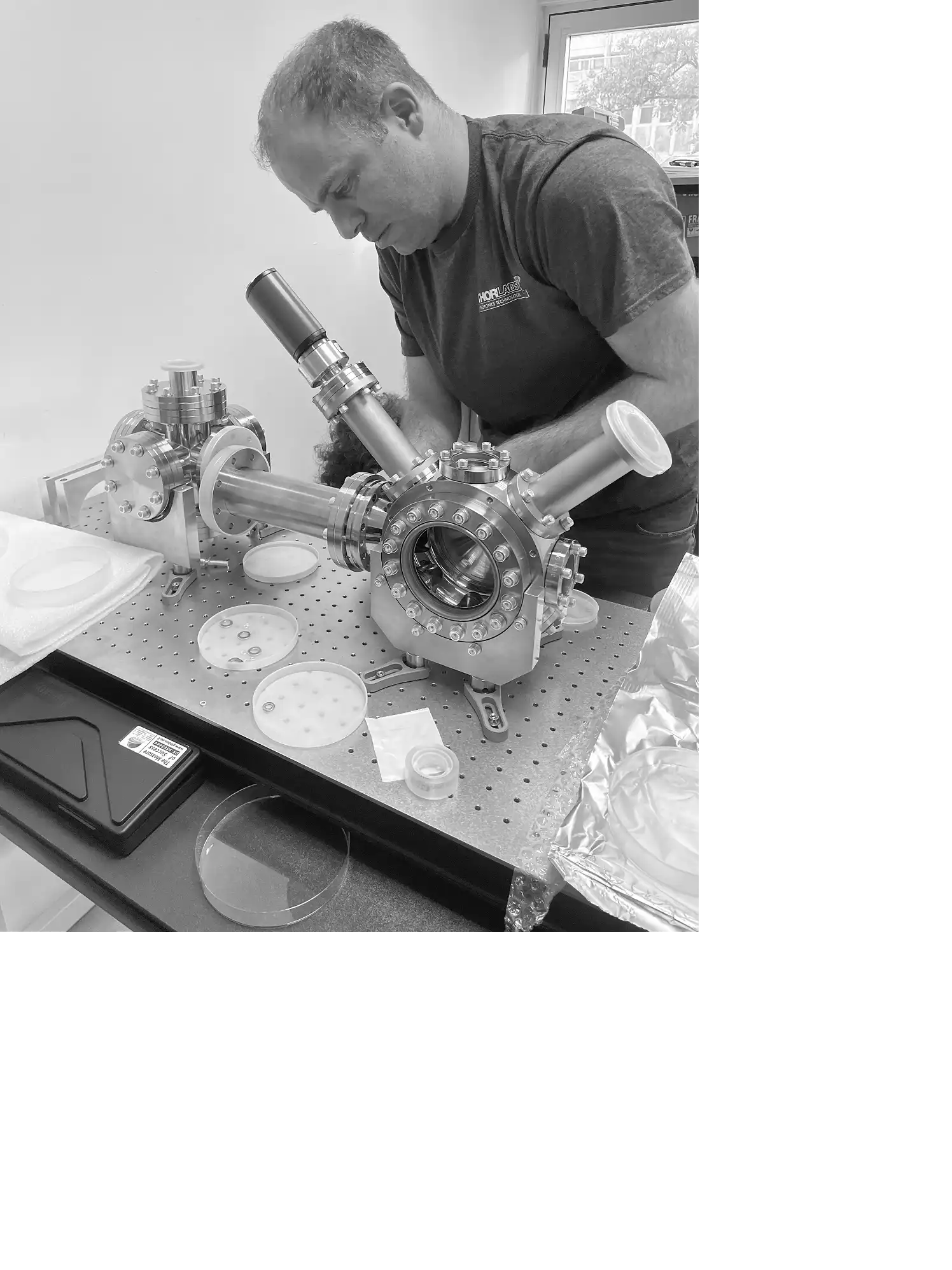
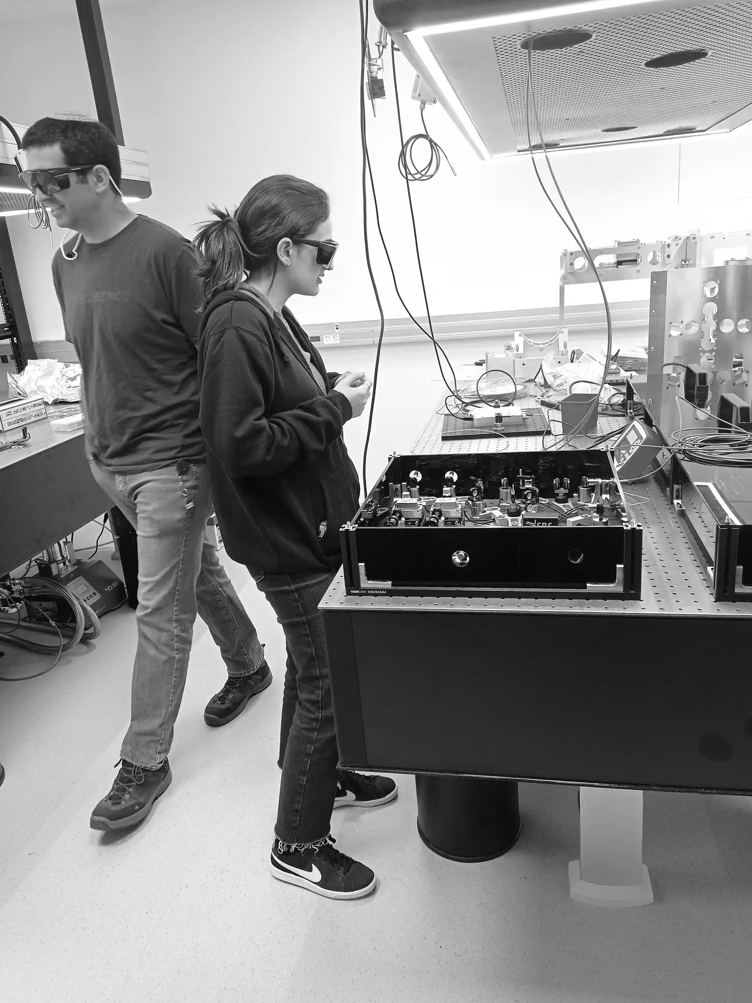
Quantum Art builds full‑stack quantum computers using trapped ion technology—one of the most advanced and promising approaches in the field.
After two years in stealth mode, they were ready to emerge with greater clarity: to external partners, collaborators, and early‑stage investors. They weren’t chasing flash or hype.
They needed a coherent visual language—something that could match the scale and subtlety of their vision while telling a story that was both technical and poetic. Serious science, yes—but also a work of art.
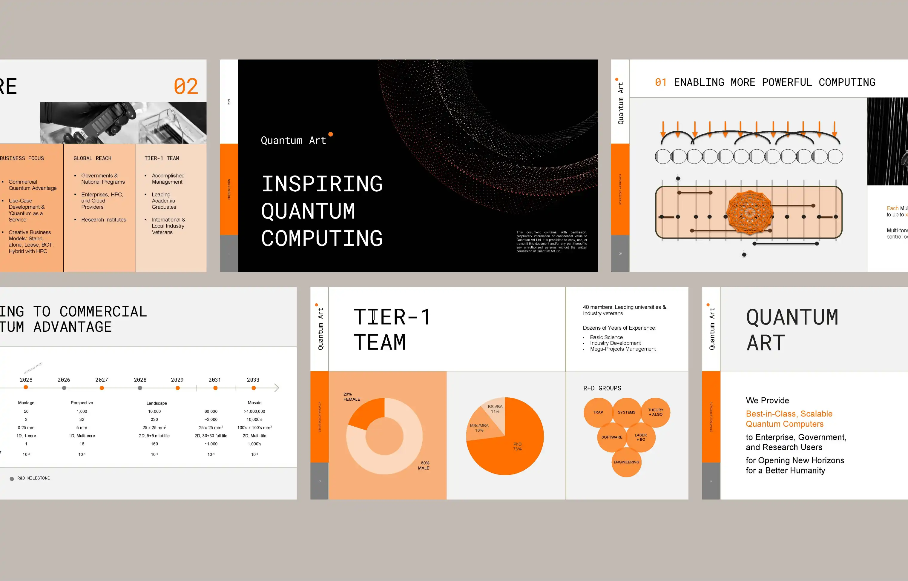
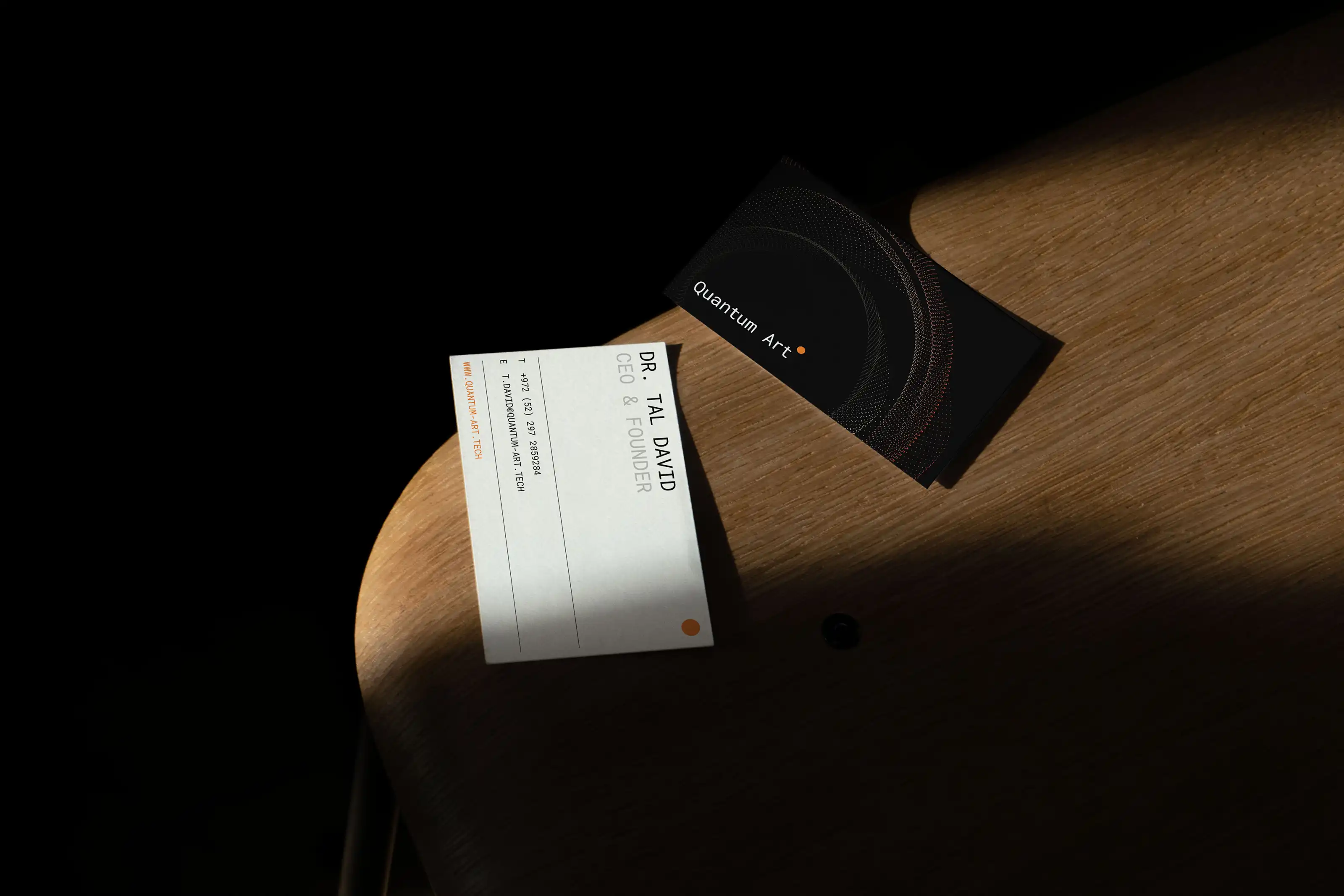
They approached us to define that foundation: a visual identity, website, pitch materials, and design system that could grow with them.
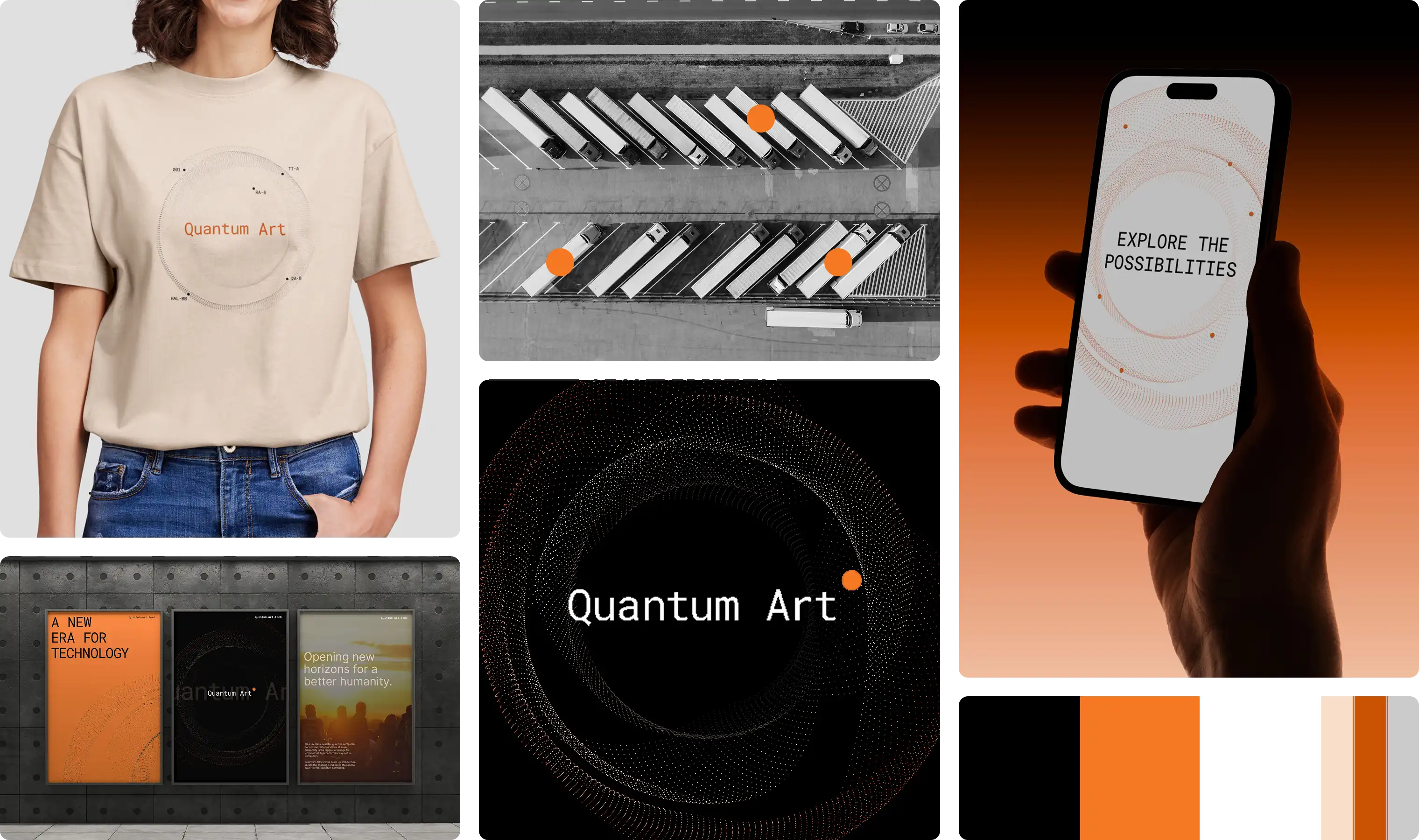
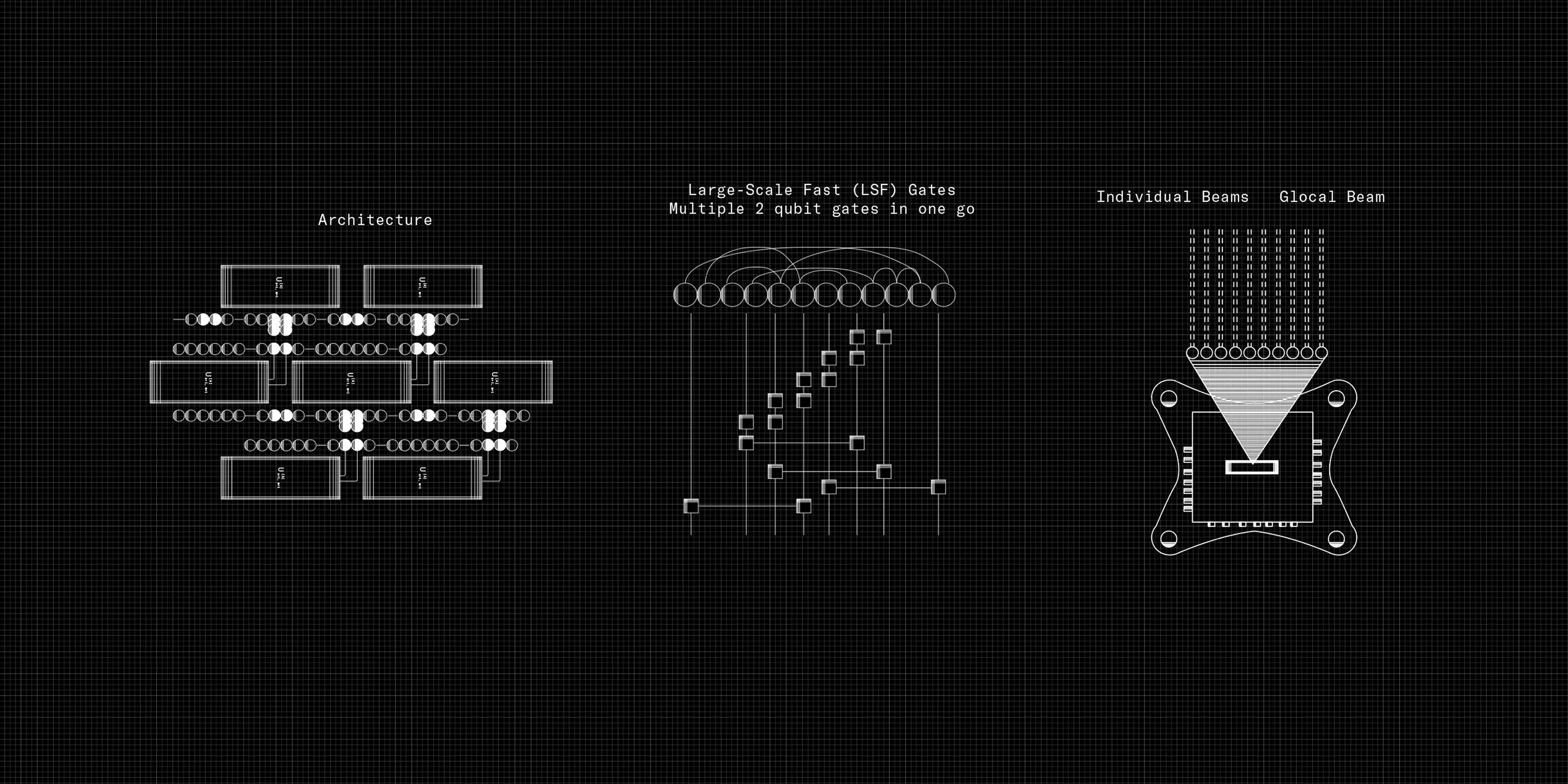
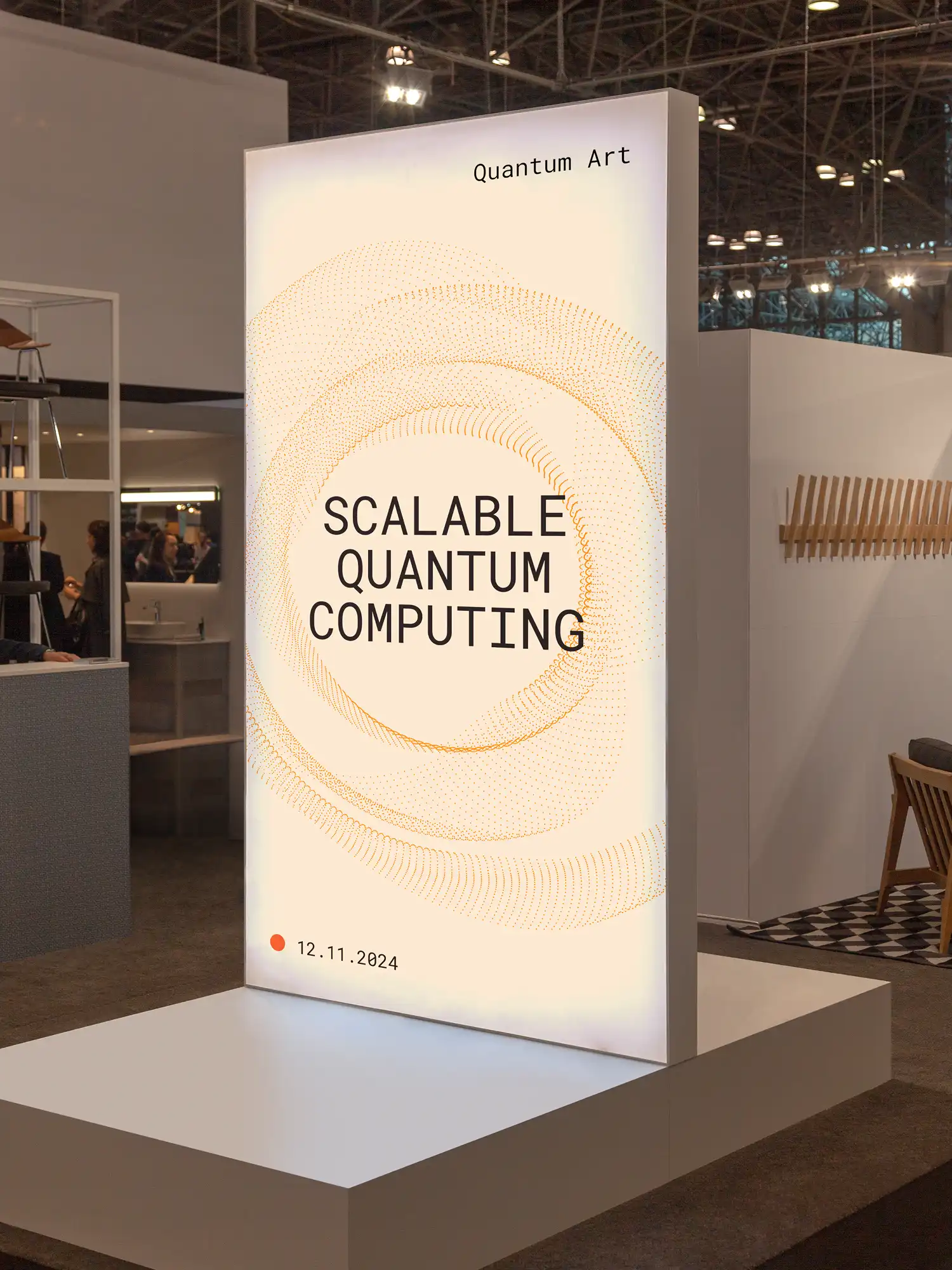
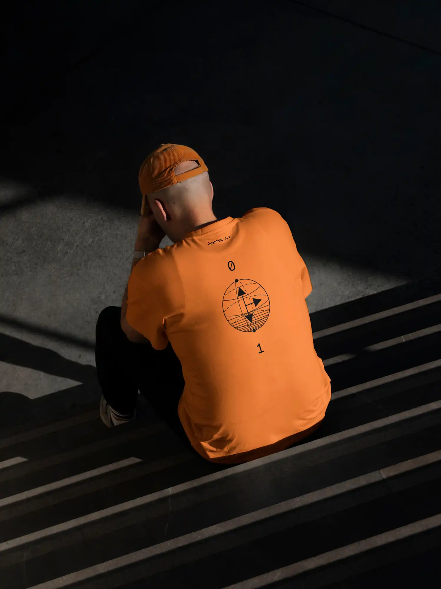
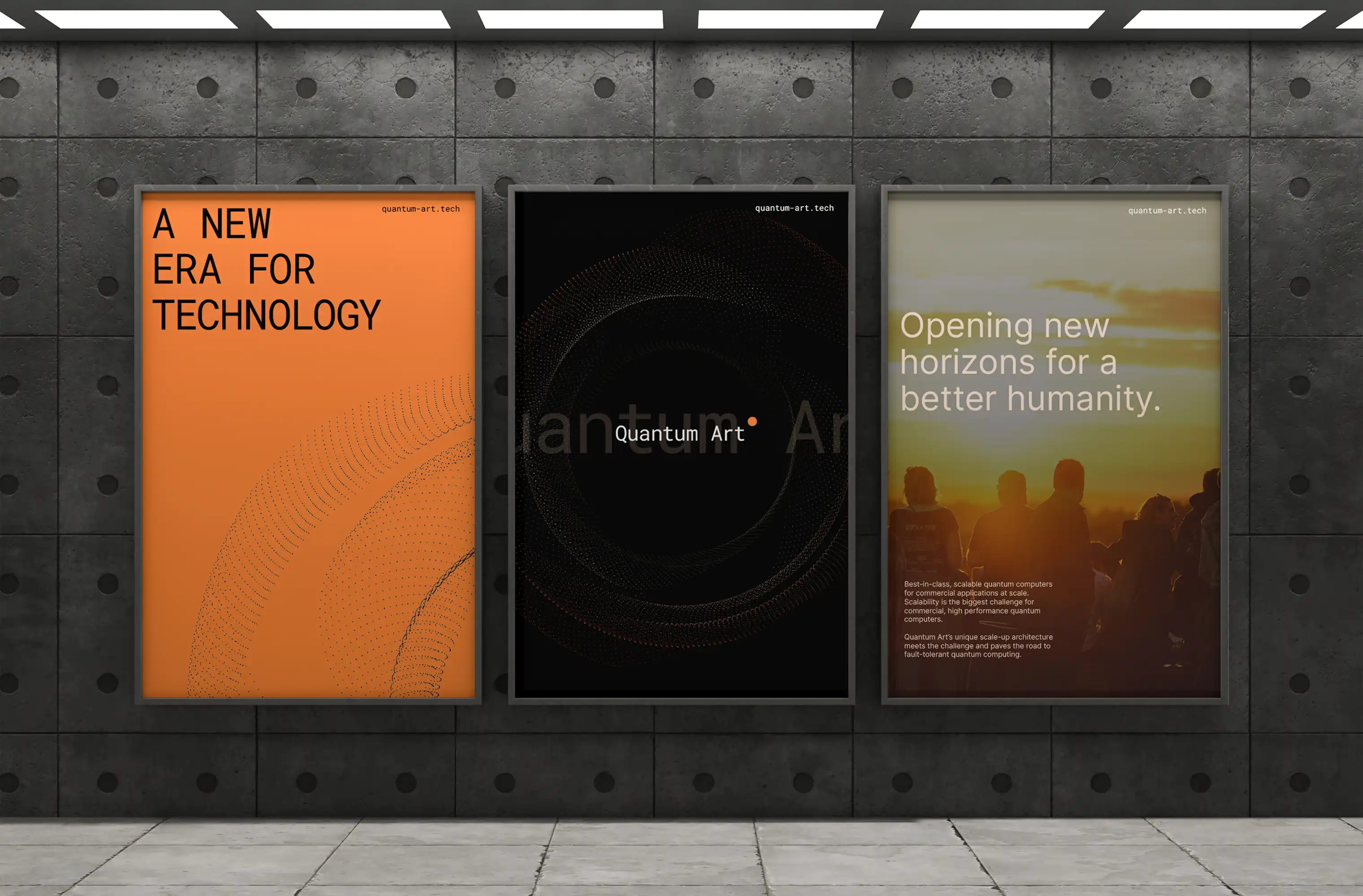
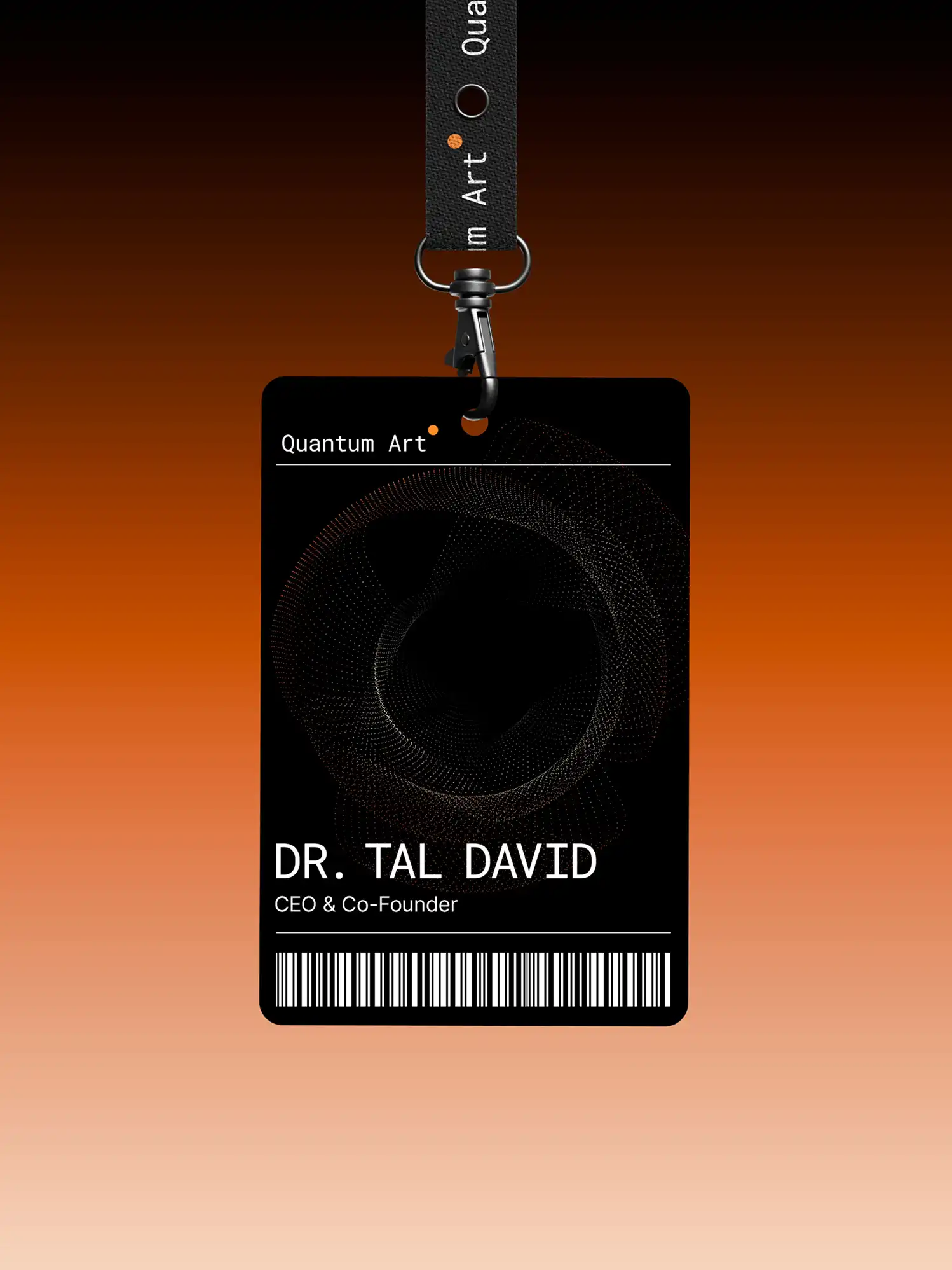
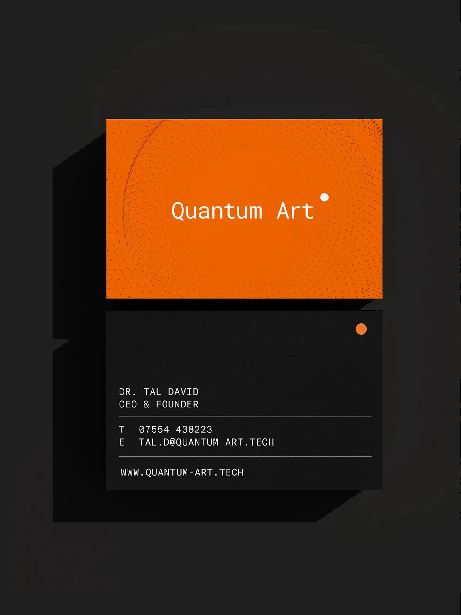
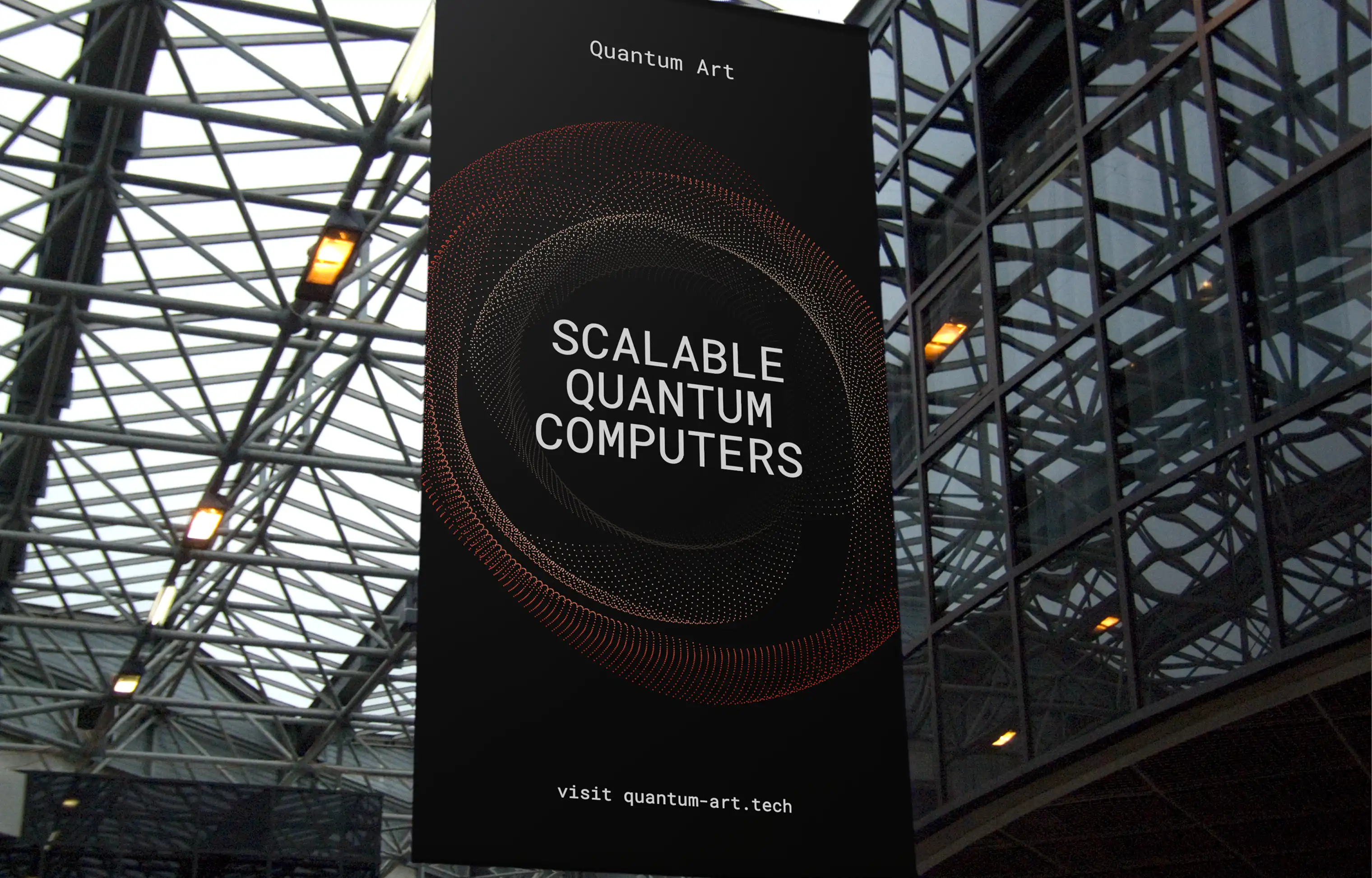
We built the identity around the elegance of the architecture itself—clean lines, refined restraint, and a palette drawn from science and light.
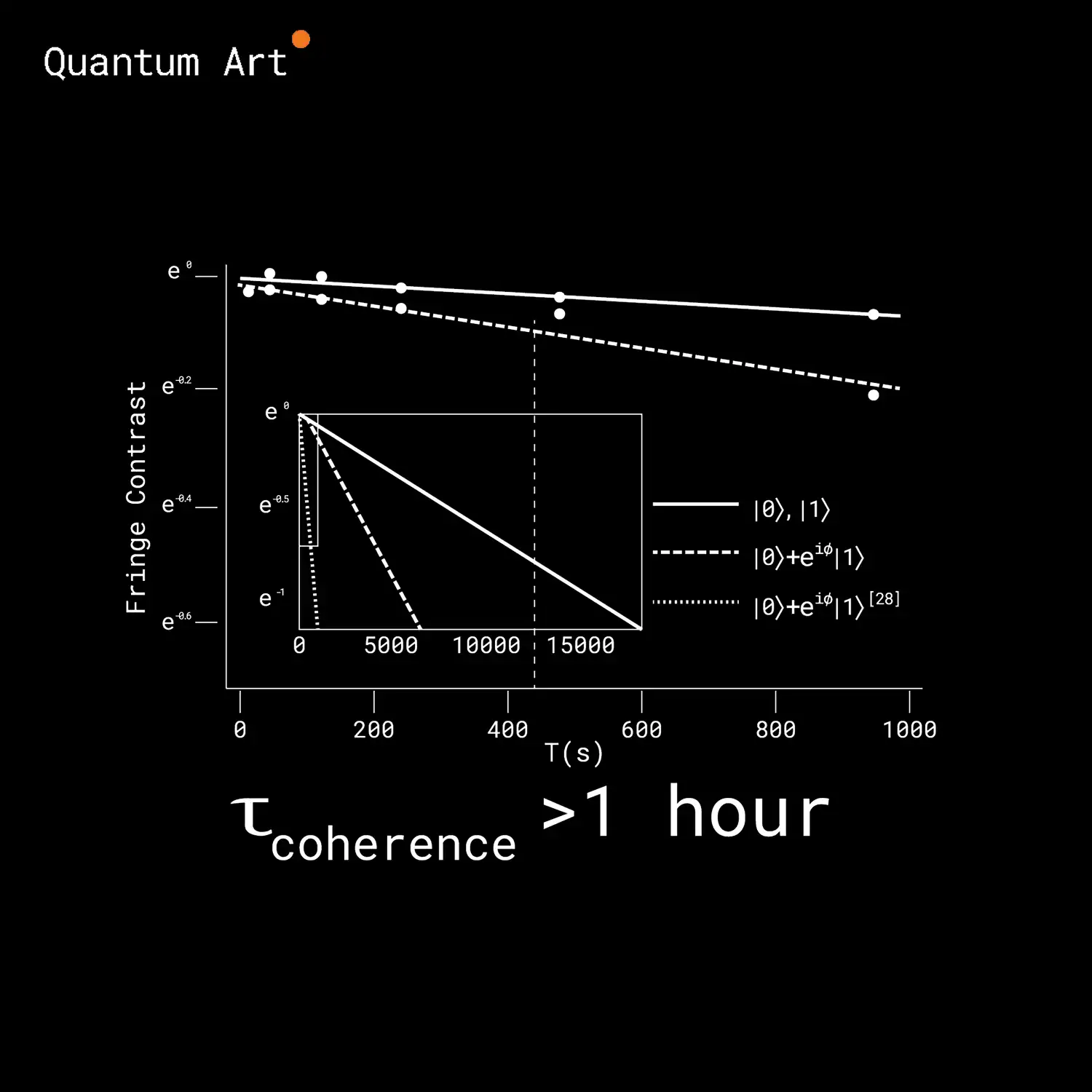
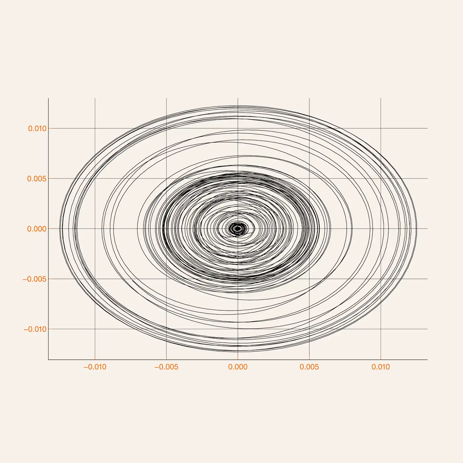
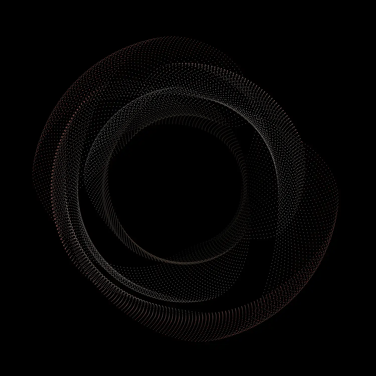
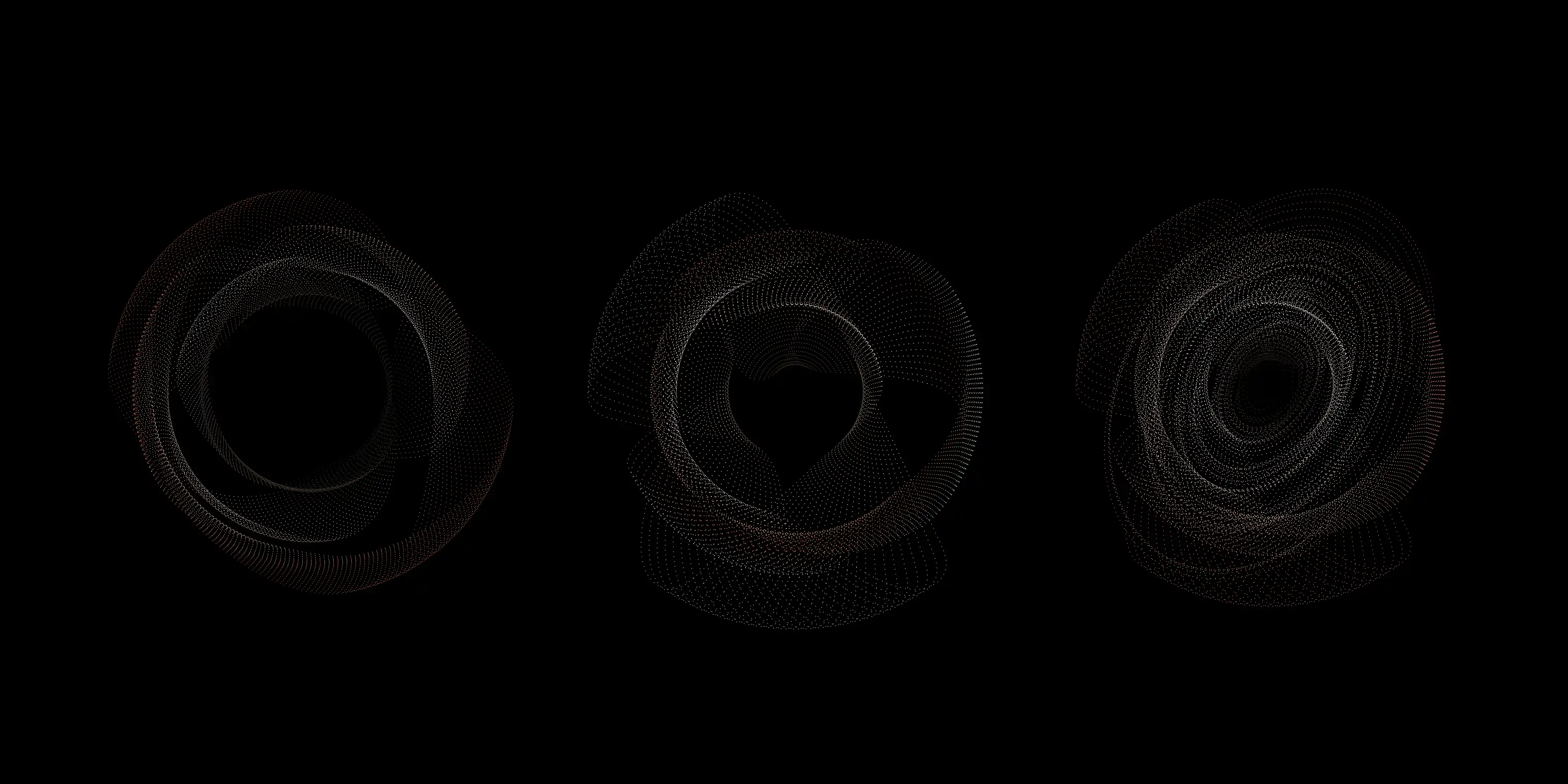
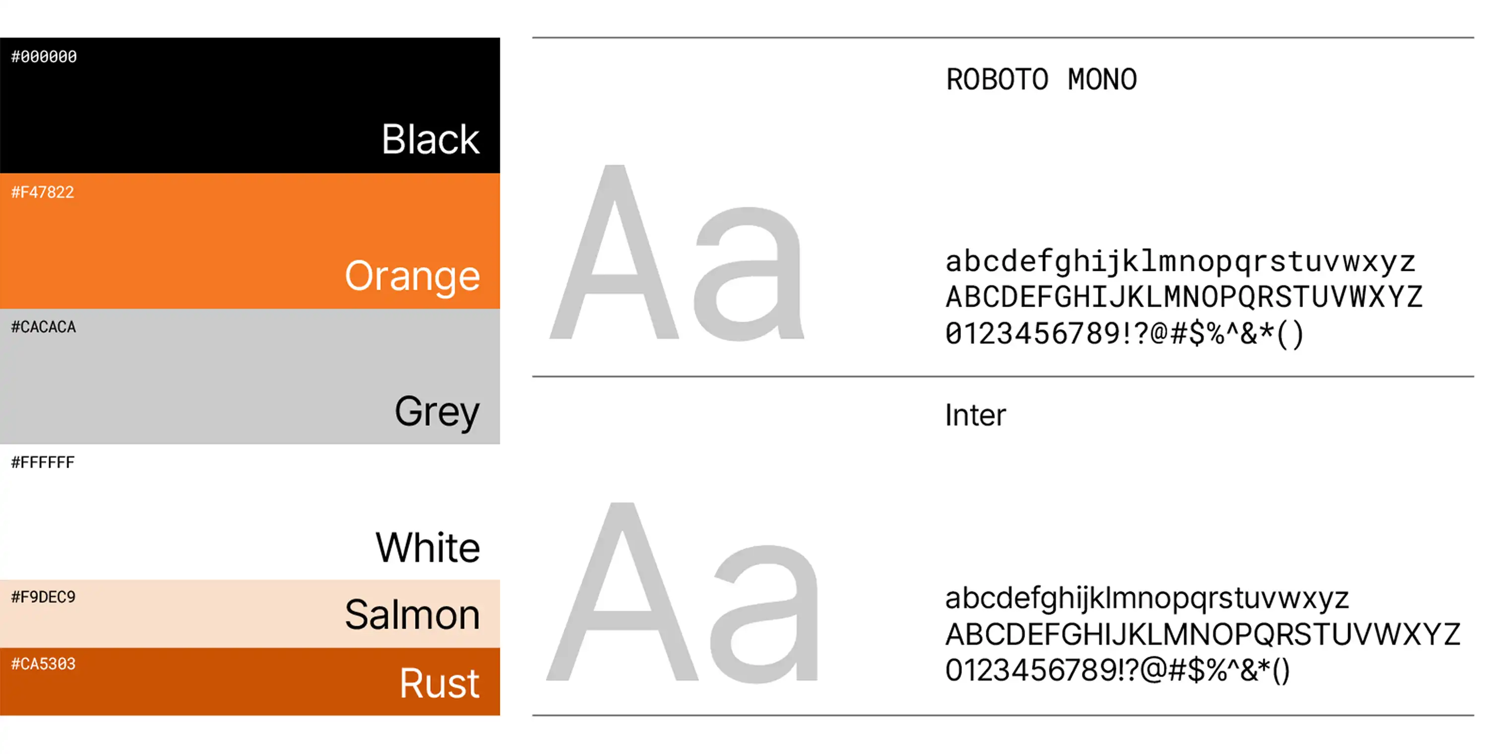
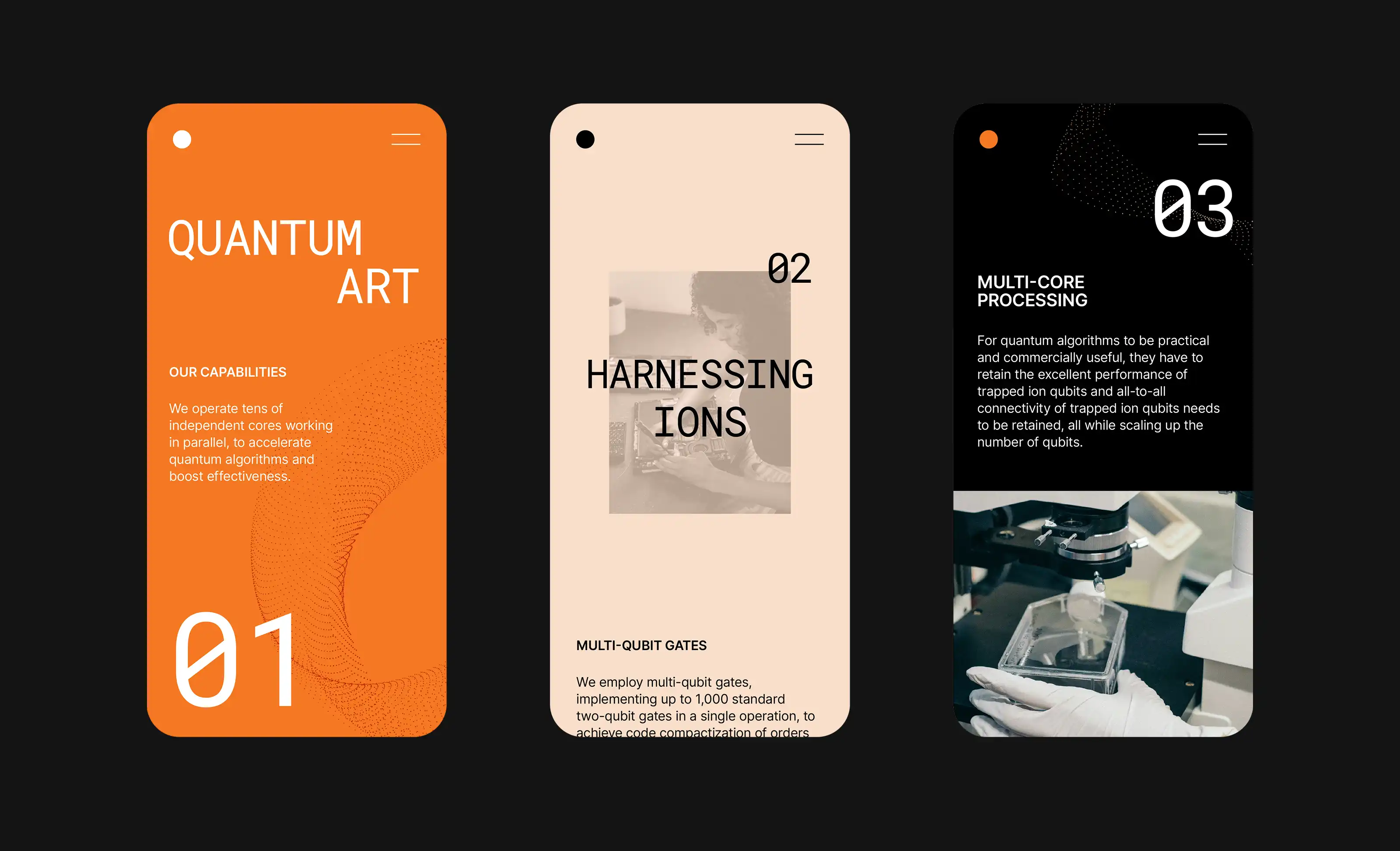
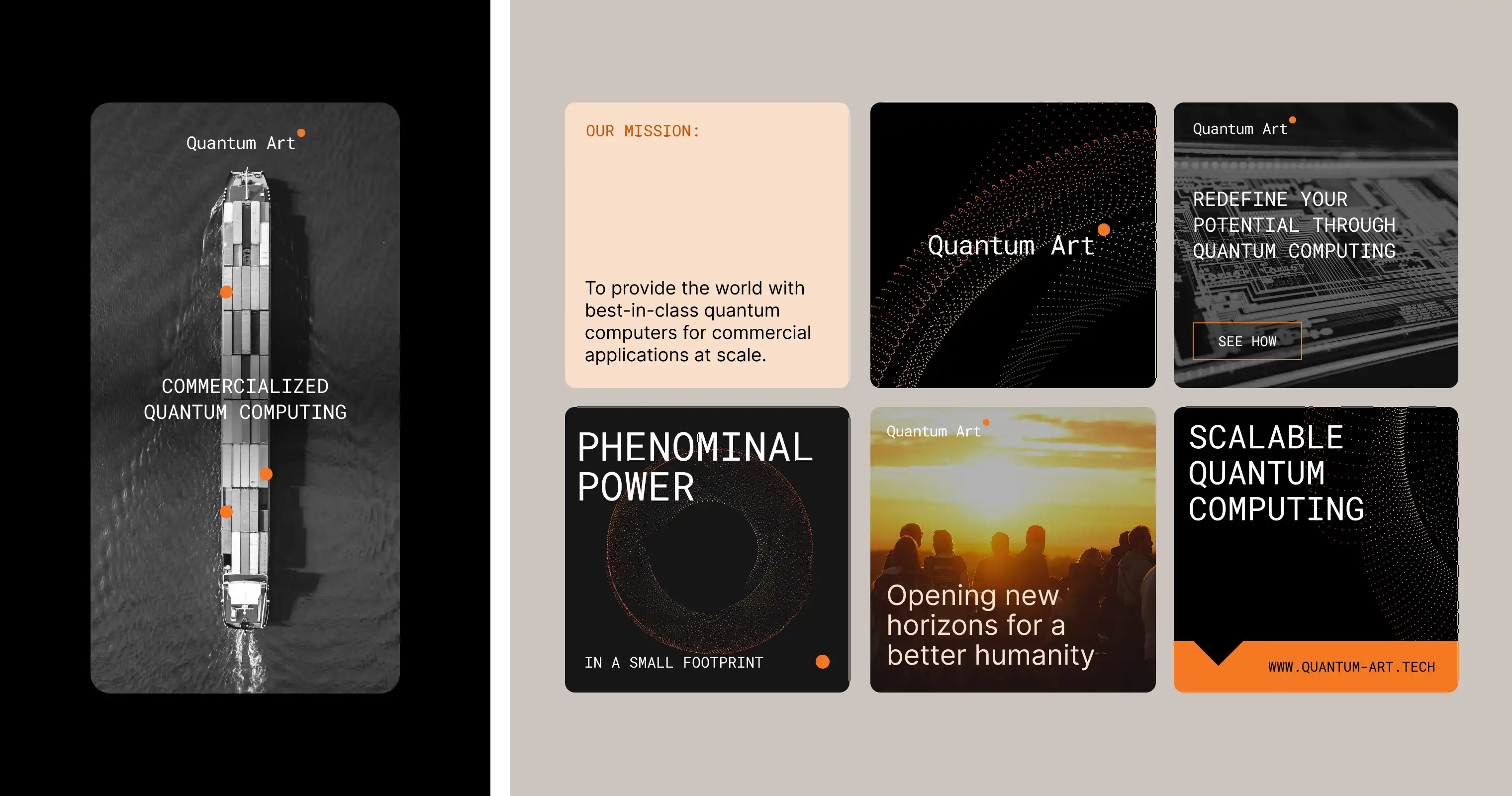
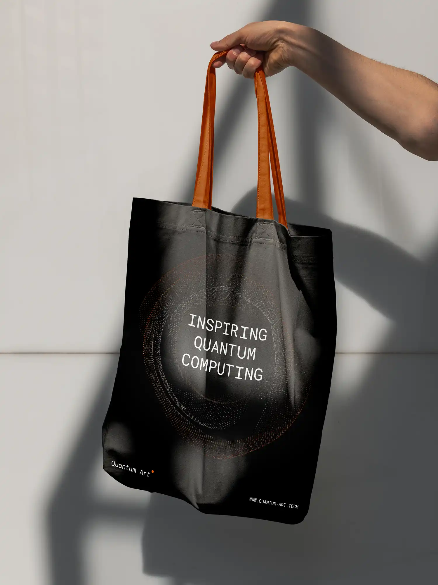
The visual identity draws from soft neutrals anchored by deep blacks and graphite tones, punctuated with plasma‑inspired accents. This palette balances quiet confidence with layered depth, mirroring the interplay of precision and complexity in quantum computation.
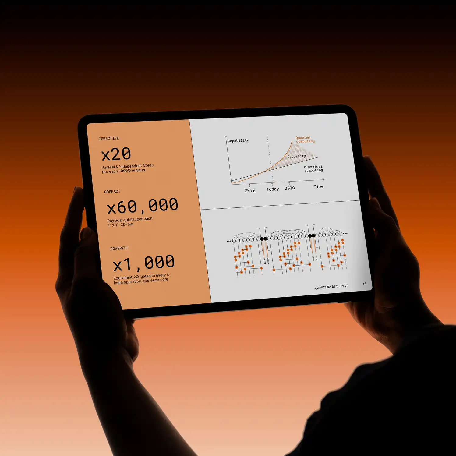
Typography combines a tech‑oriented slab sans serif with a disciplined single sans‑serif system—modern, legible, and adaptable. Graphic elements suggest modularity, coherence, and motion, serving as subtle nods to Quantum Art’s ability to scale complexity into beauty.
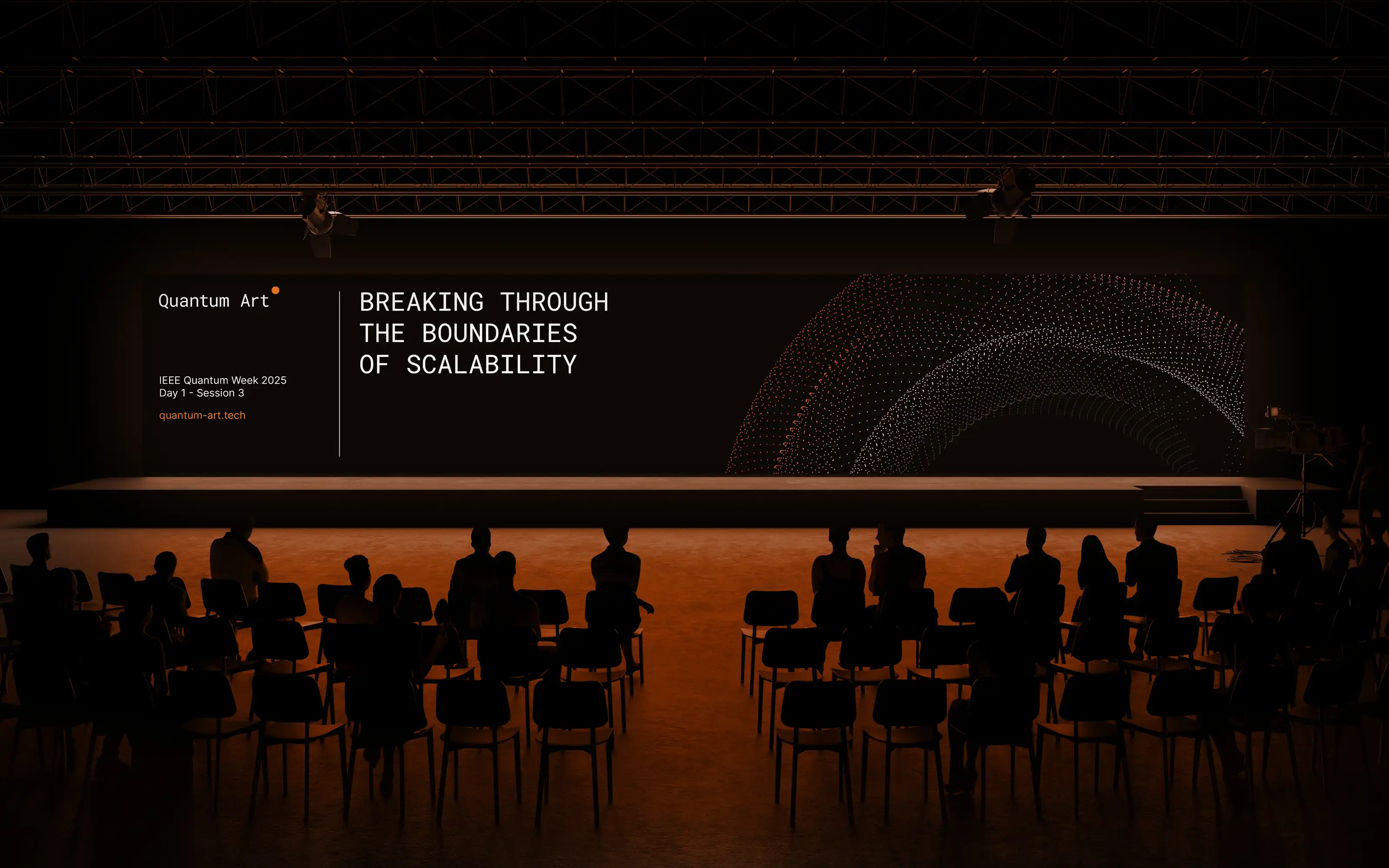
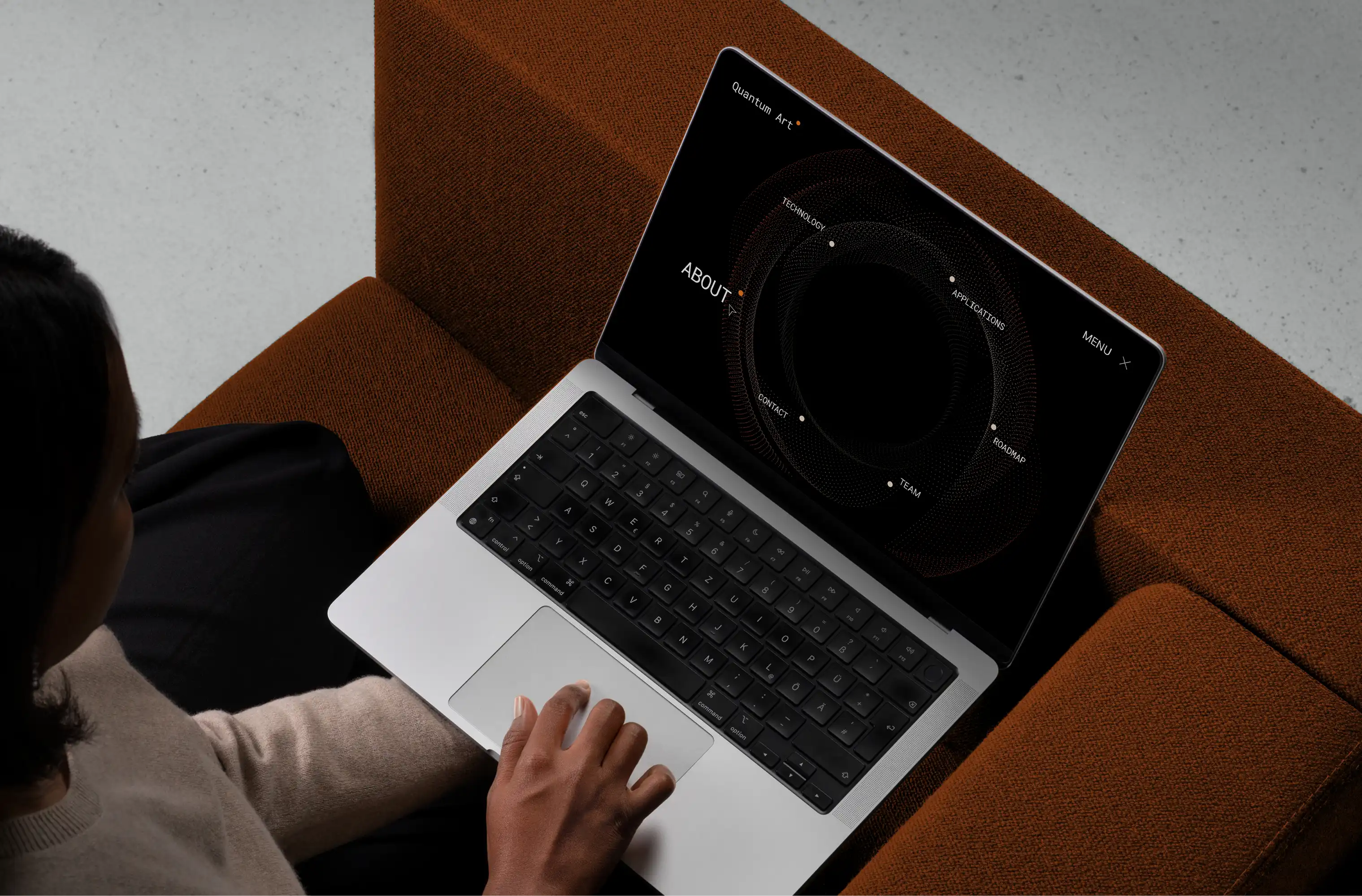
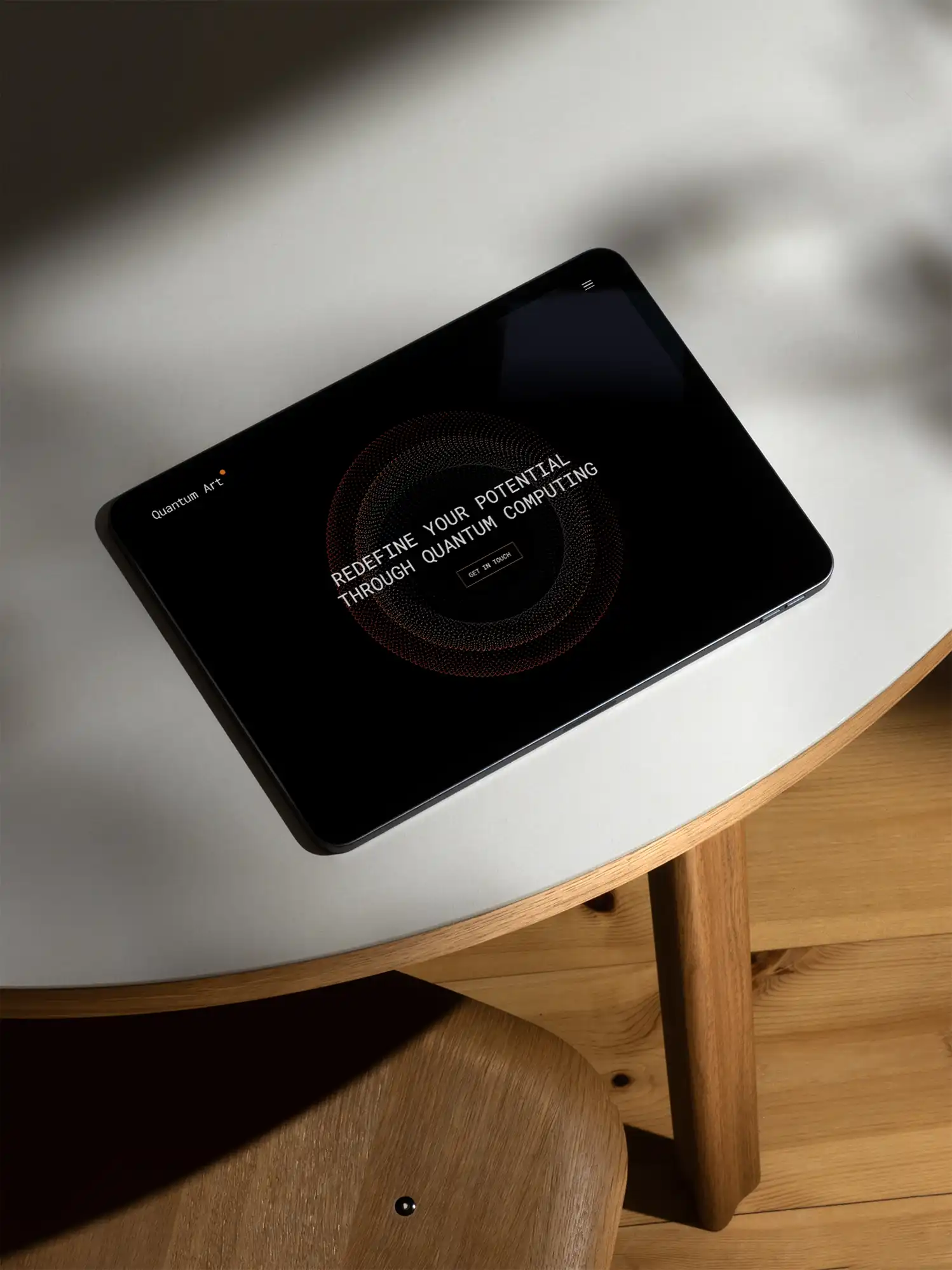
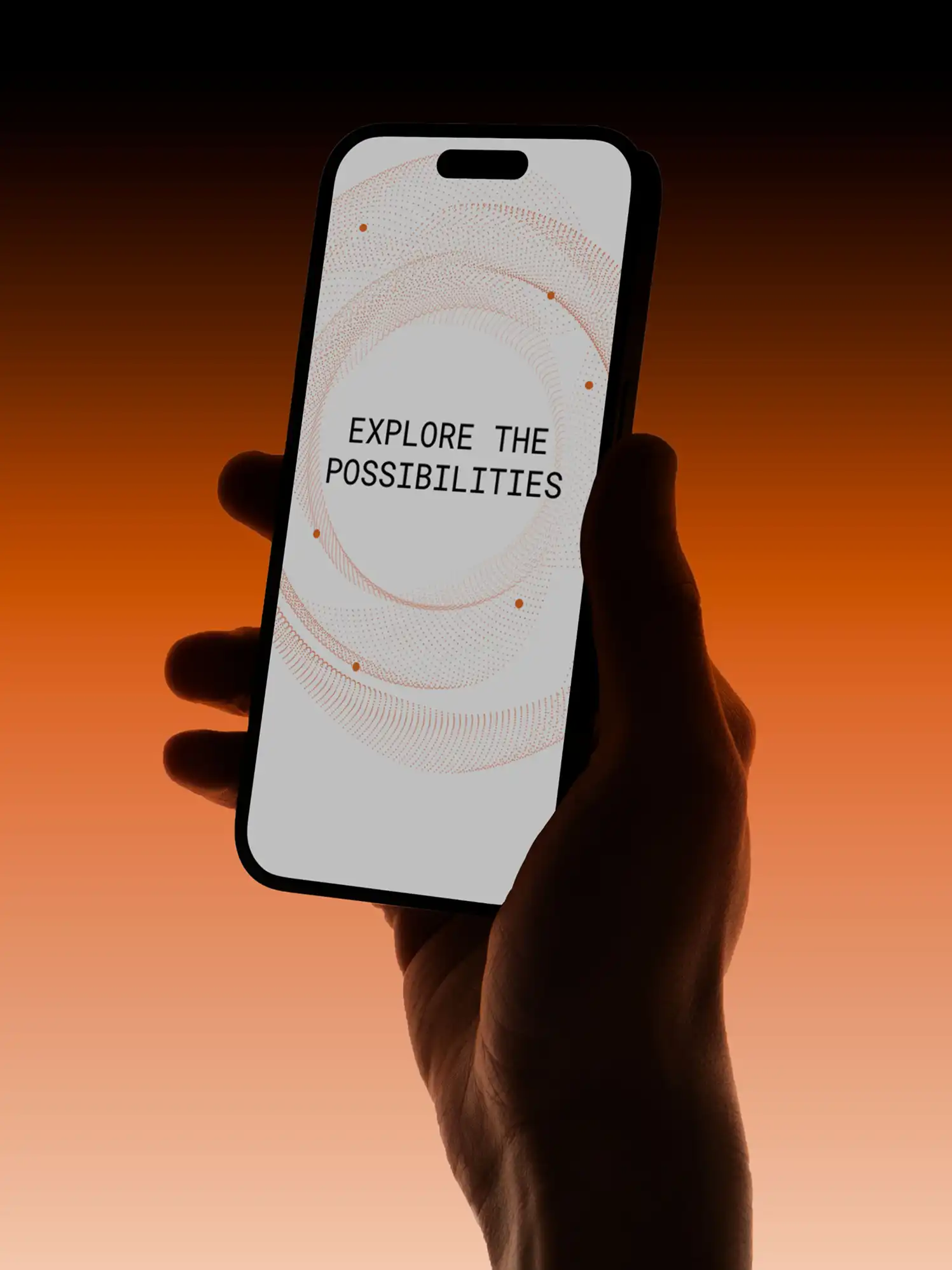
The website became a key touchpoint—focused, breathable, and intelligent. Copy was stripped of jargon, grounded in clarity. Visual motifs and subtle motion hinted at the dynamic, interconnected nature of quantum systems, while maintaining a calm, intentional presence. Every choice built toward signaling precision, authority, and the artistry of their work.
.webp)
Quantum Art’s new brand gave the team a shared foundation and vocabulary. Externally, it marked a clear shift—from stealthy R&D outfit to global contender.
The website became a critical interface for potential investors and collaborators. The pitch deck elevated every conversation. The templates saved time and sharpened delivery. The language made everything feel cohesive.
More than a new look, the brand became a signal:
This company isn’t just building quantum computers. They’re building something beautiful.