Start a project

If you would like to find out more about how we can work together, fill out the form and we’ll set up a time to chat about what’s next for your brand.


for best experience
Thread Count
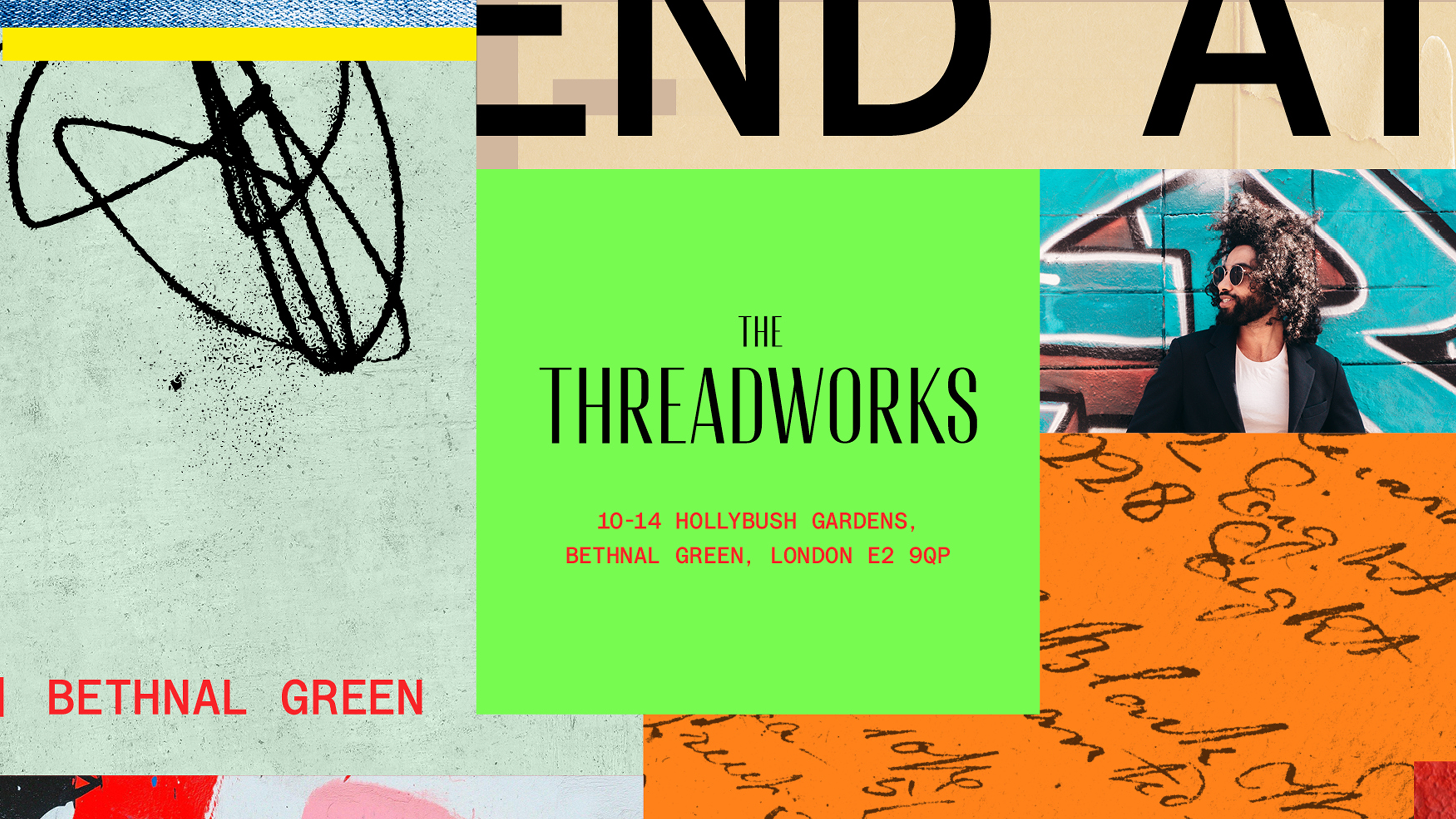
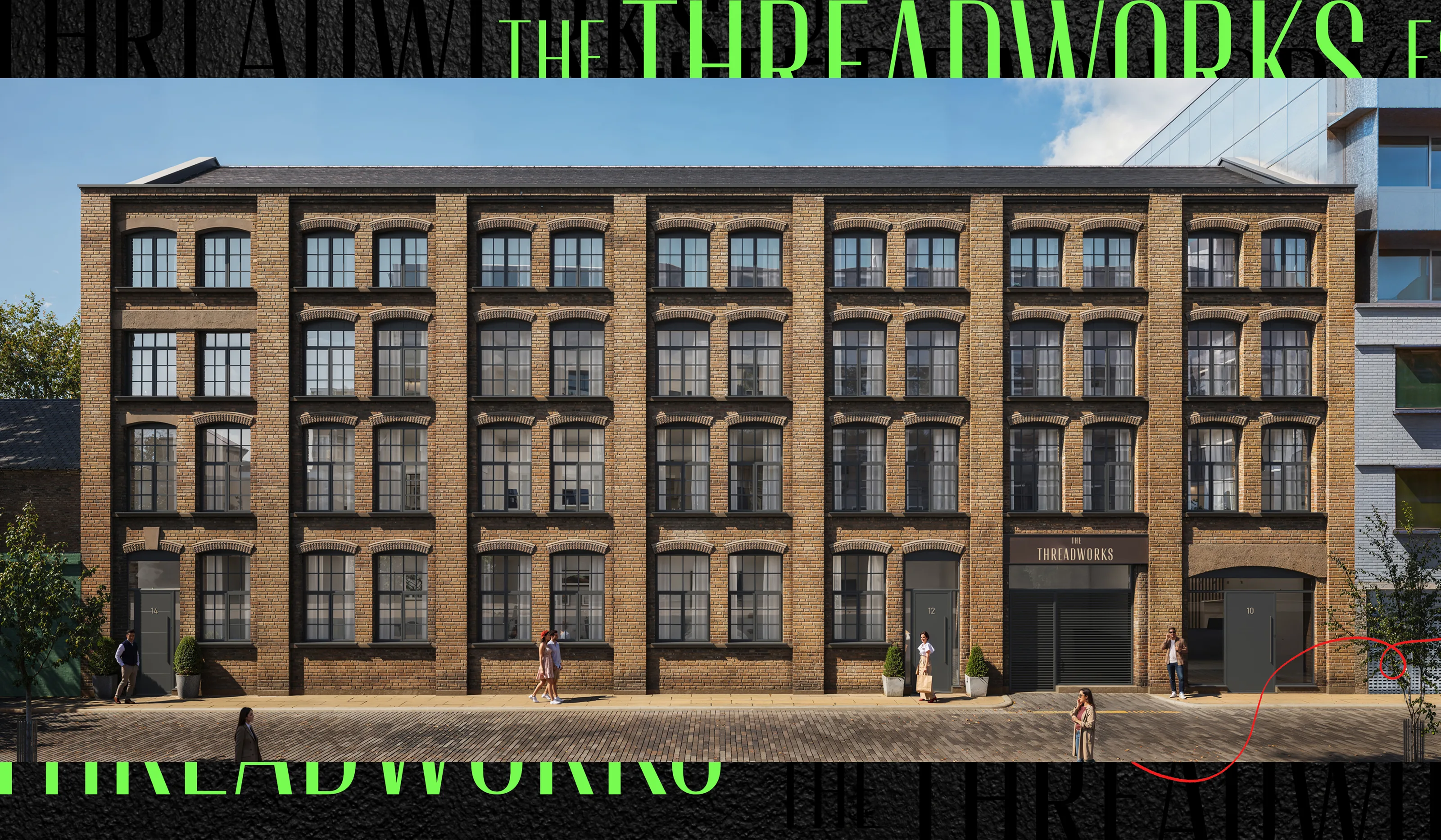
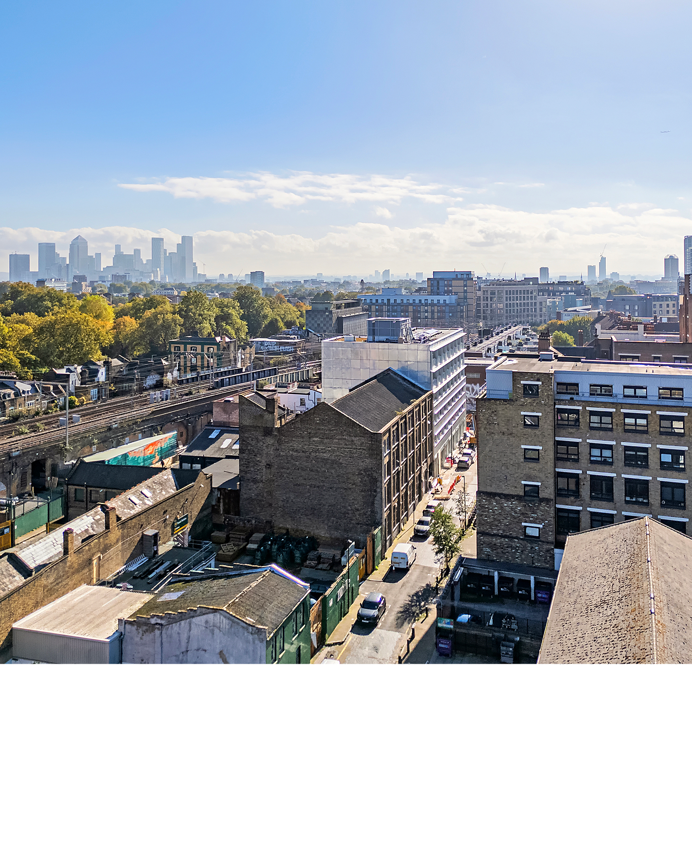
10–14 Hollybush Gardens is a four-storey warehouse in Bethnal Green, built as an upholstery works around 1880 now sitting at the intersection of London’s industrial past and cultural future. Empty for decades — Crittall windows grilled over, entrance colonised by fly-tipping and graffiti. VFund saw 21 loft apartments inside. They had no way to talk about them. East London is full of conversions trading on exposed brick and vague “character.” The brief was sharper: a brand for design-literate first-time buyers who’d sooner live with scars than without them — and make it sell.
- Brand Strategy
- Naming
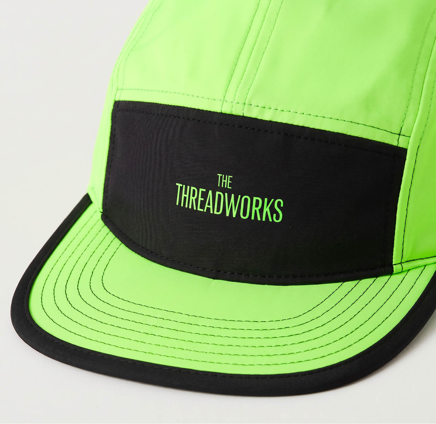
- Visual Identity
- Photography Direction
- Brand Collateral
- Website Design
- Website Development
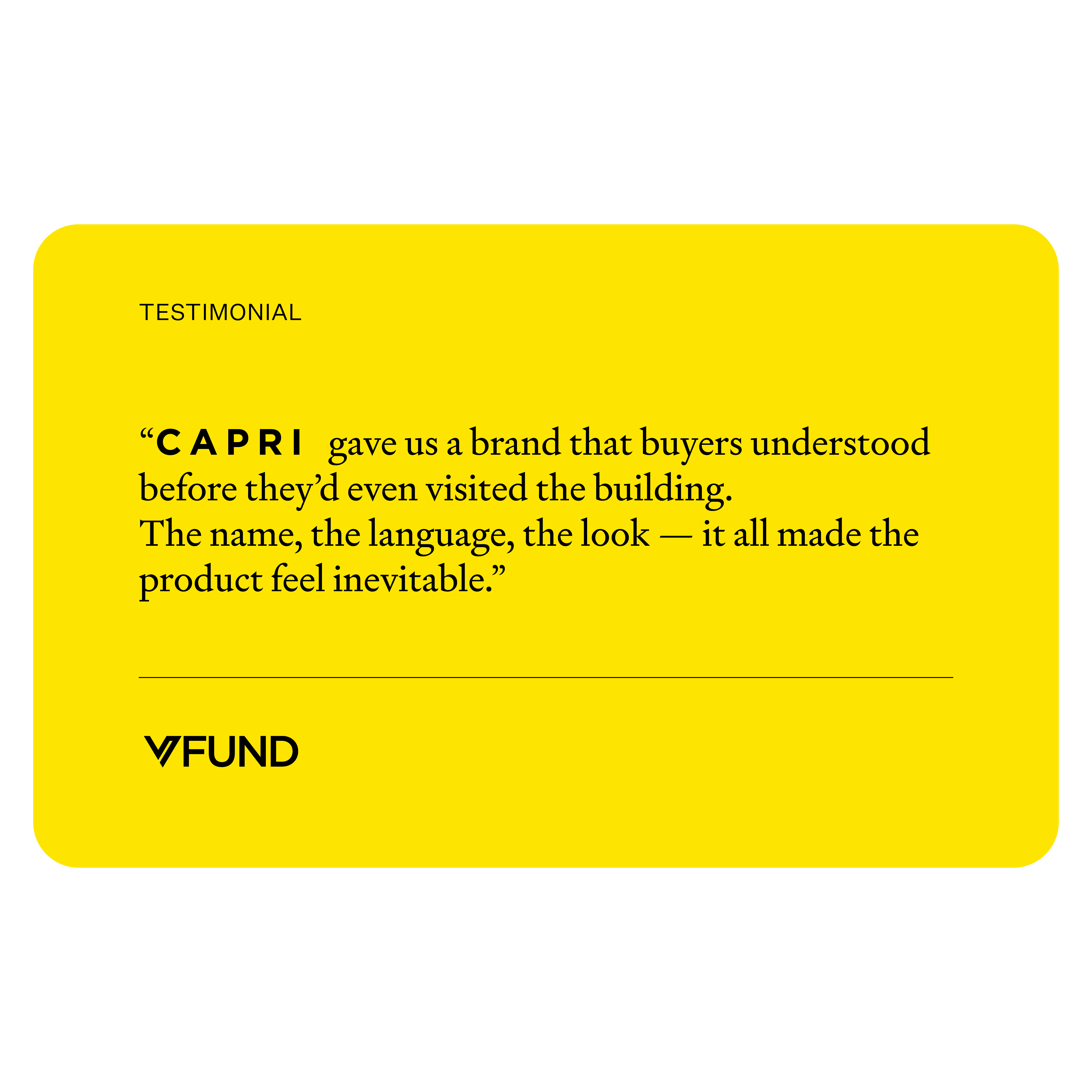
The insight came from the audience, not the architecture. CAPRI's research identified a buyer profile — young professionals in media, design, and tech, 25–40 — for whom conventional luxury is a turn-off. They don't want marble lobbies and concierge desks. They want volume, light, texture, and a postcode that still has an edge. The strategic platform, Gritty-Luxe, inverted the usual residential proposition: the warehouse's roughness wasn't a problem to solve. It was the product. Every brand decision that followed was pressure-tested against a single question: does this feel honest, or does this feel like a show flat?
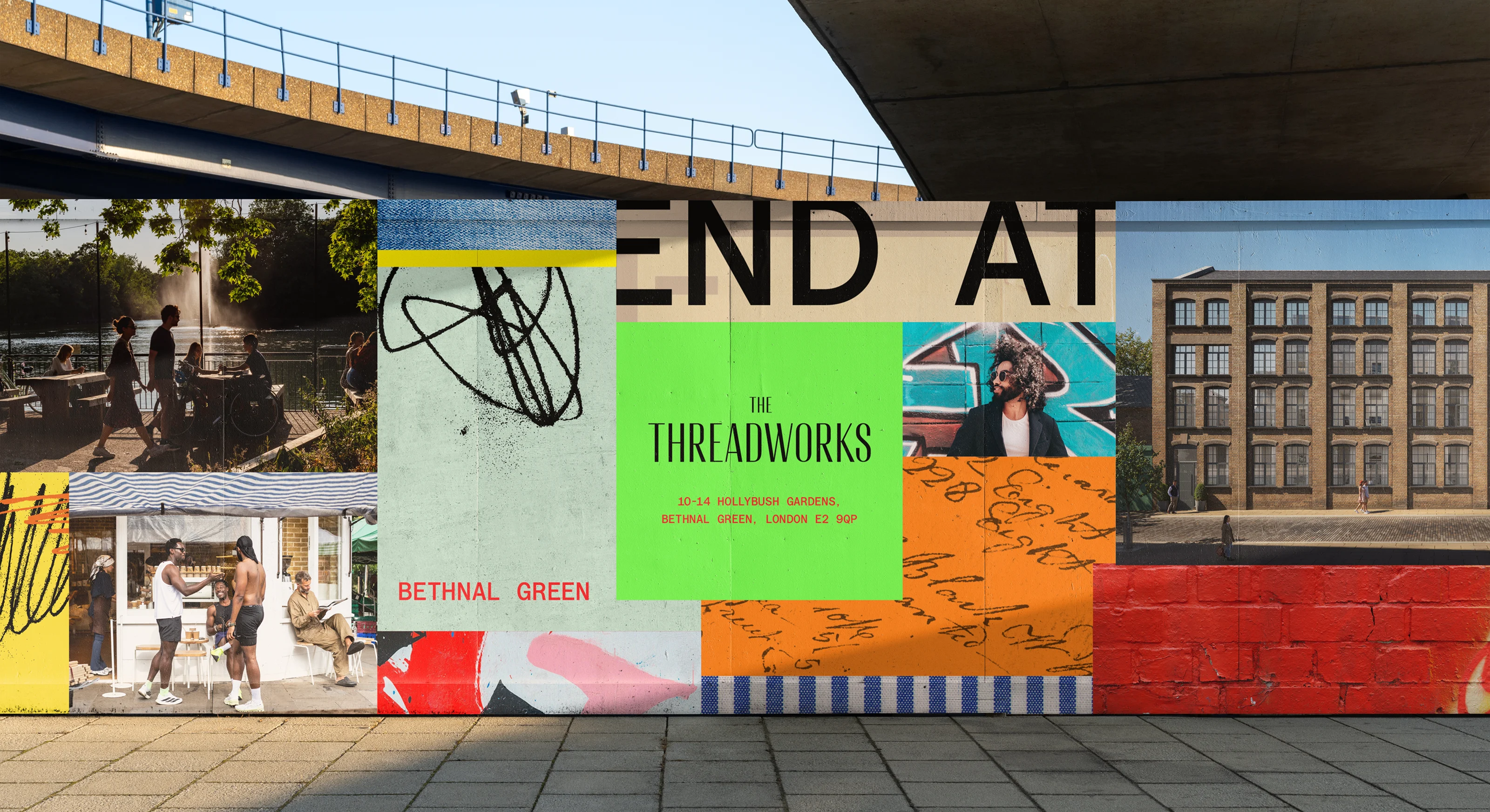
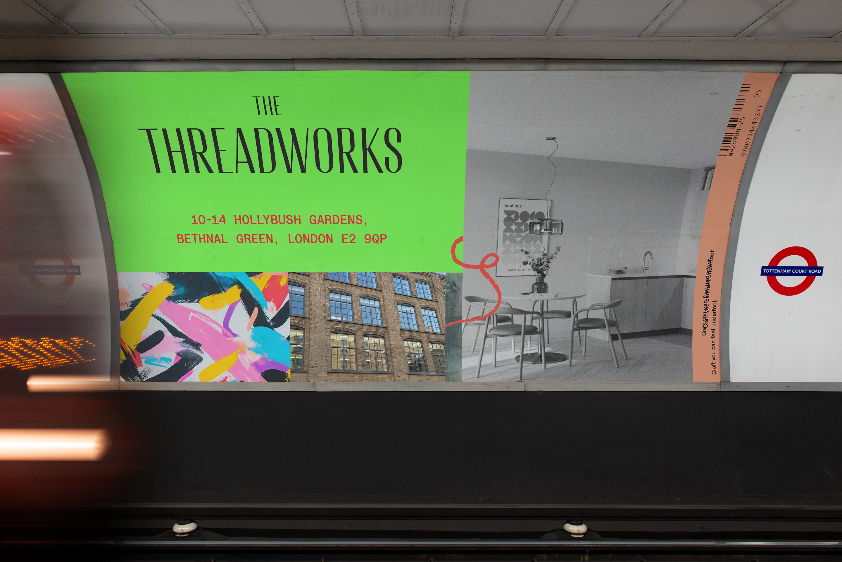
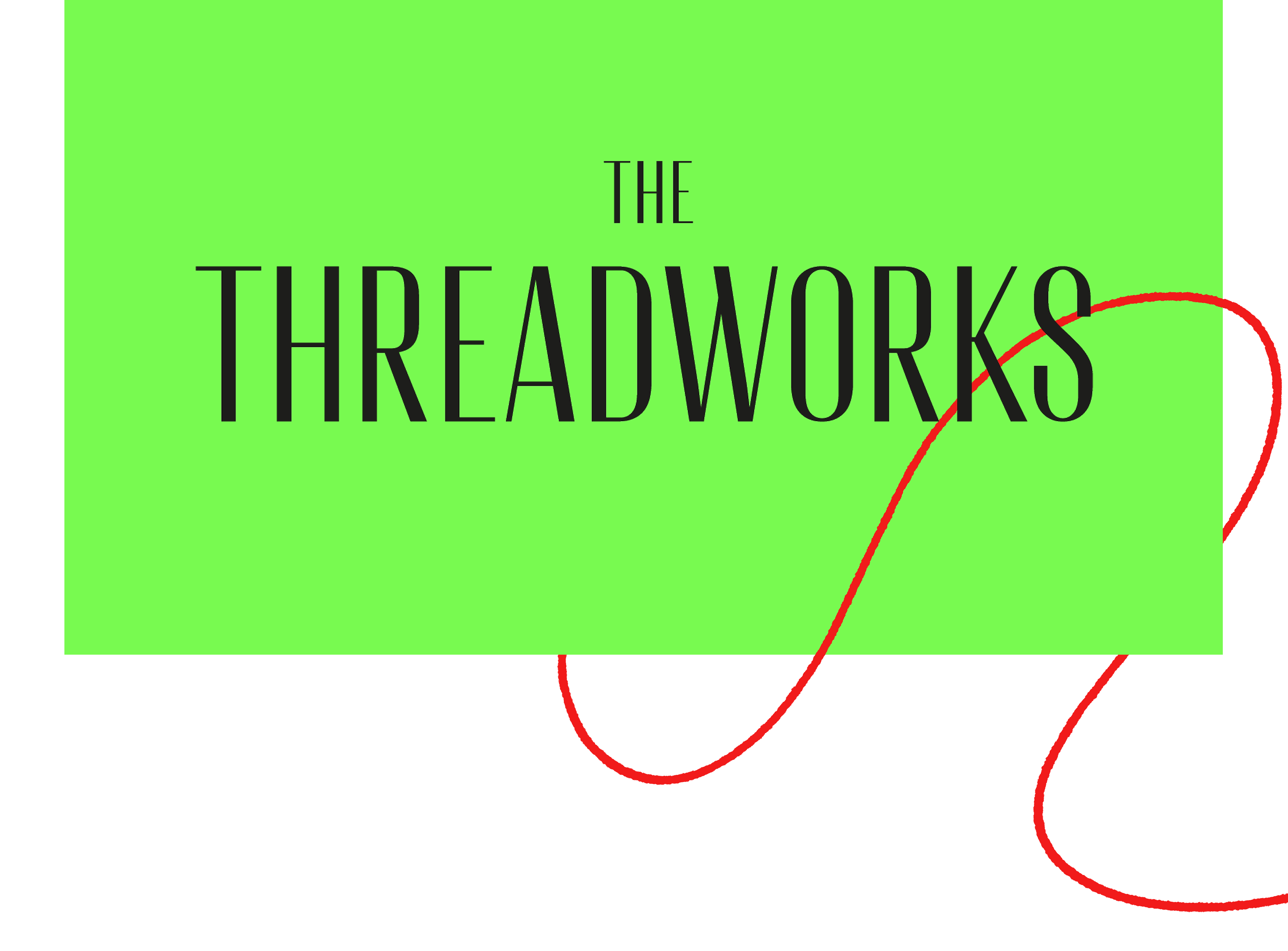
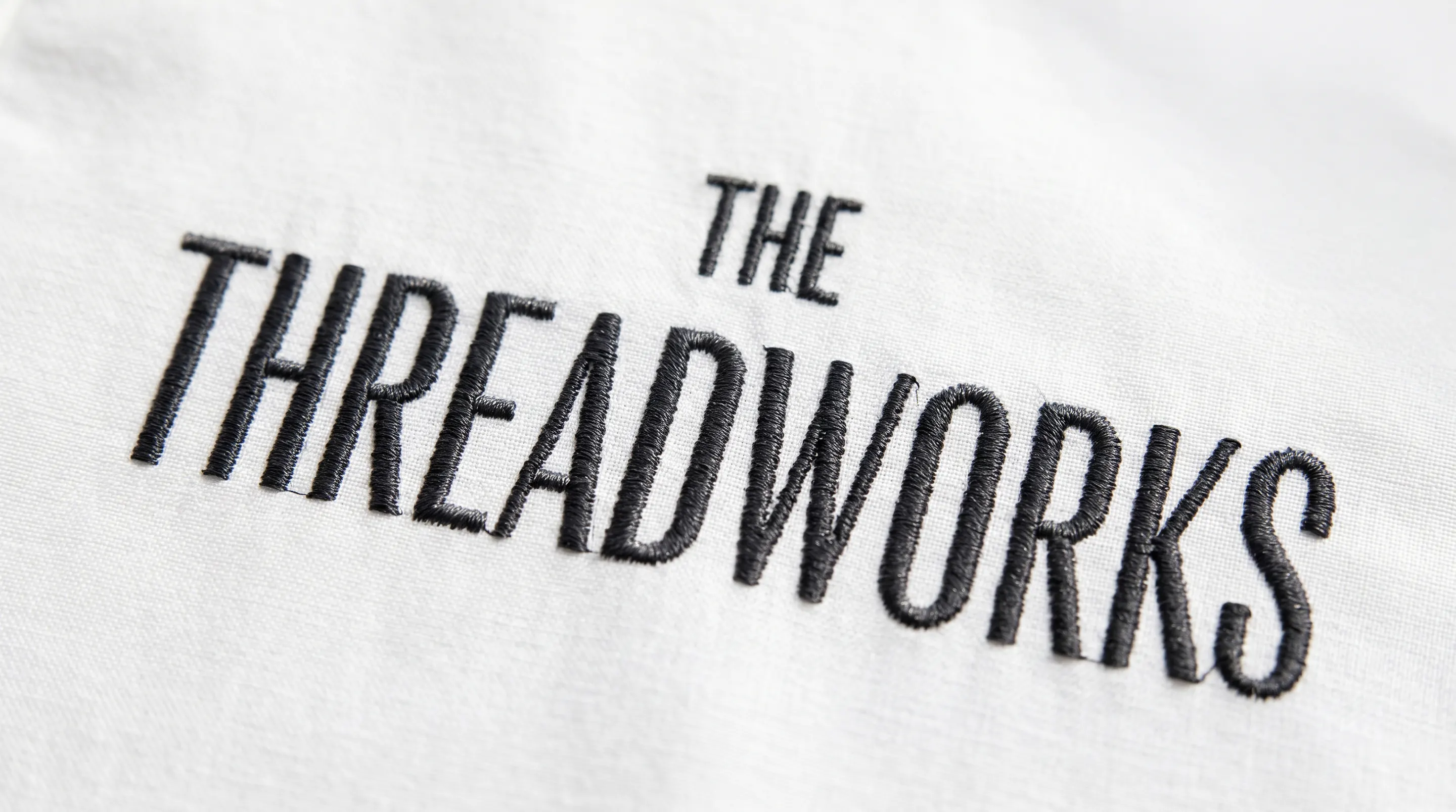
The name came first. CAPRI traced the building's origins as a trimming and upholstery factory and landed on The Threadworks — a name that carries the textile lineage without playing heritage dress-up. It sounds like a place, not a concept. It works on a hoarding, in a URL, and in a sentence beginning "I live at."
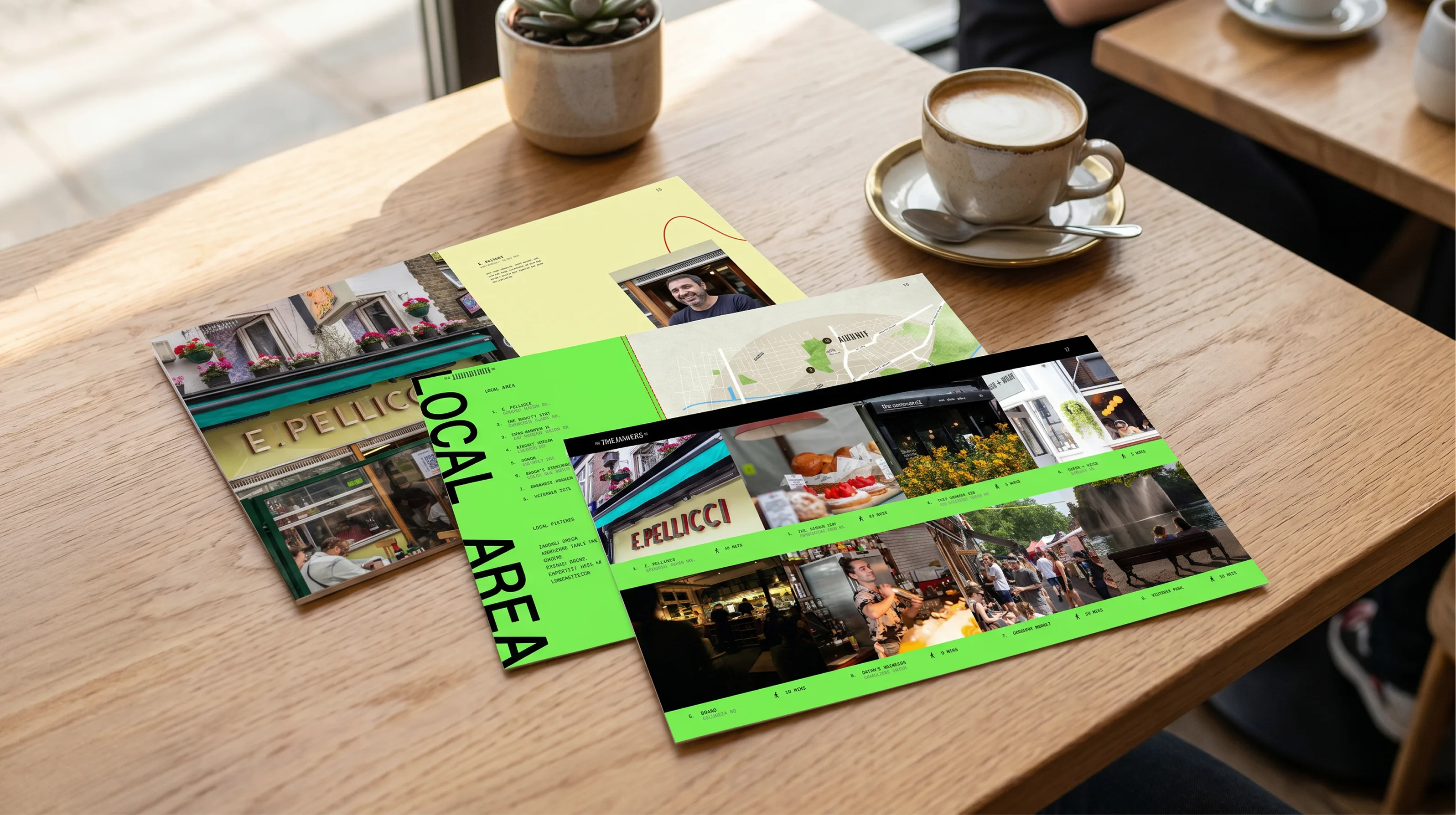
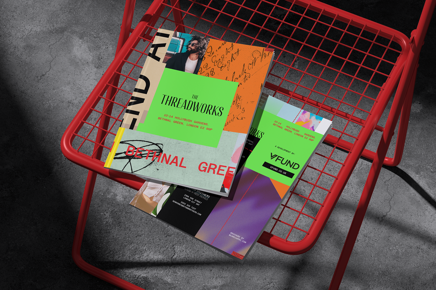
From there, the verbal identity was built on a tonal register borrowed from editorial rather than estate agency: declarative, textural, spatially aware. Lines like "Warehouse bones. East London soul" and "Built with edges intact" were written to function as brand signals — fragments that buyers would repeat to friends unprompted. The brochure reads like a neighbourhood guide that happens to contain floor plans.
Visually, CAPRI stripped back the palette to let the building speak: raw photography of brickwork and ironwork sat alongside CGI interiors that prioritised shadow and grain over aspirational gloss. The website — bethnalthreadworks.com — was designed as a single scrolling editorial experience, not a property portal. No stock imagery. No "price on application" coyness. The floor plans were redrawn with the same graphic rigour as the brand identity itself.
Multiple units reserved off-plan within the first weeks of launch. The brochure became a circulation piece among East London agents — shared not for the listings, but for the tone.