Start a project

If you would like to find out more about how we can work together, fill out the form and we’ll set up a time to chat about what’s next for your brand.


for best experience
.svg)
.webp)
A Brand as Bold as Its Discoveries
There is no place quite like the Weizmann Institute of Science. Since its modest beginnings in 1934, it has evolved into a globally renowned scientific powerhouse, pushing the boundaries of human knowledge. As the Institute embarked on a new chapter, the challenge was clear: how to capture the essence of its fearless scientific spirit in a visual and verbal identity rooted in history and that could inspire its diverse community and global audience now and for the future.
- Art Direction & Design
- Brand Identity
- Digital Assets
- Visual Identity
- Typography
- Logo Creation
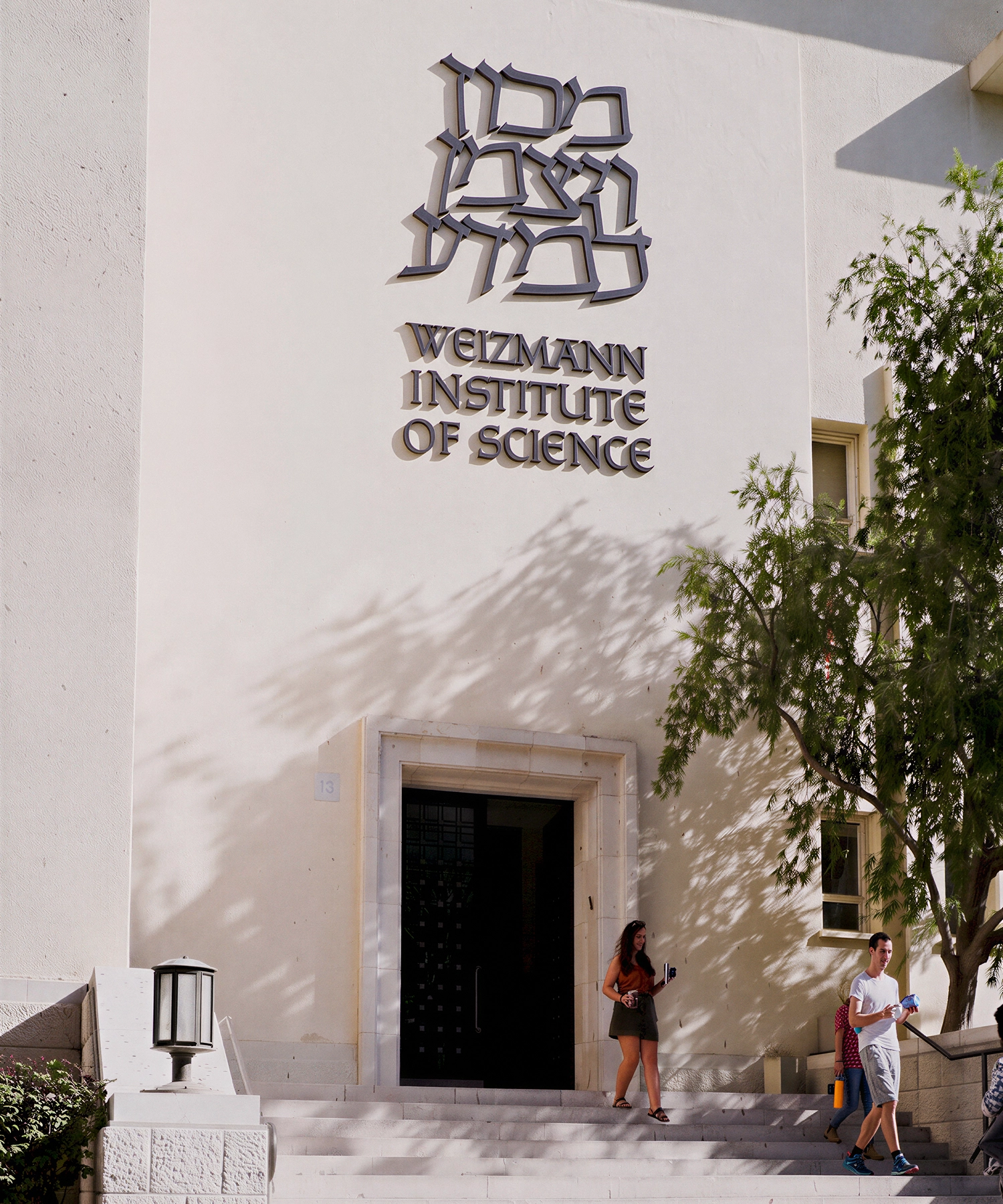
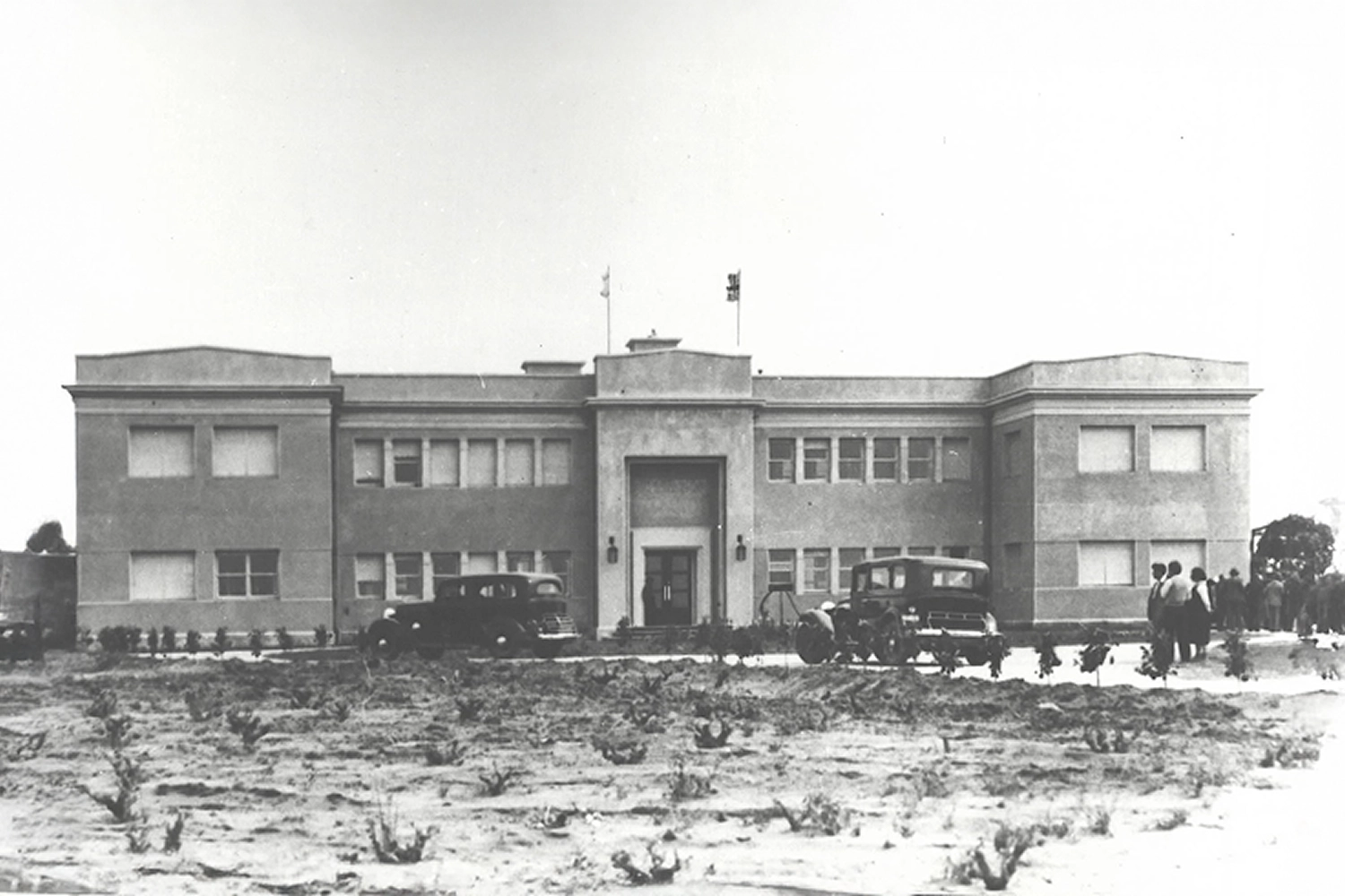
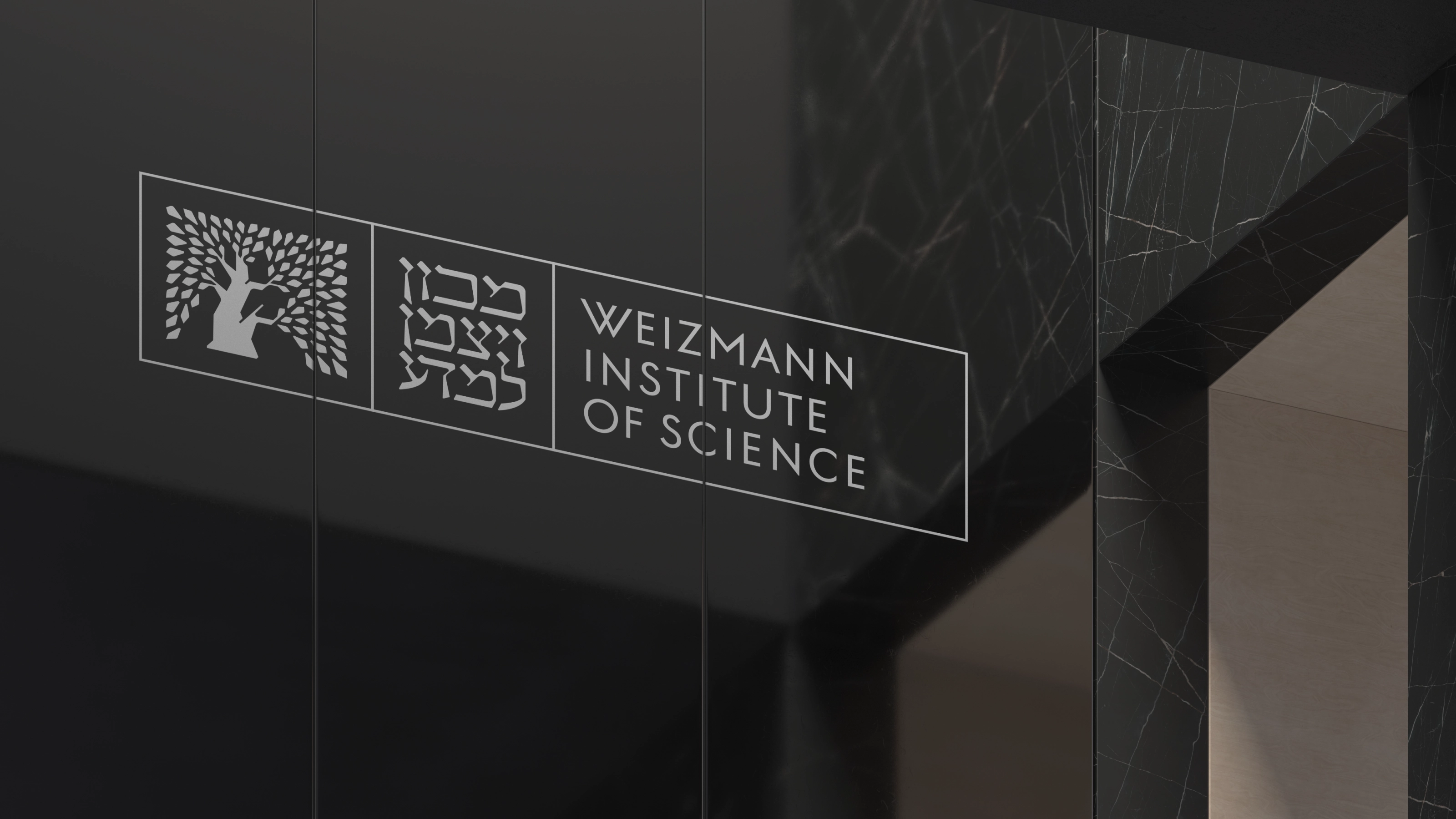
The Weizmann Institute of Science was founded in 1934, fourteen years before the country it came to symbolise. Its logotype was drawn by Franzisca Baruch, the typographer behind the emblem of Jerusalem and the cover of the first Israeli passport. Its tree had gone untouched for ninety years. We were asked to carry all of it into a global brand without losing any of it, one that could stand where the science already stood: with the world's great institutions of basic research.
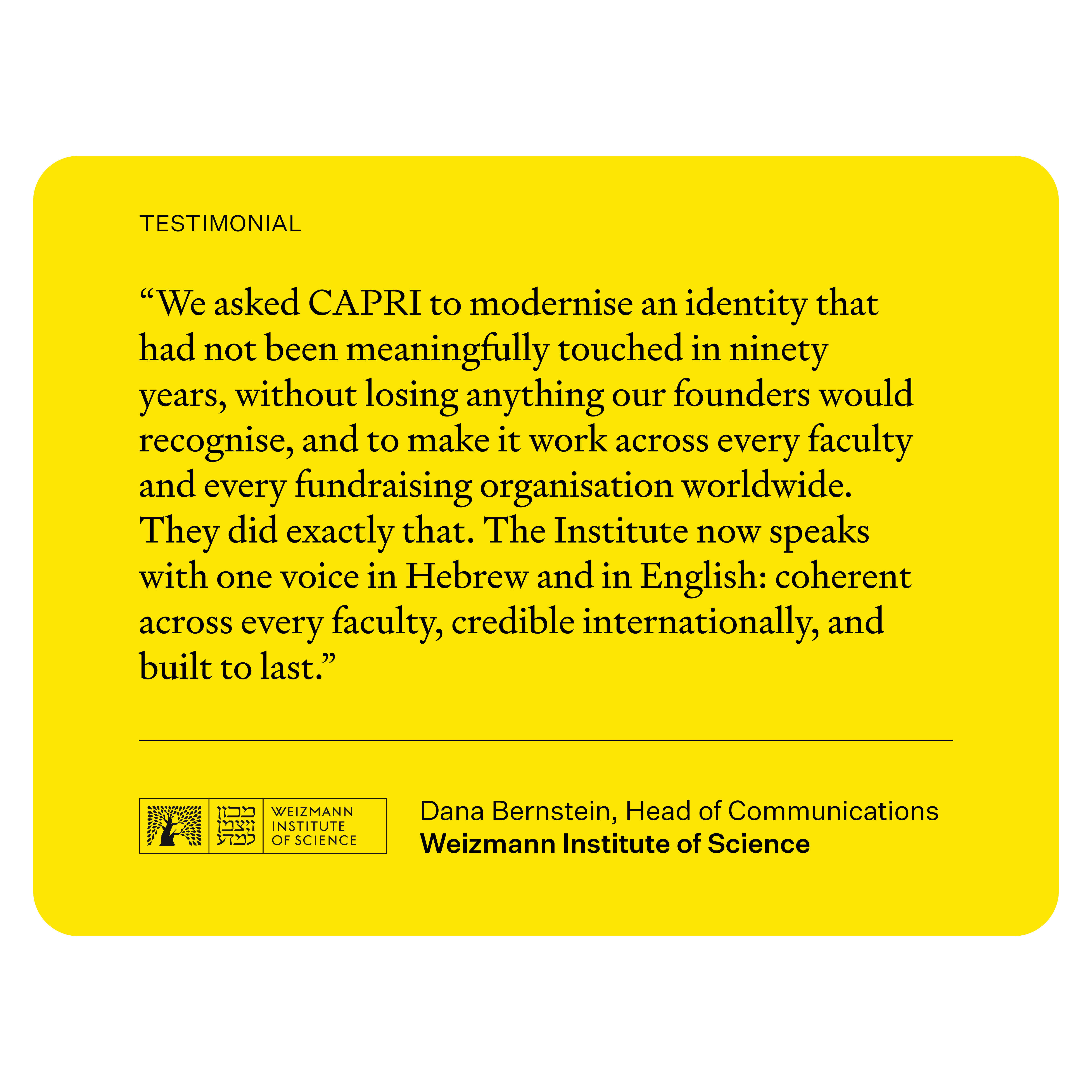
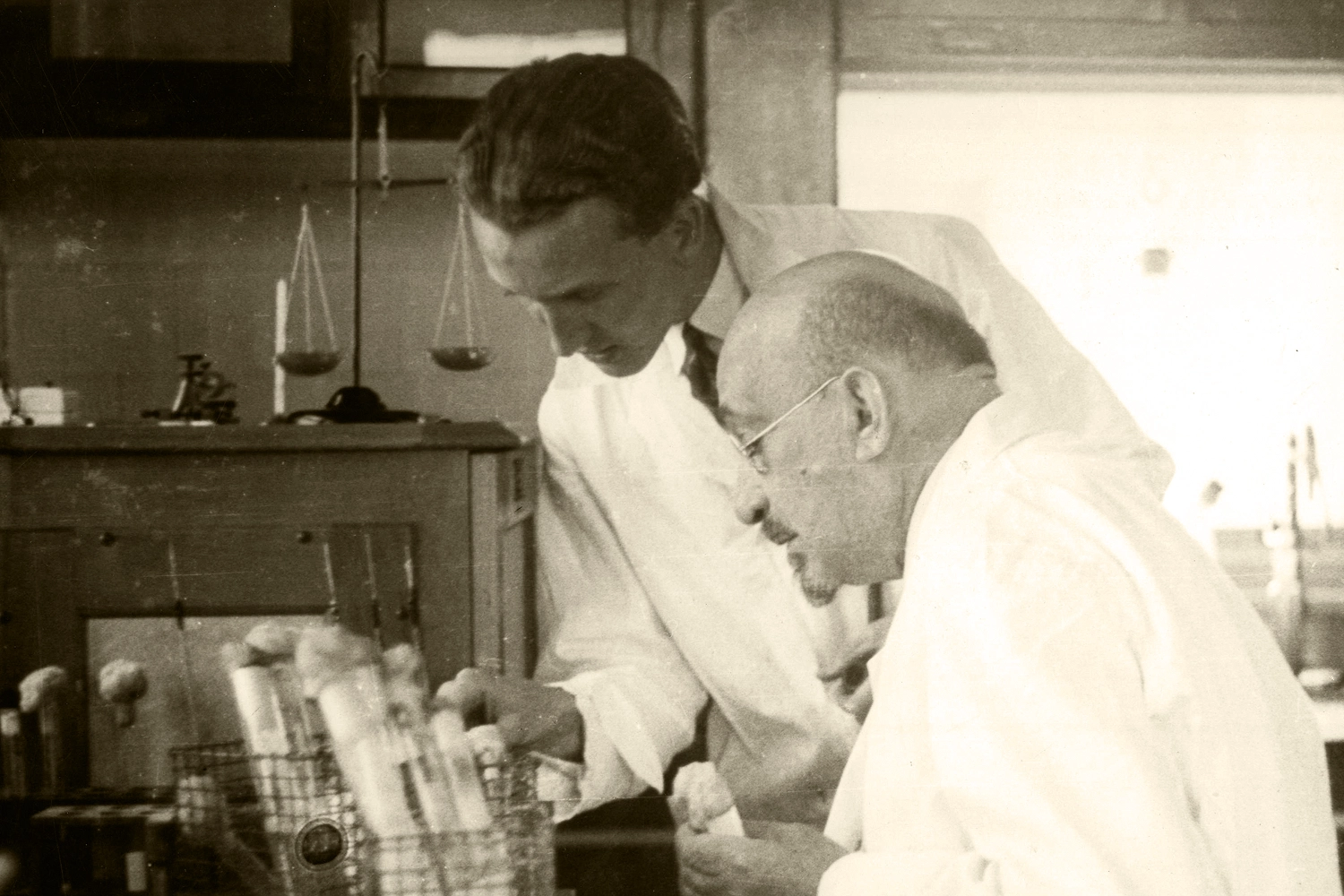
Six Nobel laureates. Eighth in the world by proportion of top-cited research, level with Rockefeller, MIT and Princeton. Weizmann is a global, world-leading basic research institute. Our partners at People Made had built a brand strategy to shift into the next chapter. What the Institute lacked was an identity capable of carrying it beyond its own borders.

The institute's primary logo has only ever experienced three redraws in ninety years, none of them a design decision. The 1989 update was made so the mark would survive a laser printer. By 2001 the guidelines were codifying accumulated damage rather than intent. Before any design work began, a more basic question had to be answered: could the tree be touched at all? The tree was the quintessential icon of the institute, renowned nationally among multiple generations and a core symbol attached to committees, faculties and fundraising boards across three continents, all of them custodians. The resistance was never really objection. It was the fear of being the generation that broke something.
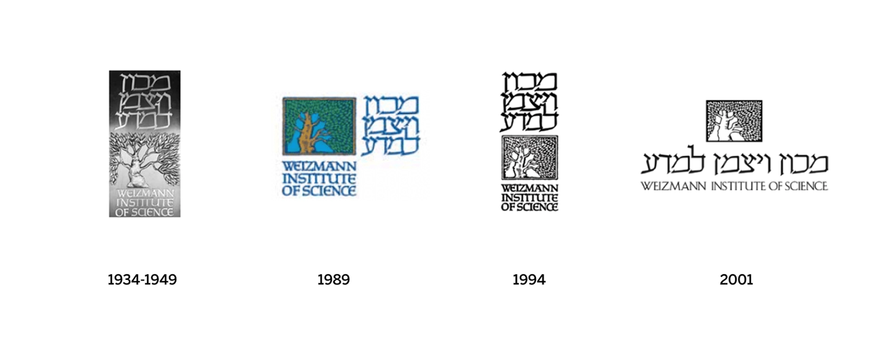
Before any design work began, a more basic question had to be answered: could the tree be touched at all? Committees, faculties and fundraising boards across three continents, all of them custodians. The resistance was never really objection. It was the fear of being the generation that broke something.
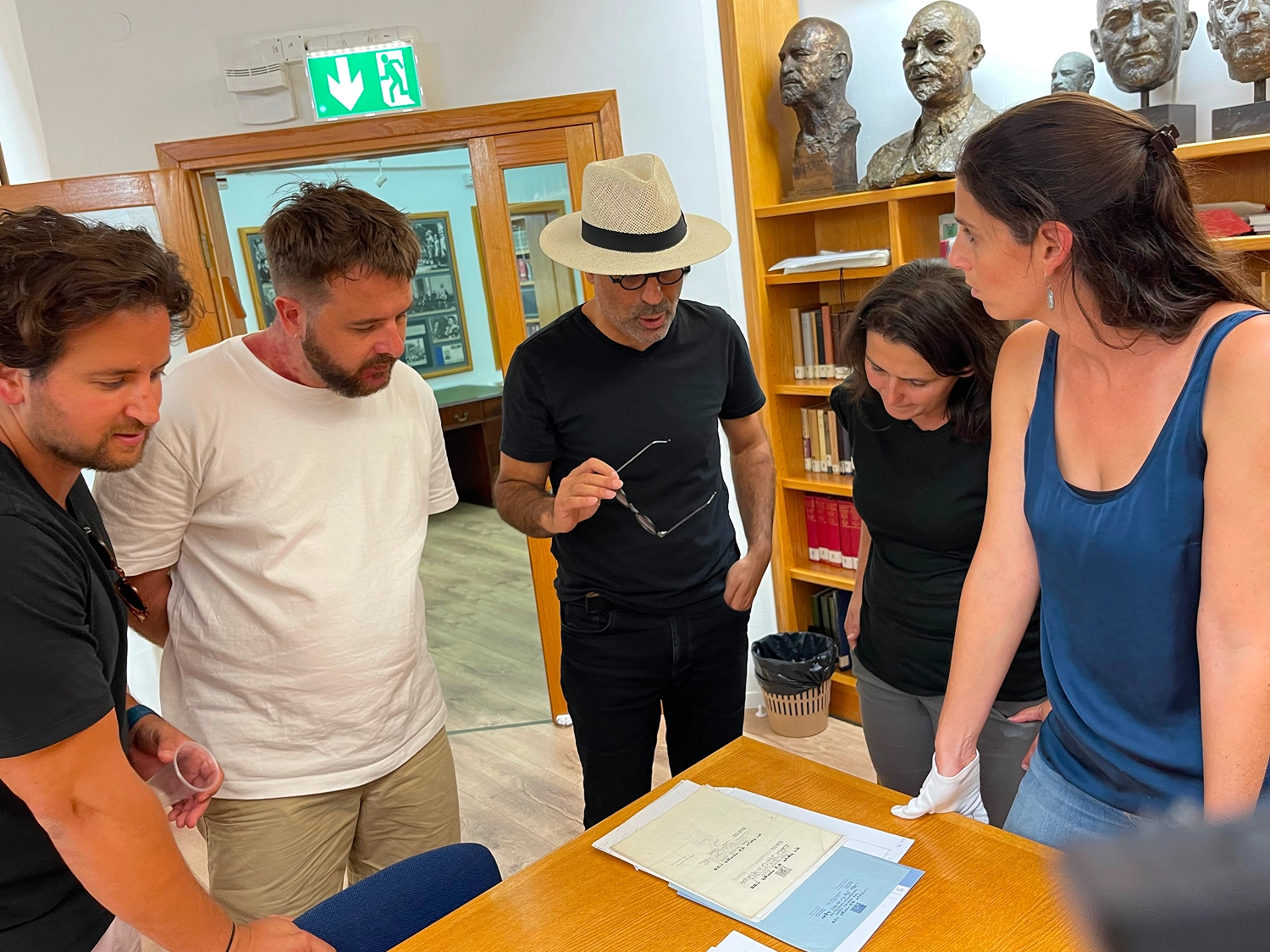
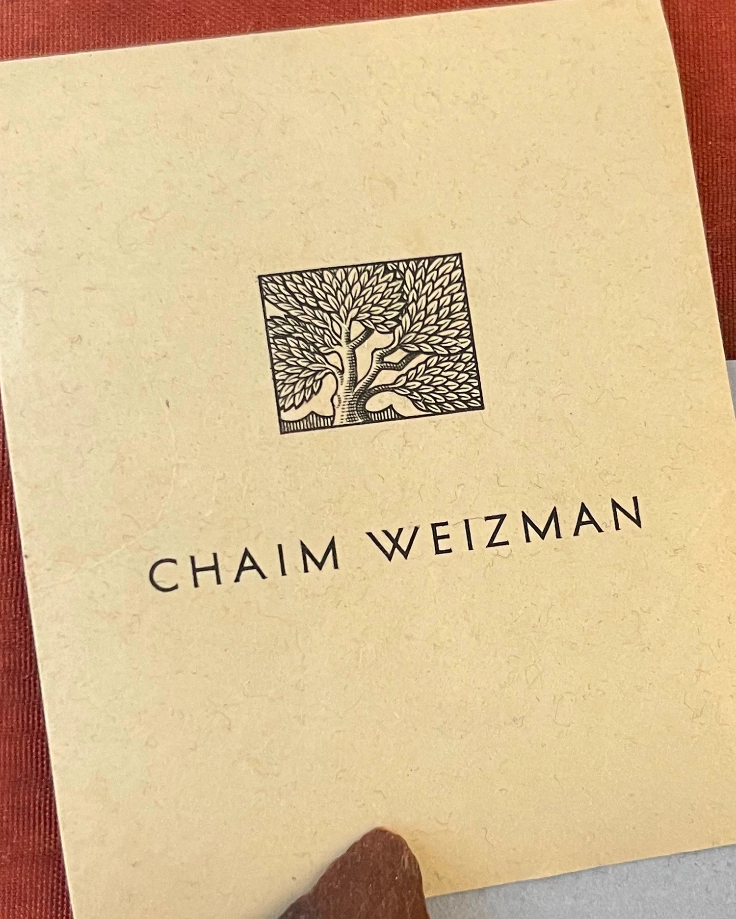
The tree was never only a symbol. The campus was sited where it is partly to cultivate the specimens under study at the time. So we went to the archive, and found on Chaim Weizmann's personal stationery a version of the tree carrying a flow the modern mark had lost somewhere across four redraws. Permission arrived with it. This was not a departure. It was a recovery.
The logo stopped being a fixed mark and became a modular grid, one that shifts and recombines rather than sitting still. It had to carry two things at once: the structure of an institution, seven faculties, co-branding and sponsorship held without a single exception being written, and the boundless exploration that structure exists to protect. The leaf became a generative pattern system.
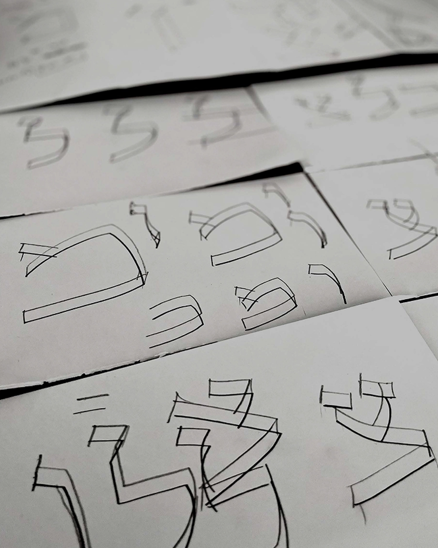
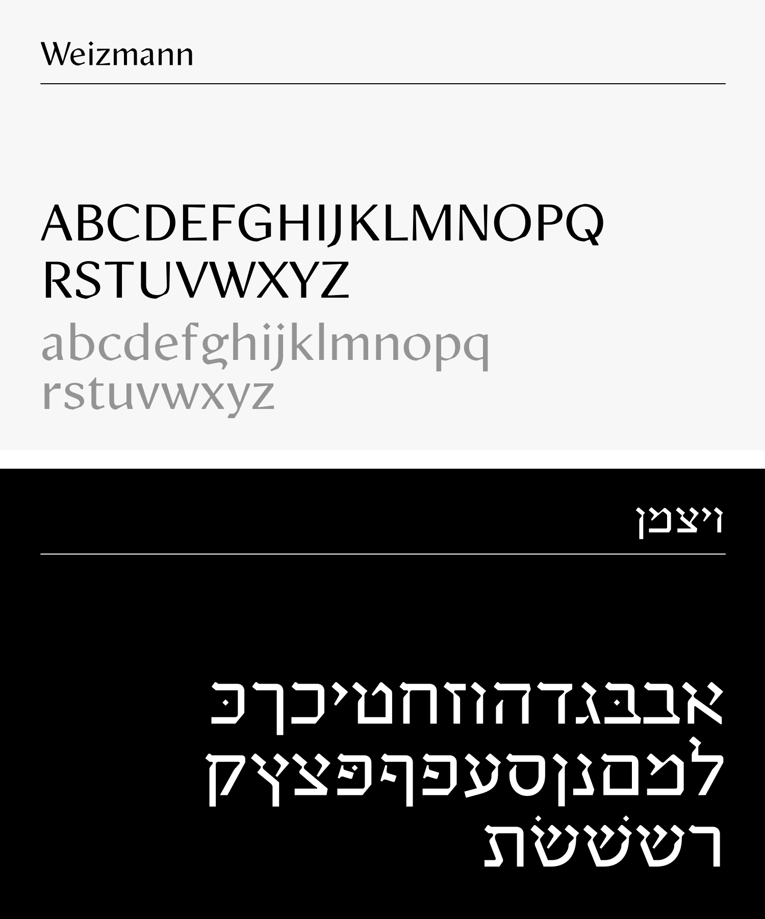
The Institute has spoken two scripts since 1934 and had never had them designed to speak to each other. For Latin we took the departure point from Weizmann's own letterhead, then art directed and co-designed Weizmann with Professor Oded Ezer, Israel's pre-eminent typographer and design historian. A bespoke bilingual headline face. One voice, in Hebrew and in English, for an institution that has always had to be both.
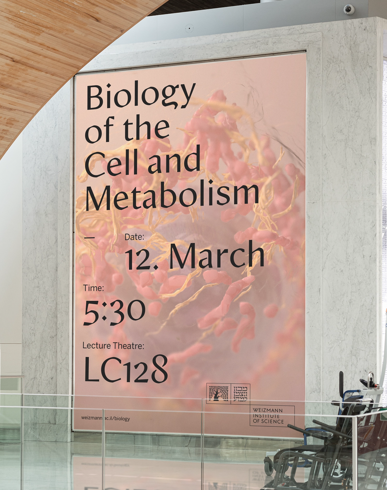
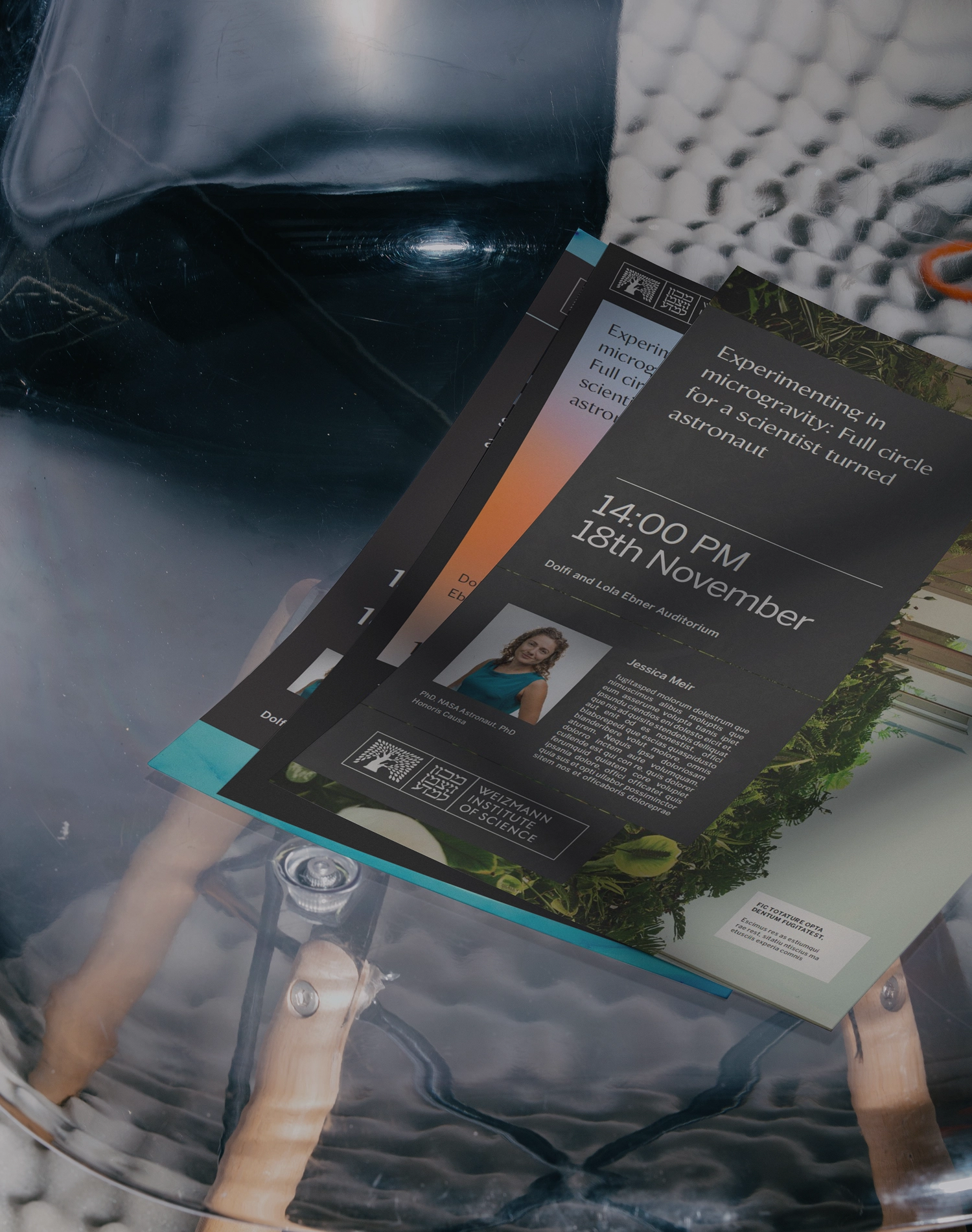
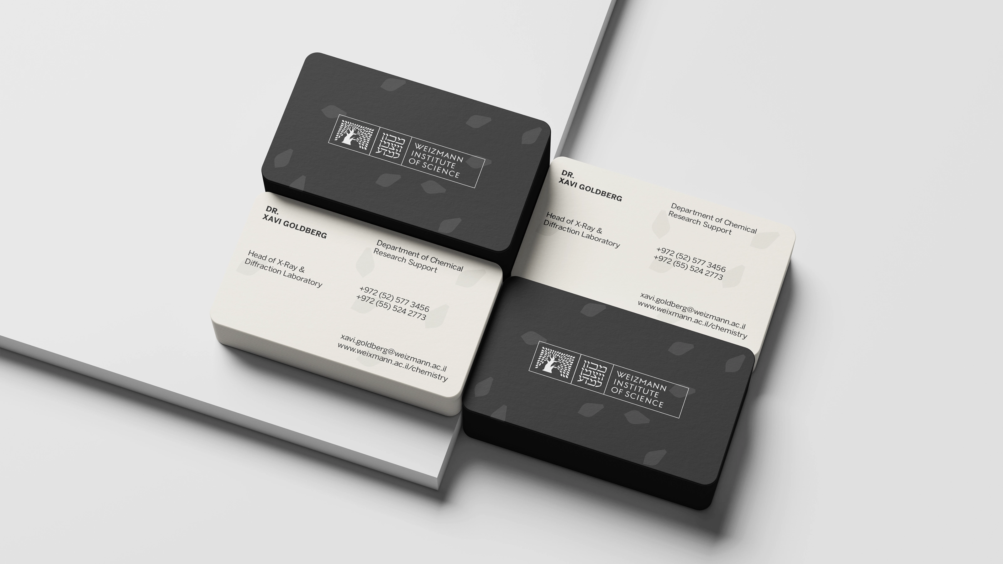
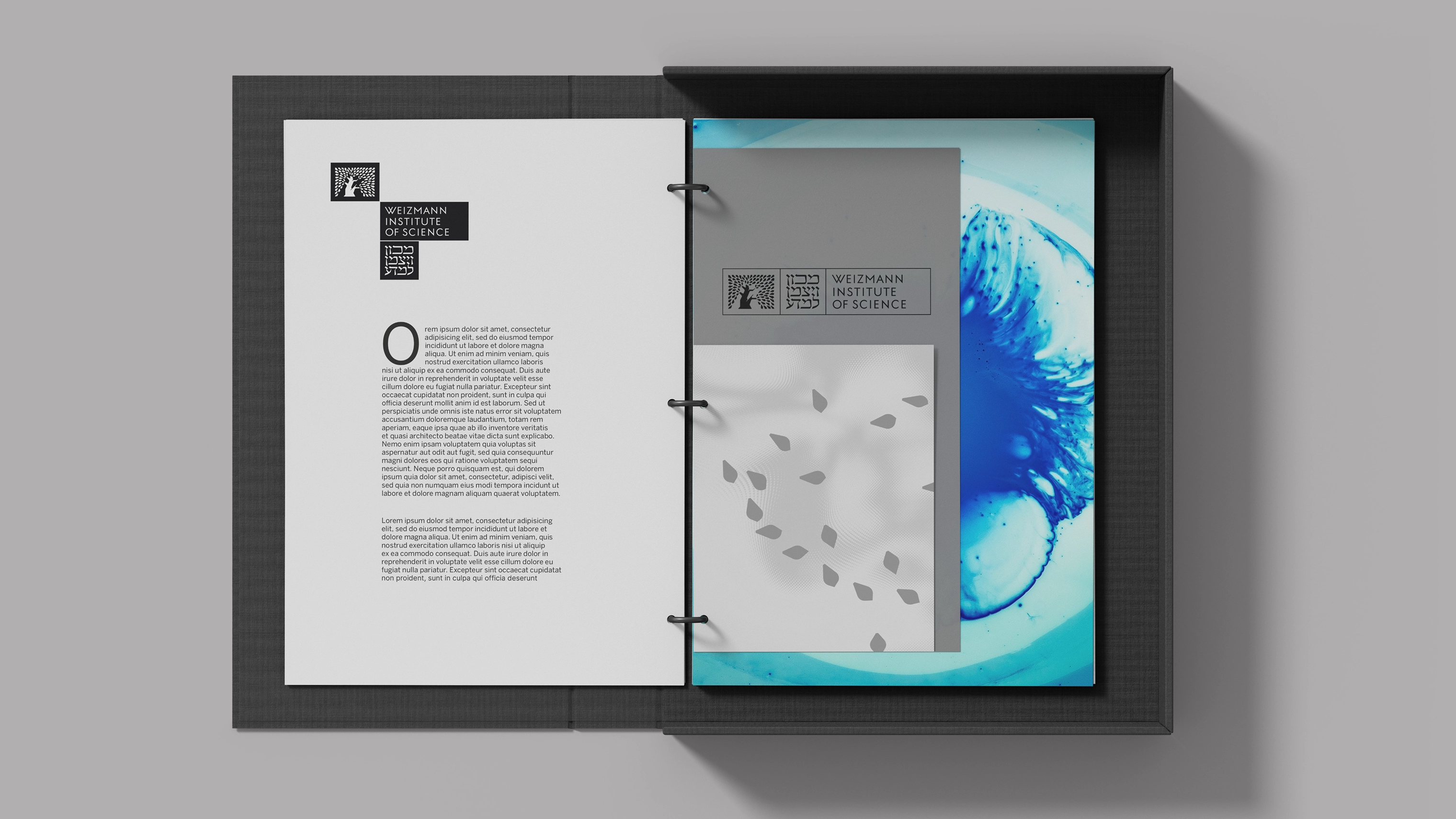
Like the institution itself, the brand balances both structure and flow. It carries both the fixed nature of the institution, including seven faculties, co-branding, and multiple fundraising vehicles, without a single exception being written, as well as the boundless exploration that the structure exists to protect.
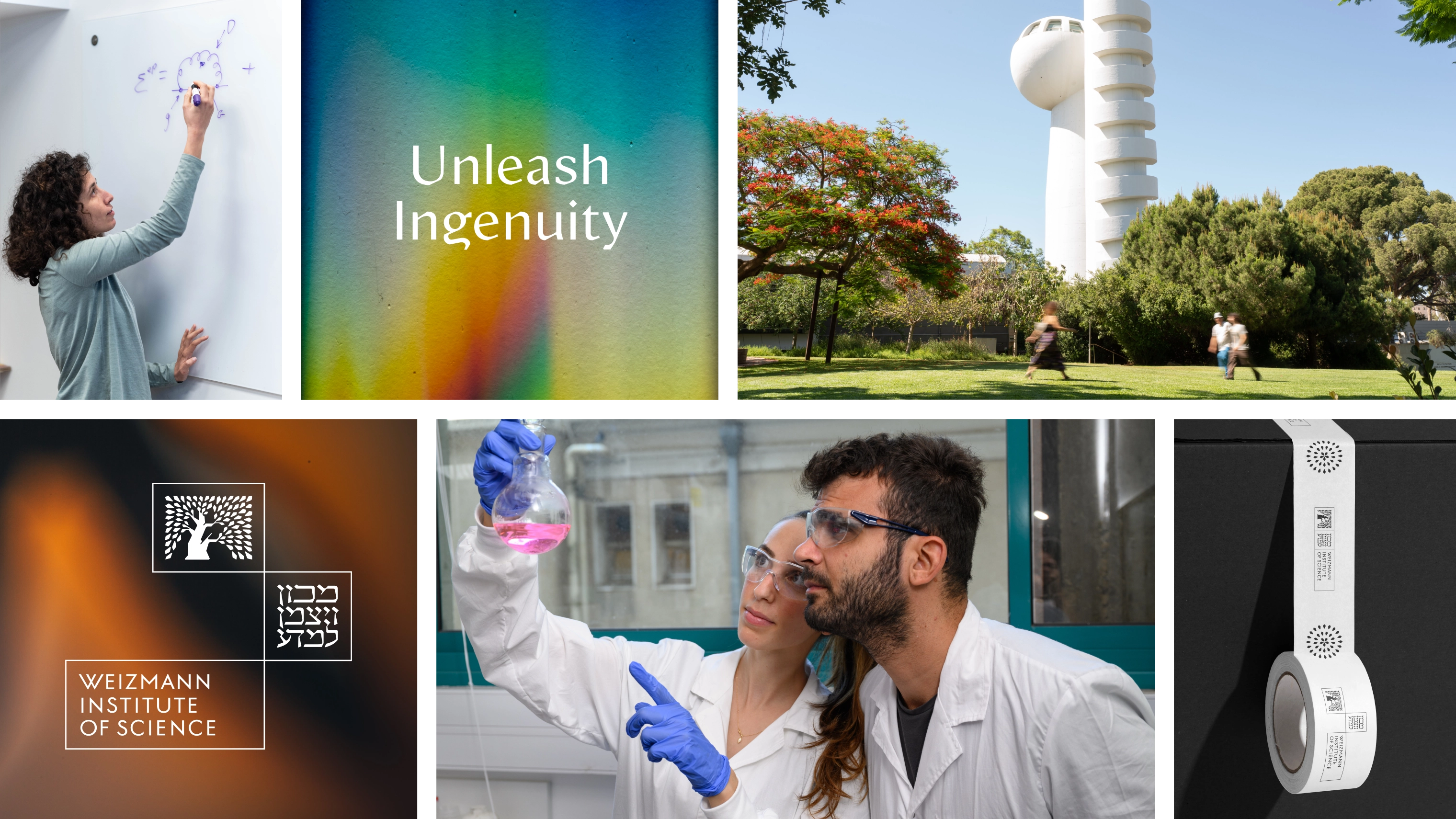
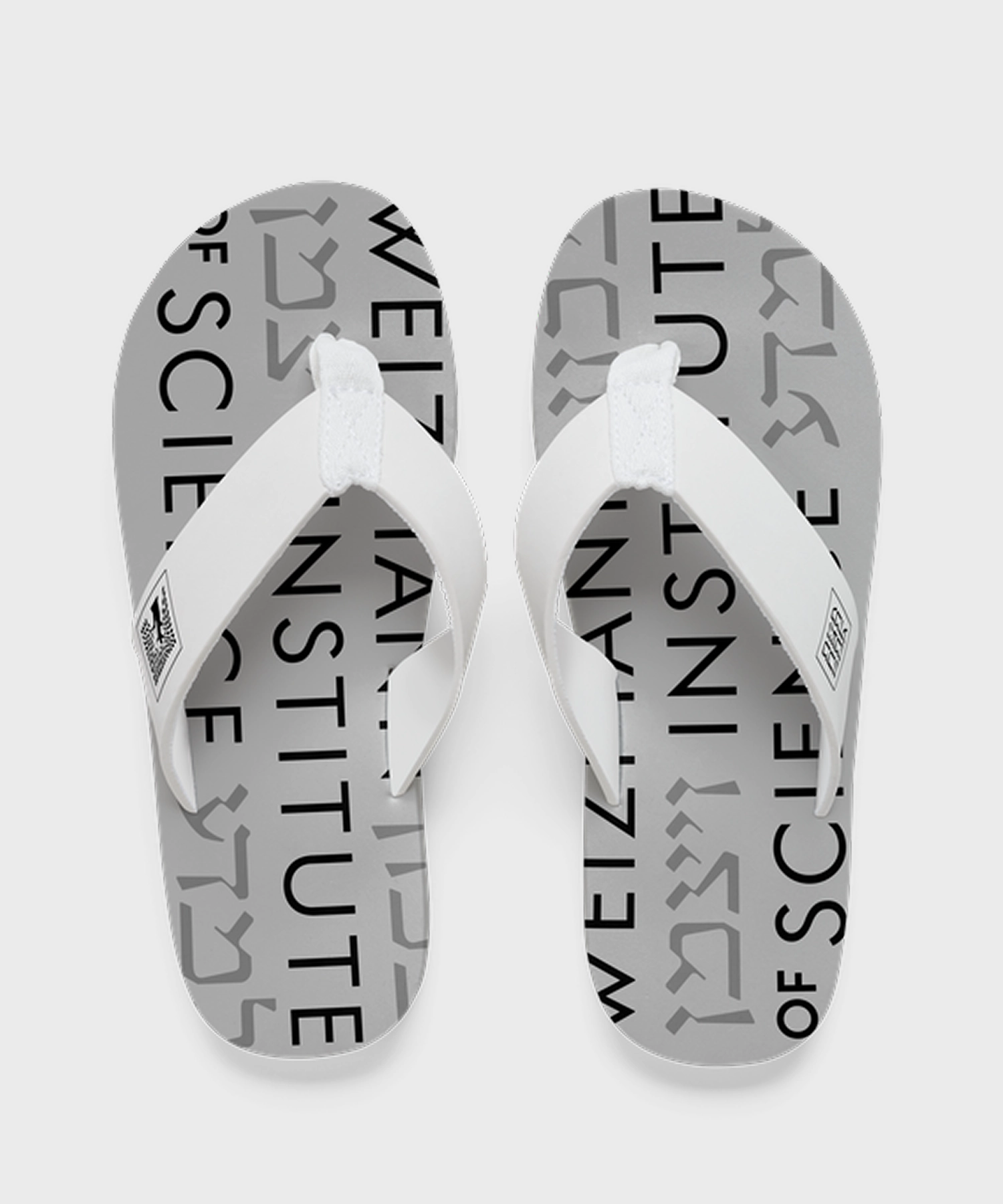

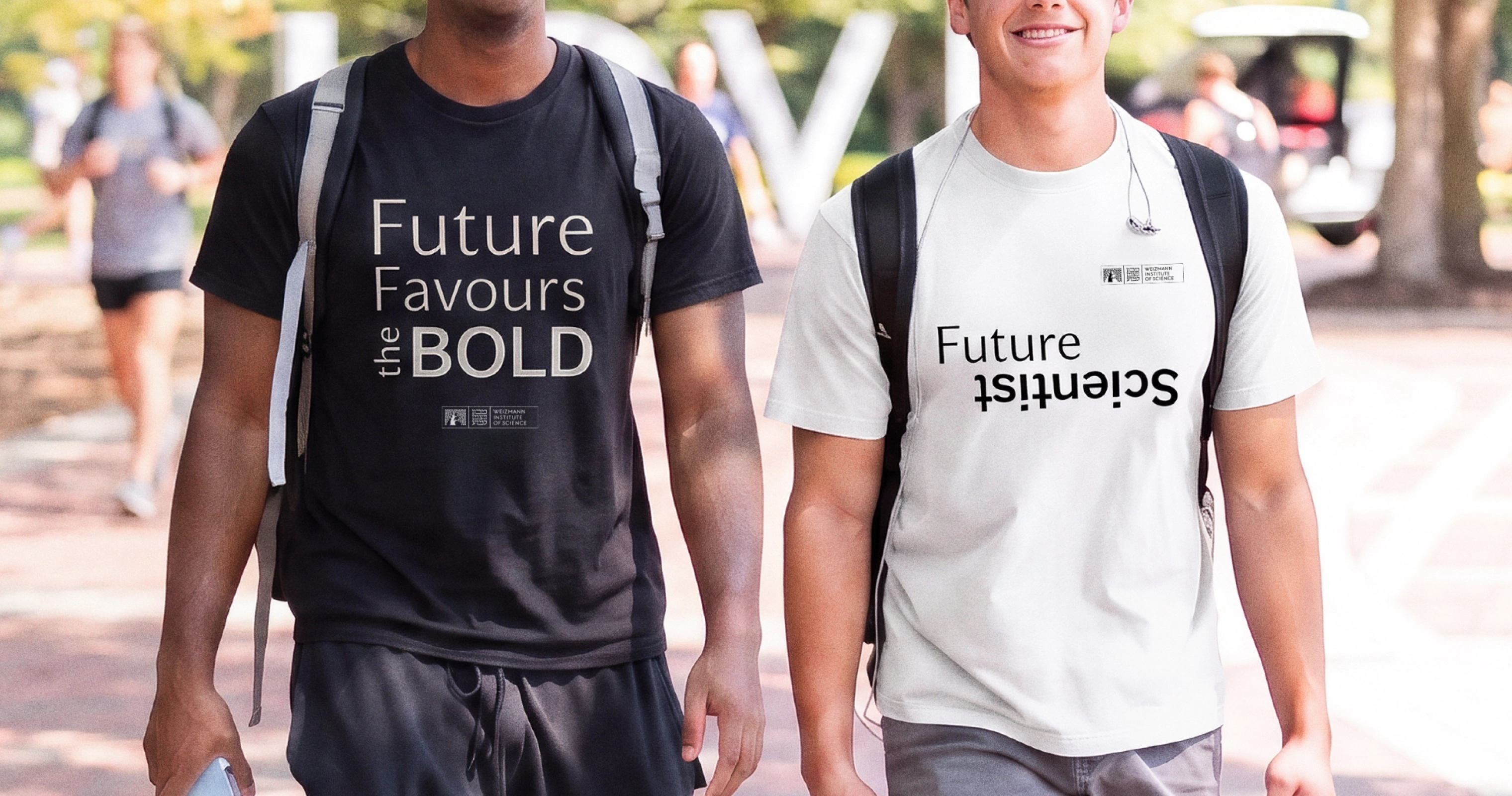
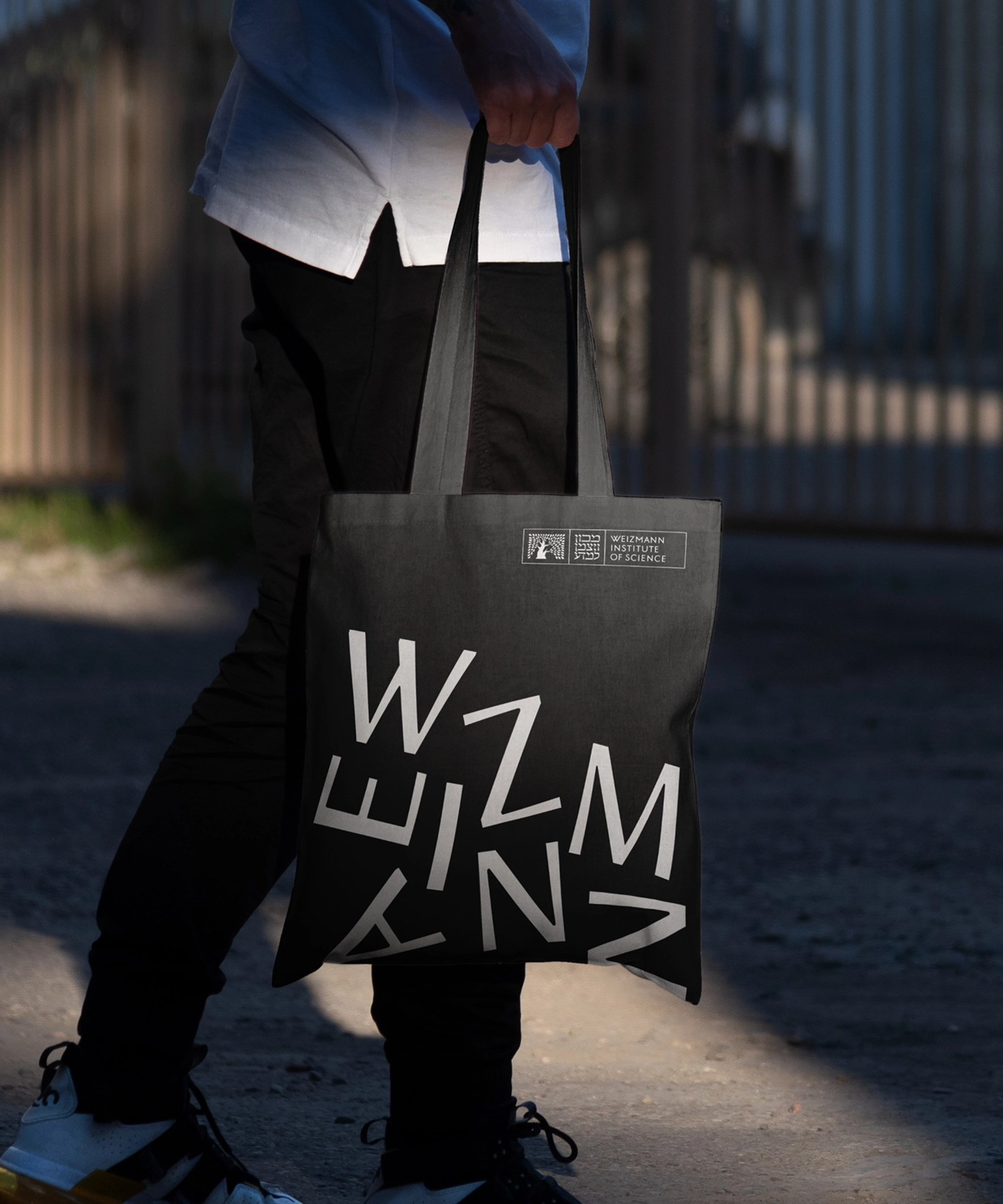


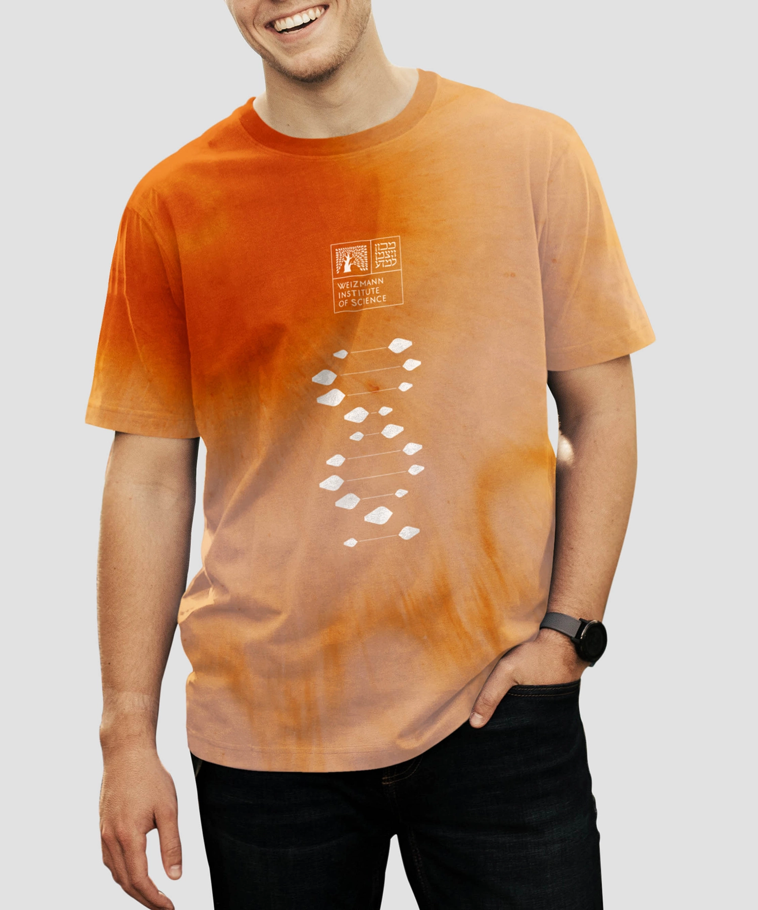
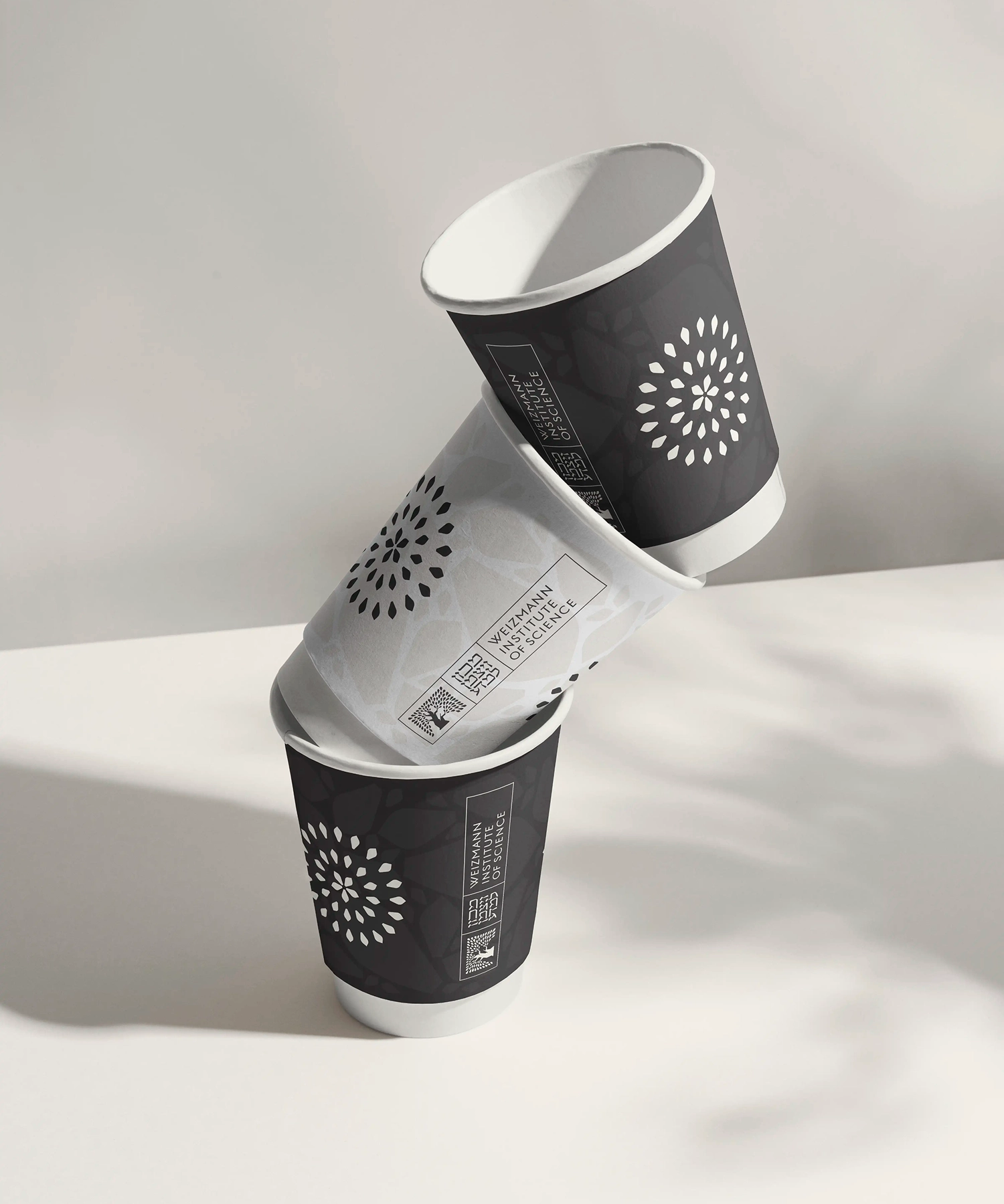
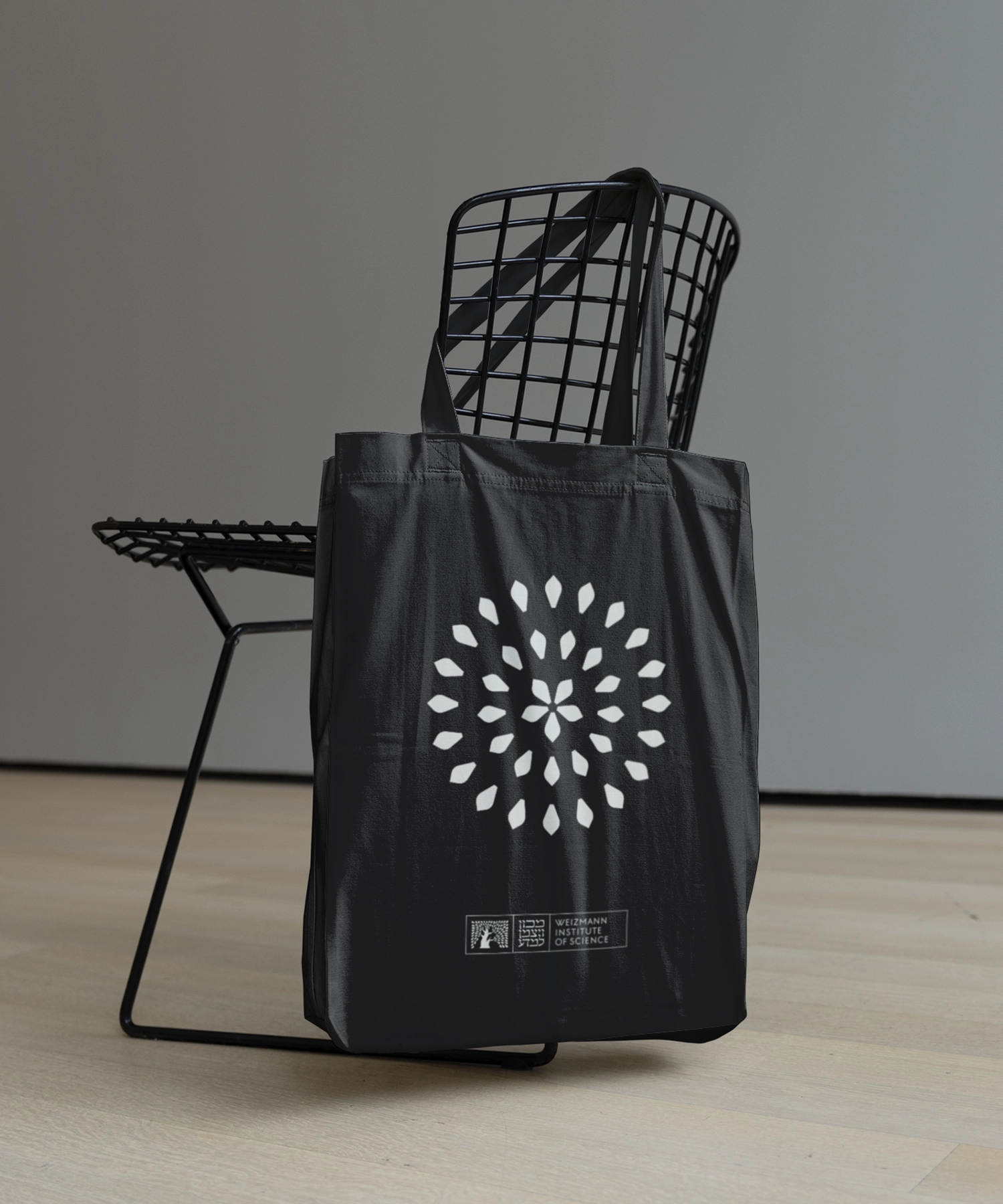
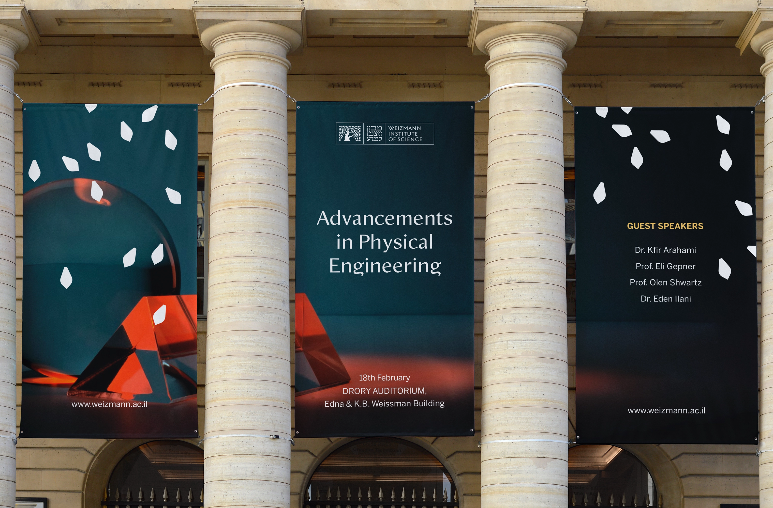
The palette was pulled back to a warm monochrome so that each faculty could take a colour and a pattern of its own without ever competing with the Institute above it. Differentiation downward, unity upward, no negotiation required.
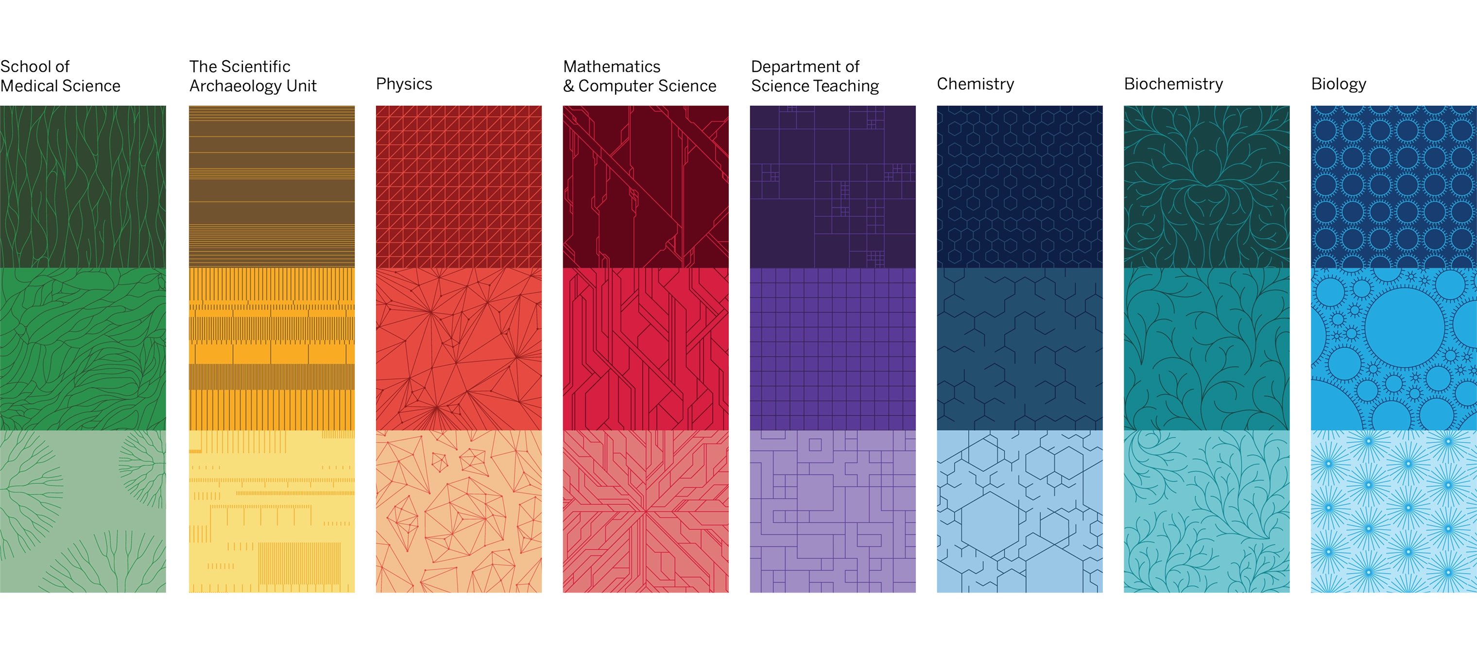
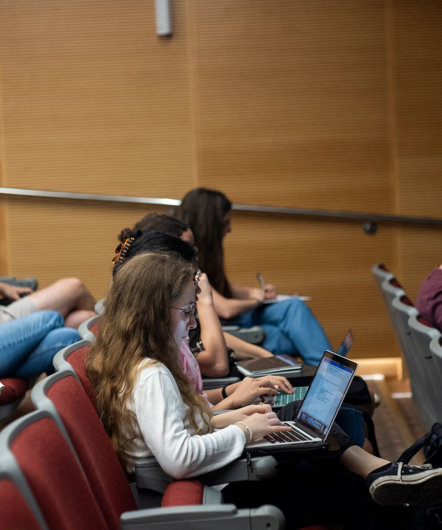
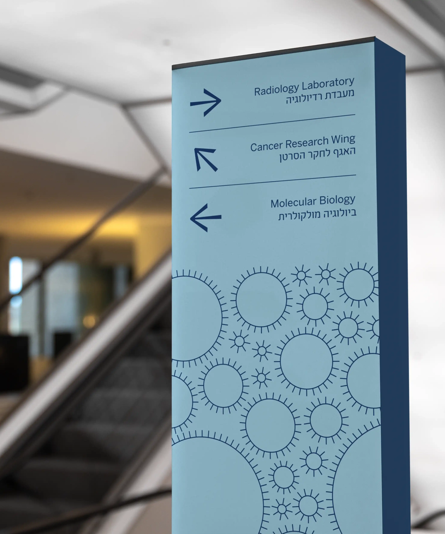
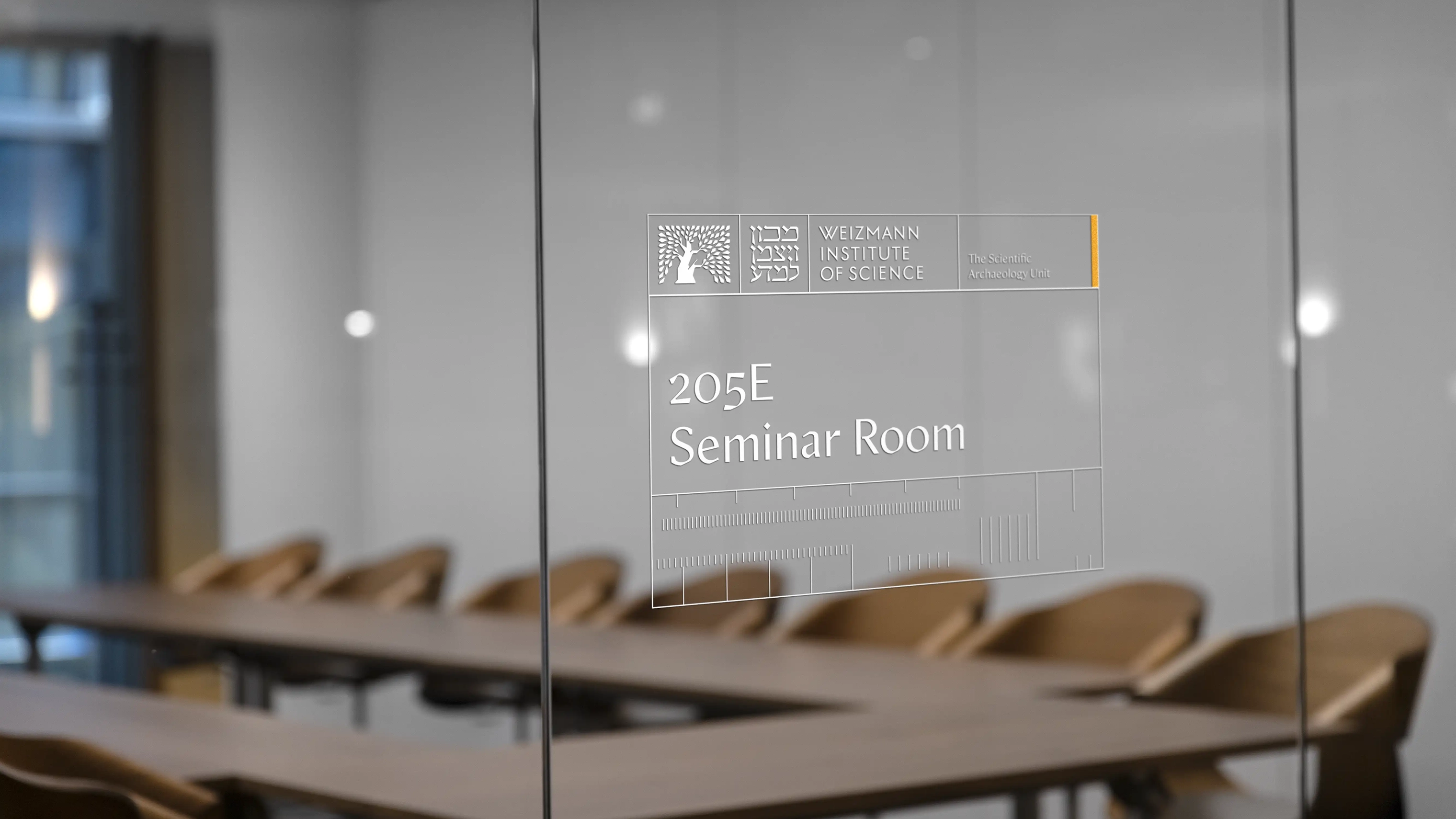
Twelve months from the first archive visit to launch. The identity now runs across every faculty and department, several thousand staff, and the Institute's global fundraising organisations, governed through Frontify and supported by a trained network of brand ambassadors on campus.
Weizmann spent ninety years protecting an heirloom. It now has one designed to be handled: across every faculty, every campaign, every fundraising organisation, in both of its languages.